
What Is Funnel Chart In Google Sheets?
Funnel charts in Google sheets, as the name suggests, is a chart type that represents the shape of a funnel. It is not an inbuilt chart type like stacked column chart but we can create funnel chart in Google sheets with the help of certain functions.
For example, consider the below table showing sample products of an organization in four different quarters.

Now, let us learn how to create a funnel chart.
Use this Funnel Chart In Google Sheets Template to follow along with the examples in this article.
Download Excel TemplateThe steps are:
To begin with, first include Helper column and insert the max function.
Next, select the entire table and click on Insert > Chart > Stacked Bar Chart.
Now, click on Customize > Series > Helper Column and change Fill Opacity to 0%.
We can see funnel chart immediately.

Likewise, we can create funnel charts.
In this article, let us learn how to create funnel chart in Google sheets along with the method to use the max function and how to customize the chart with detailed examples.
Key Takeaways
- Funnel chart in Google sheets is an essential chart type used to present data effectively.
- As the name suggests, the chart appears in the shape of a funnel.
- In Google sheets, we can create funnel chart using the Customize option under Charts Editor tab.
- Make sure to create an additional column, commonly named as helper column to create funnel chart effectively.
- Remember, the Fill capacity for helper column should be 0% instead of 100% to create funnel chart in Google sheets.
How To Create Funnel Chart In Google Sheets ?
Creating funnel chart is simple.
The steps are:
Step 1: To begin with, first include the data for which we want to create funnel chart.
Step 2: Next, right click on the intersection. Select Insert column on the right.
Step 3: Now, let us name the new column as Helper Column. Now, we need to use the =(max function. Make sure to insert the cell range as absolute reference.
Step 4: Next, select the entire cell range to create a chart. And then, click on Insert > Chart.
Step 5: The Chart Editor tab appears on the right side. Here, click on Customize and select Series option.
Step 6: Here, click on Apply to all series drop down option and click on Helper Column.
Step 7: Next, change Fill Opacity to 0%.
We can see funnel chart immediately in Google sheets. Likewise, we can create funnel charts in Google sheets.
Examples
Example #1
Consider the below table showing order details of a company such as number of products available in inventory, number of products ordered, number of orders packed and number of orders delivered in column A. Similarly, column B shows the count of the details.

Now, let us learn how to create funnel chart.
The steps are:
Step 1: To begin with, first include the data for which we want to create funnel chart.
Step 2: Next, right click on the intersection. Select Insert column on the left.

Step 3: Now, let us name the new column as Helper Column. Now, we need to use the =(max function. Make sure to insert the cell range as absolute reference.

Using the Autofill option, we can find the result for the entire column.

Step 4: Next, select the entire cell range to create a chart. And then, click on Insert > Chart.

Step 5: The Chart Editor tab appears on the right side.

Here, click on Customize and select Series option.

Step 6: Here, click on Apply to all series drop down option and click on Helper Column.

Step 7: Next, change Fill Opacity to 0%.

We can see funnel chart immediately.

Likewise, we can create funnel charts.
Example #2
Consider the below table showing payment details of orders a company such as number of orders, number of orders with successful payments, number of orders with pending payments and number of orders with cancelled payments in column A. Similarly, column B shows the count of the details.

Now, let us learn how to create funnel chart.
The steps are:
Step 1: To begin with, first include the data for which we want to create funnel chart.
Step 2: Next, right click on the intersection. Select Insert column on the left.

Step 3: Now, let us name the new column as Helper Column. Now, we need to use the =(max function. Make sure to insert the cell range as absolute reference.

Using the Autofill option, we can find the result for the entire column.

Step 4: Next, select the entire cell range to create a chart. And then, click on Insert > Chart.

Step 5: The Chart Editor tab appears on the right side.

Here, click on Customize and select Series option.

Step 6: Here, click on Apply to all series drop down option and click on Helper Column.

Step 7: Next, change Fill Opacity to 0%.

We can see funnel chart immediately.

Likewise, we can create funnel charts.
Use Of Funnel Chart In Google Sheets
We can use Funnel chart in Google sheets for the following reasons.
- Funnel charts are used to analyze data in sales, business processes and number of visitors for a website or so.
- In Excel, funnel charts were launched only in 2019 and latest versions but in Google sheets, we can create funnel charts with just a click.
- We can change colors and add as many data as we can to show the change in trend while using Funnel chart in Google sheets.
Important Things To Note
- Google sheets Funnel chart helps users create visually stunning chart type for data.
- Creating Funnel chart in Google sheets require users to create an additional Helper column.
- The most common chart type used to create funnel chart in Google sheets is stacked column chart.
Frequently Asked Questions (FAQs)
For example, consider the below table showing number of products sold by an organization in four months.
Now, let us learn how to create a funnel chart.
The steps are:
To begin with, first include Helper column and insert the max function.
Next, select the entire table and click on Insert > Chart > Stacked Bar Chart.
Now, click on Customize > Series > Helper Column and change Fill Opacity to 0%.
We can see funnel chart immediately.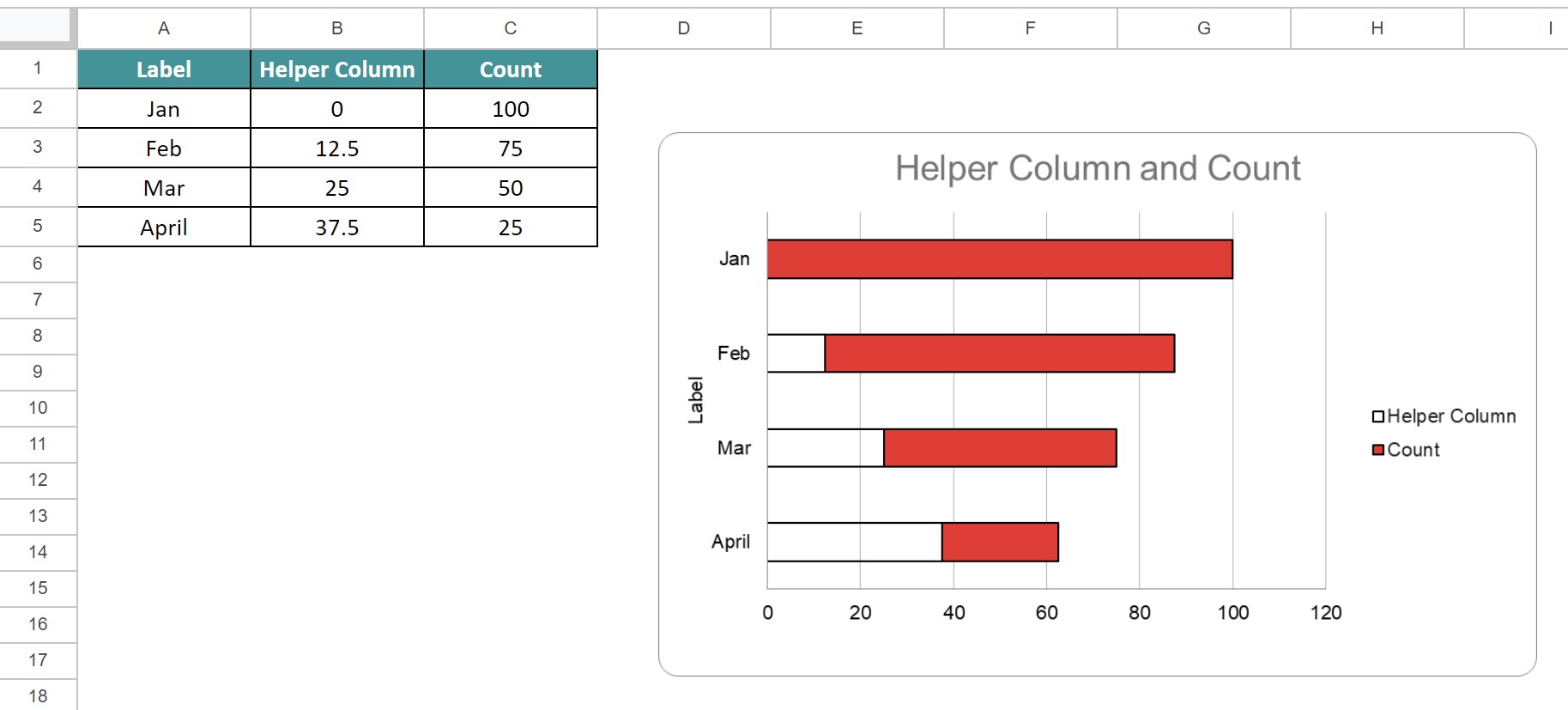
Likewise, we can create funnel charts.
We can edit or change color of funnel chart by clicking on the three dots icon and click on Edit chart. Then, we can customize the chart color as per the requirement.
Funnel charts is not an inbuilt chart like scatter chart or column charts. But, using simple steps, we can create funnel charts. Start by creating a helper column and insert =(max function.
Use this Funnel Chart In Google Sheets Template to follow along with the examples in this article.
Download Excel Template