
What Is Gauge Chart In Excel?
The Gauge chart in Excel, also called a Speedometer chart, is a plot with a dial-like structure with a needle-like pointer over it. Also, it helps quickly visualize how well a given parameter performs against a target.
Users can use the Gauge chart in finance and project management to compare the achieved sales and the targets and create executive dashboards.
Use this Gauge Chart In Excel (Speedometer) Template to follow along with the examples in this article.
Download Excel TemplateFor example, we must visually represent a firm’s sales volume using the Gauge or Speedometer plot.
The first table in the image below shows the three parts we separate the speedometer into, $20 million, $40 million, and $60 million, and cell A5 contains the sum of the three parts.

And the second table shows the achieved sales volume by the firm, the pointer width, and the End value derived from the two specified values. And value 240 is the sum of the values in the first table, $20 million, $40 million, $60 million, and $120 million.
The Gauge chart in Excel template can represent the achieved sales volume data in cell B7.

We insert Gauge chart in Excel using the Doughnut excel chart in the Insert tab, highlighted in the above image.
The semi-circular doughnut with the Green needle is the Speedometer plot. And the pointer indicates the achieved sales volume of $100 million (cell B7 value) on the speedometer.
Furthermore, if we change the achieved sales volume figure in cell B7, the pointer will point to the new value in the speedometer plot. And the data label will show the updated amount.
Key Takeaways
- The Gauge chart in Excel shows values that change over time with a pointer pointing to the current value on a speedometer or dial-like structured plot. And the dial shows the scale divided into sections of different colors, which helps understand the plot quickly.
- Users can use the Gauge plot for comparing the achieved sales versus the target, project management, preparing dashboards, and in fields such as statistics.
- Similarly, we can use the Doughnut or Pie charts to build a Gauge chart.
- Meanwhile, we can create Gauge charts with one or multiple values.
Attributes Of Gauge Chart In Excel (Speedometer Chart)
The attributes of a Gauge chart in Excel template are as follows:
- Gauge Dial: It represents the numeric data range, containing different intervals, highlighted using unique colors.
- Needle: A pointer that points at a specific value on the dial. And the pointer tip changes its location according to the change in the value.
- Pivot Point: The value the needle currently points in the speedometer.
- Minimum Value: It shows the maximum range of the Gauge plot.
- Minimum Value: It is the lowest value on the Gauge plot.
How To Create A Gauge Chart In Excel?
We can create an Excel Gauge plot using the Doughnut chart.
Now, there are two ways to insert the Doughnut chart from the Insert tab. They are:
- The Recommended Charts
- The Doughnut Chart
Now, let us see both the methods with example to understand better.
Method #1 – The Recommended Charts
Here are the steps to create Gauge Chart in excel –
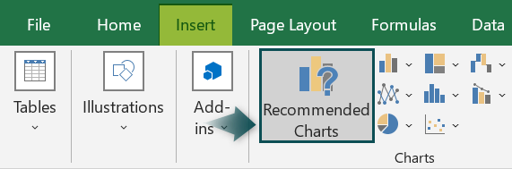
- First, select the data range and then, click the Insert tab.
Next, click on Recommended Charts option to open the Insert Chart window.
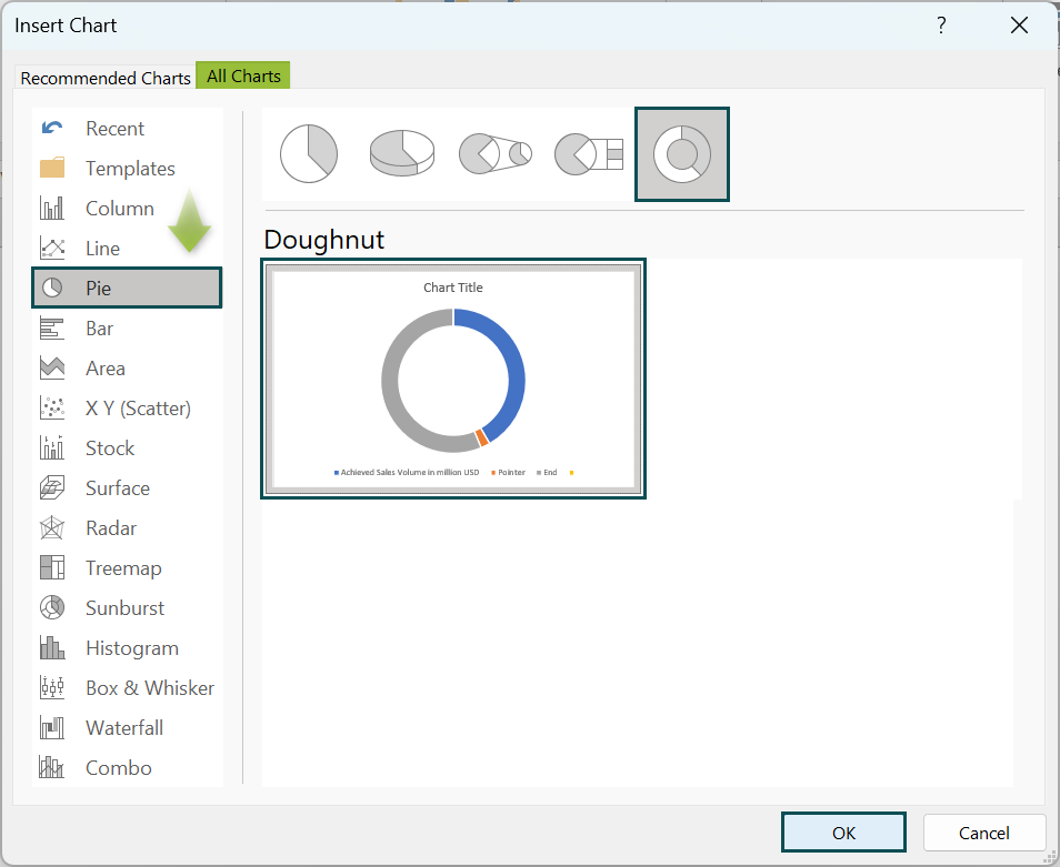
- Now, in the Insert Chart window, click the All Charts tab and then, select the Pie chart type. Next, choose the Doughnut chart.

Finally, click OK to insert the Doughnut chart into the worksheet.
Method #2 – The Doughnut Chart
First, choose the cell range and then, click the Insert tab.
Next, click on Pie or Doughnut Chart drop-down and then, select Doughnut chart type.

Furthermore, the steps to create a Gauge plot using the Doughnut chart are as follows:
- First, prepare the data to plot. Next, ensure the single or multiple values to plot are accurate, and the pointer width and the End value are correct.
However, if the Gauge plot is for a single value, then do as explained below:
- Next, select the data value, pointer width, and End value. Then, choose the Doughnut chart using one of the above methods.
- Then, rotate the plot by 90° to obtain two half-circles, one at the top and the other at the bottom.
- Next, hide the bottom half-circle, which will be the biggest slice in the plot.
- Now, add the data label of the larger slice in the top half-circle and the chart title to achieve a Gauge plot for a single value.
And, if the Gauge plot is for multiple values, then do as explained below:
- Remember, we need to have two tables, one containing the interval values and the other showing the pointer settings (value, pointer width, and End value).
- Next, select the given interval values and choose the Doughnut chart using one of the above methods.
- Then, rotate the plot by 270° to ensure the biggest slice is at the bottom.
- Now, hide the biggest slice at the bottom.
- Next, add the pointer setting data to the Doughnut plot and show the series as a Pie chart to realign the two charts.
- Then, rotate the Pie chart by 270° to align it with the Doughnut plot.
- Hide all the Pie plot slices except for the pointer slice.
- Next, add the data labels for the Doughnut plot or the first series and update the chart title to obtain the required Gauge plot for multiple values.
- Finally, insert a text box in the chart area and enter the formula to show the given data value in the box as the value the pointer points to in the dial.
Examples
The following examples explain how to insert Gauge chart in Excel and use it effectively.
Example #1 – Create A Gauge Chart In Excel With Single Value
Let us create a simple Gauge chart in Excel with a single value.
Consider we have the 2022- Q2 profit percentage in the first table. And the second table shows a value of 100%, representing half of a Doughnut plot.

Now, the task is to update the required values in the second table.
Also, based on the three values in the second table, we must plot a simple Gauge chart in Excel for the single value of the 2022- Q2 profit percentage.
- Step 1: To begin with, select cell C6 and then, enter the cell C2 value.
=C2

- Step 2: Next, select cell C5 and enter the below formula to obtain the percentage value to achieve 100% profit value.
=C4-C6

Even though the Gauge chart is for a single value of 93%, we require the remaining two values provided in the second table to plot the chart.
- Step 3: Then, select the cell range C4:C6 and click on Insert.
- Next, select Pie or Doughnut Chart → Doughnut cart to choose the required plot.


- Step 4: Next, right-click the plot and then, choose Format Data Series from the context menu.

Then, set the Border as No line in the Fill & Line tab in the Format Data Series window.

Next, set the angle of the first slice and the Doughnut hole size as 90° and 50°, respectively. The two actions will rotate the plot and make the hole size small. And rotating the plot will help us show the required semi-circle at the top.

- Step 5: Then, right-click the biggest slice in the Doughnut plot and then, click the Format Data Point option in the context menu.

Now, set Fill as No fill in the Fill & Line tab in the Format Data Point pane.

The largest slice disappears.
Next, click the larger slice in the top half-circle and then, set the required color using the Color option in the Fill & Line tab.


Thus, we obtain the required Gauge plot.
However, follow the below steps to make the chart more appealing.
Now, continue the modification steps in the Format Data Point window, and then, update the Top bevel under 3-D Format as Angle Bevel in the Effects tab.


Next, click the smaller slice and set the Top Bevel as Angle, as explained earlier.

And then, click the larger slice in the plot and go to the Series Options tab.
Next, set the Point Explosion as 1% to make the bigger slice stand out.

- Step 6: Next, click on the bigger slice in the plot and then, set the following Chart Elements settings by clicking the Chart Elements icon, ‘+’, next to the chart.
Now, we shall display the chart title and the data label of the selected larger slice and hide the legend.

Next, select the data label in the chart area and set the required font settings using the Font size, color, and bold options in the Home tab.

Finally, update the chart title by selecting the corresponding element in the chart area to achieve the below Gauge plot.

Now, we can change the quarterly profit percentage in cell C2 and view the update in the Gauge plot. For example, if we modify the profit percentage in cell C2 to 85%, the Gauge chart shows the larger slice with the updated dimension, and the data label shows the new data.

Similarly, we can create gauge chart in excel.
Example #2 – Create A Gauge Chart In Excel With Multiple Values
Let us see how to create a Gauge chart in Excel with negative values.
Consider we have an experiment’s results that are negative values. And they fall under the categories, Poor, Good, Very Good, and Excellent, and the first table shows them as intervals.
The second table shows the pointer settings, with the Value showing the number the pointer initially indicates in the Gauge plot and cell E3 containing the pointer width.

Now, the requirement is to update the required values in the two tables and develop a Gauge chart in Excel with negative values specified in the first table.
Then, the steps are as follows:
- Step 1: First, select cell B7, enter the SUM excel formula, and then, press Enter.
=SUM(B3:B6)

Remember that the Total value makes the biggest slice in the Doughnut plot. In turn, it will hide to create the required Gauge plot.
- Step 2: Next, select cell E4, enter the following formula, and then, press Enter.
=-200-(E2+E3)

Thus, we now have the labels for the intervals in the Gauge plot, and the values in the first table show the ranges of the sections into which the dial scale splits.
On the other hand, the value -200 in the above expression is the sum of the values in the first table. And the End value will help properly position the pointer in the plot.
- Step 3: Now, select the cell range B3:B7 and click on Insert.
- Next, select Pie or Doughnut Chart → Doughnut chart to insert the required plot.


- Step 4: Now, right-click the plot and then, click the Format Data Series option in the context menu.

Then, set the Border as No line in the Fill & Line tab in the Format Data Series window.

Next, set the angle of the first slice and the Doughnut hole size as 270° and 50°, respectively. The two actions will rotate the plot and make the hole size small.
Meanwhile, rotating the plot will help us show the required semi-circle at the top.

- Step 5: Next, right-click on the biggest slice and then, click the Format Data Point option in the context menu.

Now, set the Fill as No fill in the Fill & Line tab in the Format Data Point window.

- Step 6: Next, right-click the plot and then, select the option Select Data from the context menu.

Now, the Select Data Source window will open. Here, we must click Add under the Legend Entries field.

The Edit Series window will open. Now, we must update the series name and the values as the data range of values in the second table.


Then, click OK to close the window.

Next, click OK to close the Select Data Source window.
- Step 7: Now, right-click the outer plot and click the option to modify the series chart type in the context menu. It is to realign the charts of the two data series.

Clearly, we can see that the Change Chart Type window will open.

Next, update the Pointer series chart type as Pie and then, select its Secondary Axis check box.

Now, click OK to close the window.
- Step 8: Next, right-click the Pie plot and then, choose Format Data Series from the context menu.

Then, set the first slice’s angle in the Series Options tab in the Format Data Series window as 270° to rotate and align the pie chart with the doughnut plot.

- Step 9: Now, right-click the largest slice and then, click the Format Data Point option in the context menu.

Now, set Fill as No fill in the Fill & Line tab in the Format Data Point window.

Likewise, select the second-largest slice and set the Fill option as No fill.

The above actions will hide all the slices except for the pointer slice.
- Step 10: Next, select the pointer slice and then, update the required color, say, Black.

- Step 11: Then, select each slice with a border, one at a time, and then, set the Border in the Fill & Line tab in the Format Data Point window as No line.


Thus, we will achieve the below Gauge chart with multiple values.

Furthermore, the following steps will improve the plot’s appearance.
- Step 12: Next, click the plot to enable the Format tab in the ribbon.

Now, set the current selection in the Format tab as Series 1, as we must show the data labels from the first table.
Next, click Chart Elements, enable the Data Labels option, and then, click the right arrow to select More Options.

- Step 13: Then, select the first option under Label Options in the Format Data Labels window to choose values from a cell range.

Now, the Data Label Range window will open. Here, we must enter the cell range containing the interval label names (Poor, Good, Very Good, Excellent, and Total), A3:A7.


Next, click OK to close the window and uncheck the Value and Show Leader Lines options under Label Options in the Format Data Labels window.

- Step 14: Then, click the Total label in the chart area, and then, press Delete to remove it.

Now, place the labels as per the requirement by dragging each element one at a time to the required position in the chart area.

- Step 15: Next, click Insert → Text → Text Box to insert a text box in the chart area.


Now, with the cursor in the text box, enter the cell E2 reference as a formula in the Formula Bar, as shown below.

Next, cell E2 value gets displayed in the text box in the chart.

- Step 16: Next, click the Chart Elements icon to unselect the Legend option.

And then, double-click the chart title element to update the required plot heading. Now, we can obtain the final Gauge chart with multiple values.

Now, we can update the experiment trial result in cell E2 value and view the updated Gauge chart. For example, we update the cell E2 value as -45. Then, the revised Gauge plot will appear as shown below.

Likewise, we can create gauge chart in excel.
Pros And Cons
The pros of the Excel Gauge chart are as follows:
- It is easy to create and understand due to color coding in the dial.
- We can represent a linear progressive scale or a Speedometer chart disregarding the prospects of unforeseen issues.
- Similarly, we can create a Gauge chart for single and multiple values.
The cons of the Excel Gauge chart are as follows:
- The chart may take more space, even when the dataset is small.
- Showing complex data on multiple scales in the plot can become challenging.
- Meanwhile, understanding the central context of the data can become challenging when using the Gauge plot.
Important Things To Note
- First, ensure the sum of the given values used for calculating the End value in the Gauge chart in Excel data is correct.
- Secondly, when creating a Gauge chart for a single value using the Doughnut plot, we should rotate the plot by 90°.
- When creating a Gauge chart for multiple values using the Doughnut and Pie plots, rotate the plots by 270°.
Frequently Asked Questions (FAQs)
We would use a Gauge chart in Excel because it helps depict the given values that change over time between a minimum and maximum limit. Also, it has a pointer that points to the current value.
In addition, the chart is useful for creating plots for data such as BMI, customer satisfaction, and region-wise revenue.
The difference between Score Meter chart and Gauge chart in Excel is that we can create a Score Meter chart using the Stacked Bar chart. And it shows a single entity on a percentage or quality scale.
On the other hand, we can create a Gauge chart using the Doughnut or Pie chart. And it shows the current value of a parameter using a pointer on a dial-structured plot.
Unfortunately, the Gauge chart in Excel may not work because of the following reasons:
• The source data containing the single or multiple values and the pointer settings are incorrect.
• Similarly, the Doughnut plot may not be aligned at the correct angle.
Use this Gauge Chart In Excel (Speedometer) Template to follow along with the examples in this article.
Download Excel Template