
What Are Graphs And Charts In Google Sheets?
Graphs and Charts in Google Sheets are the pictorial representation of variables from a single or multiple datasets for better understanding of the projected data.
In the Google Sheets Graphs and Charts, graphs represent the numeric data and show the relation and variation of how one number affects or changes another. However, charts represent data that may or may not be related.
Use this Graphs And Charts In Google Sheets Template to follow along with the examples in this article.
Download Excel TemplateFor example, the below table shows a firm’s region-wise quarterly sales figures, and we will analyze the data visually using the Clustered Column chart.

Select cell range B2:E6 and enter the Clustered Column chart from the charts group.

The generated Clustered Column chart is shown in the above image where,
- We see a cluster of four bars for each quarter representing the sales in the four regions, in the order of Region1 to Region4.
- Region4 in Q4 showed the highest sales of $36 thousand.
- Region3 registered the lowest sales of $5 thousand in Q3.
- The firm performed exceptionally well in Q4 compared to the other quarters.
Key Takeaways
- The Graphs and Charts in Google Sheets are the graphical representation of any selected dataset. It represents the data in a user understandable way.
- In a presentation, when we represent the data as a chart or graph, we can comprehend the trend with just a glimpse. Unlike the numeric value datasets, we cannot immediately identify the maximum and minimum values, the increase or decrease in profit, etc.
- To generate an accurate chart or graph, we must sort the data in the required order, ensure to have all the data filled, i.e., no empty or blank cells, and the cell values must always be numeric. i.e., not special characters or alpha-numeric values.
Types
The different types of Charts and Graphs in Google Sheets are as follows:
- The Line Chart displays the selected dataset as a line, which is easy to understand and not cluttered.

- The Area Chart is like a line graph to represent data comparison and to keep track of data trends.

- The Column Chart displays statistical data relation or variation in the form of vertical Columns.

- The Bar Chart displays statistical data relation or variation in the form of horizontal Bars.

- The Scatter Chart is used for a smaller dataset as the graph will look like scattered dots for data points.

- A pie chart displays the data as a pie or a circular form to display percentage data.

- A Map or a Geo Chart helps view data as a map geographically according to the location.

- Finally, we have some rarely used charts in the other category, such as, the Waterfall Chart, Histogram Chart, Radar Chart, Gauge Chart, Scorecard Chart, Candlestick Chart, Organizational Chart, Tree map Chart, Timeline Chart, Table Chart, etc, as shown in the below image.

How To Access Graphs And Charts In Google Sheets?
The steps to Access Graphs and Charts in Google Sheets are as follows:
Step 1: Choose the dataset or the cell range à select the “Insert” tab à click the “Chart” option, as shown below.

Step 2: A default chart appears along with the “Chart editor” window on the right side. Here, select the required chart from the “Chart type” drop-down, as shown below.

Examples
Let us consider the Graphs and Charts in Google Sheets examples for better understanding.
Example #1 – Bar Graph or Column Chart in Google Sheets.
We will plot a Clustered Column chart for the below table that shows the monthly customer votes data for two brands.

The steps to create a Clustered Column chart for the given data are,
Step 1: Choose the cell range A2:E4 -> select the “Insert” tab -> choose the “Chart” option and the “Chart editor” window opens on the right-side, as shown below.

The chart generates as shown below.

Step 2: Let us customize the chart as required. Here, we see a slight gap in between the clusters. Therefore, to remove the gap or to show as clusters of columns for each category distinctly, click the “Customize” option in the “Chart editor” window to get the options, as shown below.

Step 3: Click the “Chart style” option right arrow and check/tick the “3D” option

The above step will make the clustered columns appear more clearly with no gaps.
Step 4: Next, let us add titles to the chart and format them accordingly. Therefore, in the “Chart editor” under the “Customize” menu, select the “Chart & axis titles”, as shown below.

Step 5: Click the “Title type selector” drop-down and select each option to update the title as follows:
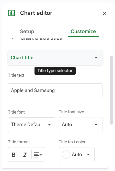
- First, select the “Chart title” option, type “Brand-Wise Customers Monthly Votes Comparison” in the “Title text” field, select “Bold” and “Center alignment” in the “Title format” field and color Black in the “Title text color” field, as shown below.

- Next, select the “Horizontal axis title” option, type “Months” in the “Title text” field, select “Bold” and “Center alignment” in the “Title format” field and color Black in the “Title text color” field, as shown below.

- Finally, select the “Vertical axis title” option, type “Customer Votes” in the “Title text” field, select “Bold” in the “Title format” field and color Black in the “Title text color” field, as shown below.

The final Clustered Column Chart is shown below. We can either stop here, or customize further by exploring the options available in the “Customize” menu in the “Chart editor”.

We see that the customer votes are represented by bars, where, the Blue bars represent the data points of the brand Apple, the Red bars show the brand Samsung’s data points.
- The brands received the maximum customer votes in April. Among the two brands,
- Samsung got the maximum votes, 6945 and the least votes, 1479 in the compared months.
- Apple received more votes than Samsung in Jan-Mar.
Example #2 – Line Chart in Google Sheets.
The below table shows a monthly inventory data of a firm for the months April to August on the units ordered for the Smartphones, Laptops and Desktops. We will create a Line Chart.

The steps to create a Line Chart are as follows:
Step 1: Choose the dataset cells A1:D7 à select the “Insert” tab àchoose the “Chart” option and the “Chart editor” window opens on the right-side, as shown below.

Step 2: Select the “Setup” menu, click the “Chart type” drop-down and choose the “Line chart” to generate the following chart. Now, let us customize the chart as per our requirement.

Step 3: Follow the steps learnt in Example #1 to update the titles, min and max values to display the values within the chart, etc. Then, we see the final Line Chart like below.

Output Observation:
- The first trend line with the area below it shaded in Blue represents the Smartphone units ordered data.
- Next, the Laptop units ordered get added to the first trendline data points every month to form the second trendline, with the area below it being in Orange.
- Finally, the Desktop units get added to the second trendline data points every month to form the third trendline, with the area below it being Yellow. And the shaded areas from each trend line overlap with the area from the lowest trend line to the X-axis, shown in front.
Thus, we can review the total units of all items ordered each month and the overall and item-wise trends. And we can analyze the proportion of the units of each item order in the overall inventory order.
Example #3 – Pie Chart in Google Sheets.
The below table contains some of the juice brands and their respective sales percentage. Let us create a Pie Chart in Google Sheets.

The procedure to create a Pie Chart in Google Sheets is,
Choose the dataset cells A1:B6 -> select the “Insert” tab -> choose the “Chart” option and the “Chart editor” window opens on the right-side, as shown below.

Once we get the default chart, change the chart type to “PIE chart” and proceed with the inserting and formatting of the titles, labels, legends, etc. as learnt in Example #1 – Step 2 to Step 5, to get the final Pie Chart shown below.

Example #4 – Area Chart in Google Sheets
The below table contains the monthly Mathematics test scores of five students. The requirement is to analyze each student’s performance in the monthly tests visually using a Stacked Area Chart.

The steps to create a Stacked Area Chart are shown below,
Step 1: Choose the dataset cells A1:D7 à select the “Insert” tab à choose the “Chart” option and the “Chart editor” window opens on the right-side, as shown below.

Step 2: Select the “Setup” menu, click the “Chart type” drop-down and choose the “Stacked area chart” to generate the following chart. Now, let us customize the chart as per our requirement.

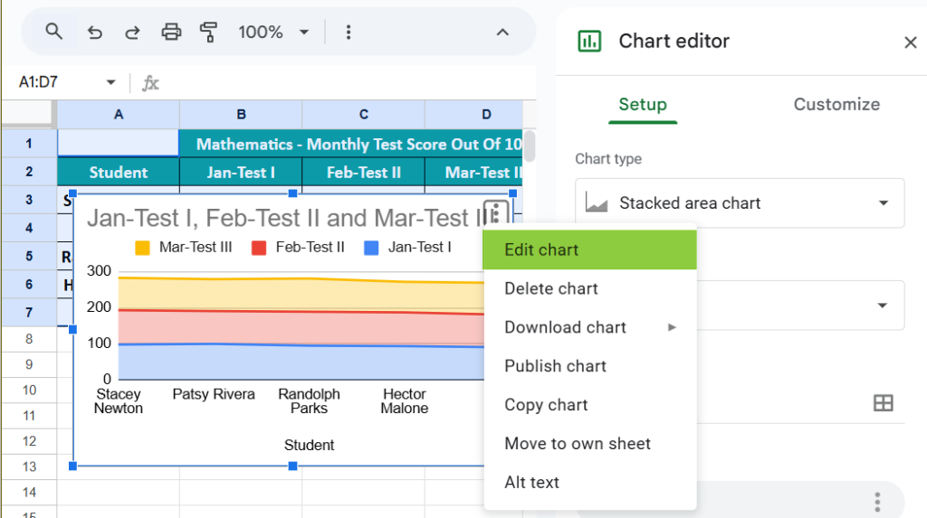
Step 3: First, we will update the chart titles. Please check if the “Chart editor” window is open else we can click the chart to activate, click the 3 dots on the top-right corner of the chart and select the “Edit chart” option to open the “Chart editor” window, as shown below.
Step 4: Select the “Customize” menu and click the “Chart & axis titles” right arrow, as shown below.

Step 5: Click the “Title type selector” drop-down. Select each option to update the title as follows:

- First, select the “Chart title” option, type “Mathematics Monthly Test Scores” in the “Title text” field, select “Bold” and “Center alignment” in the “Title format” field and color Black in the “Title text color” field, as shown below.

- Next, select the “Horizontal axis title” option, type “Student” in the “Title text” field, select “Bold” and “Center alignment” in the “Title format” field and color Black in the “Title text color” field, as shown below.

- Finally, select the “Vertical axis title” option, type “Monthly Scores” in the “Title text” field, select “Bold” in the “Title format” field and color Black in the “Title text color” field, as shown below.

Step 6: Select the “Customize” menu. Click the “Vertical axis” right arrow. We can check/tick “Show axis line” checkbox, enter the values as 75 and 100 in the Min and Max fields, as shown below.

[Note: We see now the chart above looks different from the one in step 5.]
Step 7:Finally, select the “Setup” menu and click the “Stacking” drop-down and select the “None” option, as shown in the images below.

We get the final Stacked Area Chart which you can see below. We can either stop here, or customize further by exploring the options available in the “Customize” menu in the “Chart editor”.

Output Observation:
The plot shows a line segment for each monthly test. And the shaded areas from each trend line overlap with the area from the lowest trend line to the X-axis, shown in front.
- The Feb monthly test trend, the second line segment formed by data points 95, 91, 94, 93, and 90. And the area from this trendline to the X-axis is in Red.
- Likewise, we get the first and third trendlines for January and March monthly tests, with the respective areas below them shaded in Blue and Yellow.
So, now using the above plot, we can review how each student has performed in the monthly tests.
Important Things To Note
- For the same data, we can insert various chart types. It is important to identify a suitable chart.
- If the data is smaller, it is easy to plot a graph without any hurdles.
- In the case of percentage data, we must select the PIE chart.
- We must try using different charts for the same data to identify the best fit chart for the data set.
A few tips to follow while creating a Graph and Chart in Google Sheets are as follows:
1) Numerical Data: The first thing required is numerical data. Charts or graphs can only be built using numerical data sets.
2) Data Headings: These are often called data labels. The headings of each column should be understandable and readable.
3) Data in Proper Order: If the information to build a chart is in bits and pieces, it is difficult to construct a chart. So, arrange the data properly.
A few reasons why a Graph or Chart in Google Sheets may not work are as follows:
• The dataset linked to the generated chart is modified, and the chart did not update automatically. In such scenarios, we can refresh the chart once to display the updated data.
• The dataset is neither selected nor deleted. So, there is no data range to display or generate the chart.
A few ways to insert Graphs and Charts in Google Sheets are,
• Auto Selection of Data Range – Here, we select the dataset first, insert a chart type, and then generate the chart. Later, we use the “Format Data Series” to format it further.
• Manual Data Selection à Here, we first insert a chart using the “Insert” tab. A blank chart generates in the background. Then, click the “Select Data…”, and format it as required.
Use this Graphs And Charts In Google Sheets Template to follow along with the examples in this article.
Download Excel Template