
Interactive Chart in Excel
An interactive chart in Excel contains interactive features, making it more user-friendly and easily understandable. These features could include a dropdown list, scroll bar, etc., making the chart easier to read. For instance, below are the revenue details for different business regions over three years. We use the following formula using the region entered in cell H3 and fetch the revenue details in cells G4 to I4.
=XLOOKUP(H3, B3:B6,C3:E6).
Based on the results displayed,

we prepare a clustered column chart in excel. For instance, in the first chart, we have entered the region as East, so its corresponding revenue details are fetched, and the chart is plotted for those values. In the second chart, we have mentioned the region as South, and the values and graph change accordingly.
Use this Interactive Chart in Excel Template to follow along with the examples in this article.
Download Excel TemplateKey Takeaways
- An interactive chart in Excel has interactive features which the user can change.
- Thus, the data displayed in the chart is changed.
- We can use it when users must select information to display a chart based on their choice.
- The interactive chart in Excel contains complex data that cannot be displayed in a static chart.
- Design the interactive chart to help the user get their required information. Refrain from including unnecessary information in the interactive chart.
Explanation and Uses
An interactive chart in Excel has many interactive features, which the user can change by taking action. Thereby, the data displayed in the chart is also changed.
Users can interact with a chart by:
- Using a scroll bar in excel
- Hovering
- Using an input box
- Using buttons or tabs
- With a drop-down menu
When to use an interactive chart
- These charts display information that changes dynamically based on user preferences.
- We need the users to select information to display the appropriate chart based on their choice.
- Complex data cannot be shown in a static graph.
- Where users need to explore the data by themselves.
How to Create Interactive Chart in Excel?
Creating an interactive chart in Excel is a little time-consuming, but the effort is worth it when dealing with complex data. Let us consider an example of how to create an interactive chart. Below is the average temperature of Seattle, Phoenix, and Dallas every month. Now, a user who wishes to check the temperature of Seattle can click on the drop-down list and choose the city to get the appropriate chart.

Follow the below steps to create an interactive chart in excel:
- To create a drop-down list, go to the Data tab → Data Validation. Click on the icon.

- The Data Validation window pops up. Go to Validation criteria, and select List.
Under Source, highlight the choices for your dropdown list. Here we choose the city names from B2 to D2.

- Press OK. You get a drop-down list of the cities in cell F3.

- Based on the city selection, the corresponding temperatures are displayed in cells G3 to G14. Now, let us plot a column chart based on this data.

- Go to the Insert tab – Choose the “Insert Column or Bar Chart” option in the Charts group.

- You get a graph as shown. Now, we must change the axis details. Select the horizontal axis by clicking on it. Right-click and choose the option “Select Data.”

- Click on “Edit” in the pop-up window under “Horizontal Axis Labels.” Select the months from cells A3 to A14. Press OK.

- The horizontal axis now changes to months. Now, select the city of Seattle and check the chart.

- Now, choose the city name as Dallas, and check how the graph changes.


Thus, an interactive chart in Excel is dynamic, capturing a selected portion of a raw data table in a graph.
Examples
Let us look at some interesting interactive charts in the examples below.
Example #1
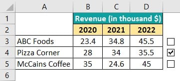
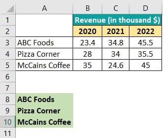
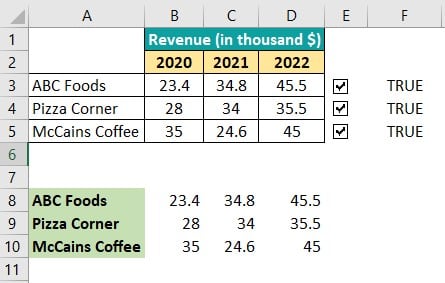
Below is a table with the yearly revenue details of the three companies. Let us try to create an interactive chart to display the revenues of the companies we choose. We can use checkboxes here.

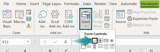
1: Let us add checkboxes. Go to the following:
- Developer tab – Controls group – Click on Insert.
- Click on the checkbox image.
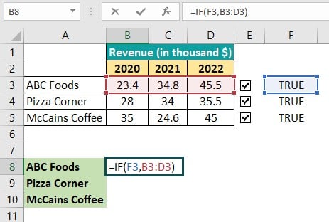
2: Choose the checkbox and place it in cell E3. Copy and paste to cells E4 and E5 as well.
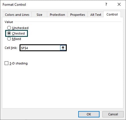
3: Right-click on any of the boxes. In the menu, choose “Format Control.”

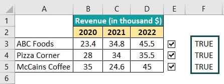
4: You get a pop-up window. Now, in the cells adjacent to the three checkboxes, in F3 to F5, we enter TRUE as shown.
5: Now, in the pop-up window, under the Controls tab, choose “Checked.” Also, click on the Cell link box and select the appropriate cell. Here, for E3, we choose F3, for E4, we choose F4; and for E5, it is F5.
6: Repeat the same step for all the above boxes. Copy the exact details in cells A3 to A5 and cells A8 to A10.
7: Now, in cell B8, enter the following formula:
=IF(F3,B3:D3). Here, if cell F3 shows TRUE, the details of ABC foods will be displayed from cells B8 to D8.
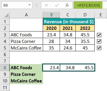
8: Press Enter. Since cell F3 is TRUE, as shown below, its details are displayed from B8 to D8.
9: Now, copy-paste the following formulas:
- In B9: =IF(F4,B4:D4)
- In B10: =IF(F5,B5:D5)
Press Enter.
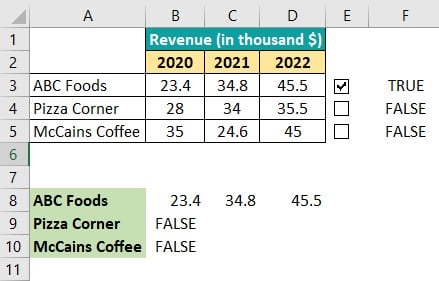
10: As observed above, cells F4 and F5 are unchecked; hence their values are not displayed in table A8 – D10. Check the boxes in E4 and E5 and observe the table.
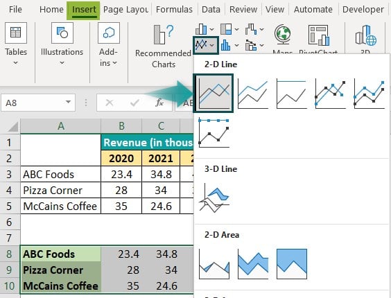
11: Let us plot a graph by selecting the table A8 to D10.
Go to Insert – Insert Line or Area Chart – Line Chart.
12: You get a line graph for the table.
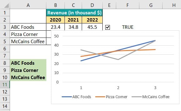
13: This is an example of an interactive chart. If we uncheck one of the boxes, for instance, E4, you only get the graphs for ABC Foods and McCains Coffee.
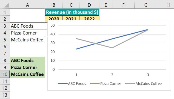
Thus, such a chart is visually appealing and provides only the necessary data. Imagine if this table had the revenues of hundreds of companies! In such cases, using the interactive chart in Excel helps you choose the required details and plot only their graph.
Example #2
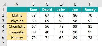
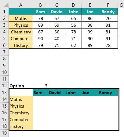
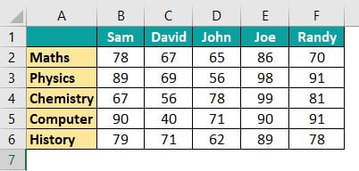
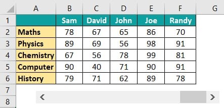
Below is a table containing the marks of five students in 5 subjects. We can use a line graph to understand the students’ performance in different subjects and make interactive chart in Excel.
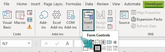
1: Let us use radio buttons to select the subject. Go to the following location:
- Developer tab – Insert – Radio Button.

2: You get one radio button. Copy-paste it five times. You can rename and resize each button by clicking on it. Arrange them as shown.
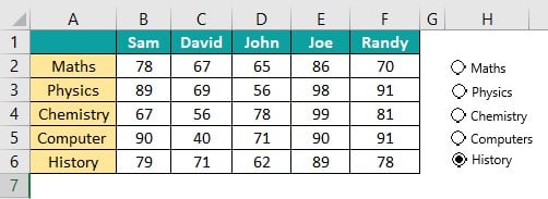
3: Right-Click on each button and select “Format Control.” In the pop-up window, select the option “Checked” and choose the cell where the option number is displayed.
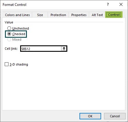
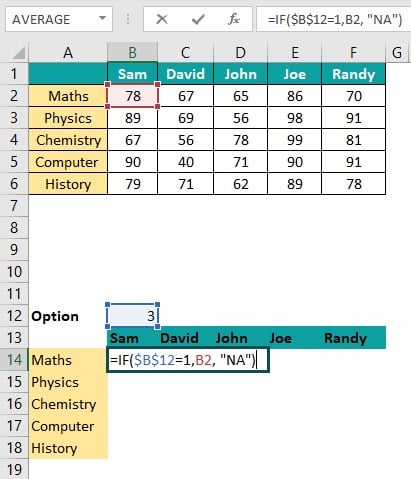
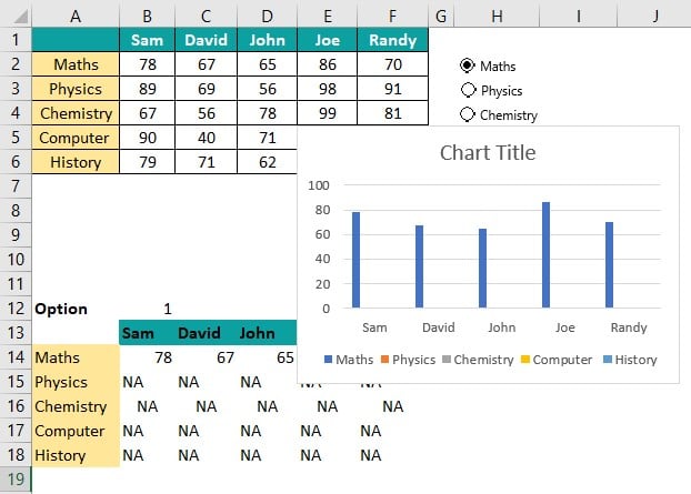
$B$12 cell specified above indicates which radio button is selected.
4: Now, copy-paste the headings again below in cells A13-F18.
5: Enter the following formula in cells B14 to B18.
- =IF($B$12=1,B2, “NA”)
- =IF($B$12=2,B3, “NA”)
- =IF($B$12=3,B4, “NA”)
- =IF($B$12=4,B5, “NA”)
- =IF($B$12=5,B6, “NA”)
Here, we check the option clicked, that is, the number of the radio button clicked. Accordingly, the data is fetched from the corresponding cell in the upper table. Else, NA is printed.
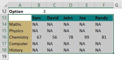
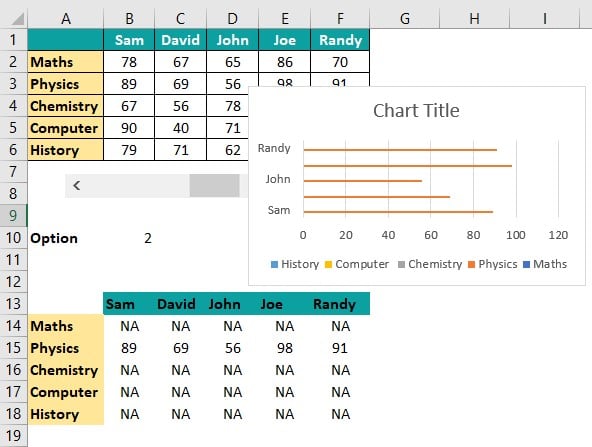
6: Now, drag each formula across the corresponding row. For instance, drag B14 to F14, B15 to F15, and so on. The table is populated as shown below.
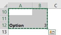
Select the table data which is displayed. Here, we get NA for the rest of the rows except Chemistry since we have selected Option 3 in the radio button, Chemistry.
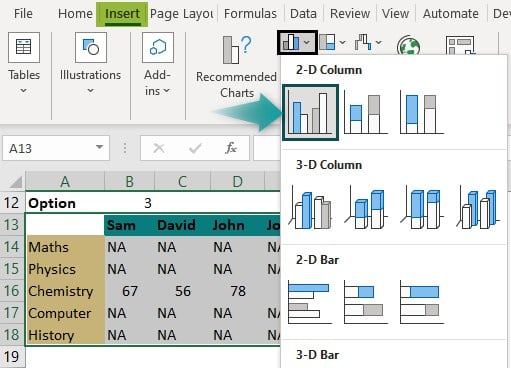
7: Go to the Insert tab and choose “Insert Column or Bar Chart” in Excel. Choose the Clustered Column chart.
8: You get a line chart in excel as shown. Since only the Chemistry column has data, we get a graph.

9: Change the radio button option to Maths.
Thus, you get a chart that is easy to create. Note that you should enter the right format controls for the interactive objects; else you will encounter the interactive flowchart in Excel not working.
Example #3
For the above example, we can create a scroll bar instead of a radio button. The table of data is shown below.
1: Let us use radio buttons to select the subject. Go to the following location:
Developer tab – Insert – Radio Button.
Step 2: Paste this button on the worksheet.
3: Right-click on the scroll bar and choose “Format Control.” In the pop-up window, enter the minimum value as zero and the maximum value as five because there are five subjects.
The incremental change is one because when we click the forward button, the value should change by one. Also, here we give the cell link as B10.

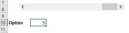
4: Press OK. Now, if you observe the position of the small bar in the scroll bar, it is at the end, so the option is displayed as 5 in B10.
5: Enter the following formula in cells B14 to B18.
- =IF($B$10=1,B2, “NA”)
- =IF($B$10=2,B3, “NA”)
- =IF($B$10=3,B4, “NA”)
- =IF($B$10=4,B5, “NA”)
- =IF($B$10=5,B6, “NA”)
6: Press Enter. Drag the formulas in the respective cells horizontally up to column F. That is, drag the Autofill handle from B18 to F18, B19 to F19, B20 to F20, and so on. The table is populated as shown below. Since the option is one, the first row is populated.

7: Now, you can plot any graph of your choice. Select the table in A13 to F18 and choose a chart from the Charts group in the Insert tab.
Here, we choose the bar graph.
8: Move the scroll bar and check the graph for options.

Thus, you can create different options like a scroll bar or radio buttons to create an interactive chart in Excel.
Important Things to Note
- Interactive charts may hide necessary information from users.
- An interactive chart in Excel should only include relevant data necessary for your user.
- They are complex to produce compared to static charts.
Frequently Asked Questions (FAQs)
To create an interactive chart in Excel with a drop-down list, go to the Data Validation from the Data tab and click on the icon.
• The Data Validation window pops up. Go to Validation criteria, and select the option, List.
• Under Source, highlight the choices for your dropdown list by choosing the cell range.
• Press OK. You get a drop-down list that influences the interactive chart in Excel.
An interactive chart in Excel has many interactive features, such as a scroll bar, an input box, a dropdown box, and buttons or tabs. We need interactive charts where the most critical information for the user cannot be chosen by them and displayed.
• We use this chart where we need the users to select information to display the appropriate chart based on their choice.
• There are complex data that cannot be displayed in a static chart.
• Design the interactive chart to help the user get their required information e.g. a COVID chart, where users need COVID-related information based on their locality.
Use this Interactive Chart in Excel Template to follow along with the examples in this article.
Download Excel Template