
What Is KPI Dashboard In Excel?
KPI dashboards are one-page information that will show the performance of the business in the pre-defined KPI standards. The KPI dashboard in Excel usually contains visuals with slicers to play around with the data. KPIs are different from industry to industry.
Let us learn how to build KPI dashboard in excel with a few examples.
- If we are preparing a ‘Safety Dashboard’, it will talk about the incidents over a period and the losses from those incidents.
- If we are preparing a ‘Salesperson’s Performance Dashboard,’ KPIs like ROI, and efficiency of each salesperson are built.
- If we are an ad company, then ‘Website Visitors’ is the main KPI we need to track. Based on criterias such as ‘How many visitors visit every day?’ and ‘How many are clicking on ads?,’ we can measure the performance of our marketing and SEO team.
Use this KPI Dashboard In Excel Template to follow along with the examples in this article.
Download Excel TemplateKey Takeaways
- In simple terms, KPI dashboard in Excel helps the key stakeholders to track their business and compare it with standards. KPIs are different from one industry to another.
- It helps users take better decisions.
- Before creating the dashboard, making a list of all the required KPIs is important.
- Using conditional formatting is important to make the formatting of numbers dynamic.
- Maintaining lesser information in the dashboard worksheet makes the dashboard more readable and user-friendly.
KPI Dashboard In Excel Examples
Let us understand the method to use KPI Dashboard in excel with the following examples.
Example #1 – Tracking KPIs Of Salespersons’ Performance
Assume that we are working in a sales-driven organization and the sales team’s performance is the primary thing we look up to. The sales team drives the revenue, and the entire company depends on the sales team’s performance. Hence, it becomes vital to track each salesperson’s performance in an organization.
We will use the following data in Excel.

The above data shows the sales revenue based on what each salesperson generates in a calendar year from January to December.
To begin with, convert the above data into Excel Table format by pressing the shortcut keys Ctrl + T.
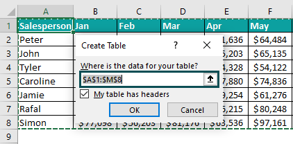
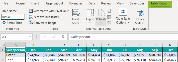
Next, give a name for the table as Actual.
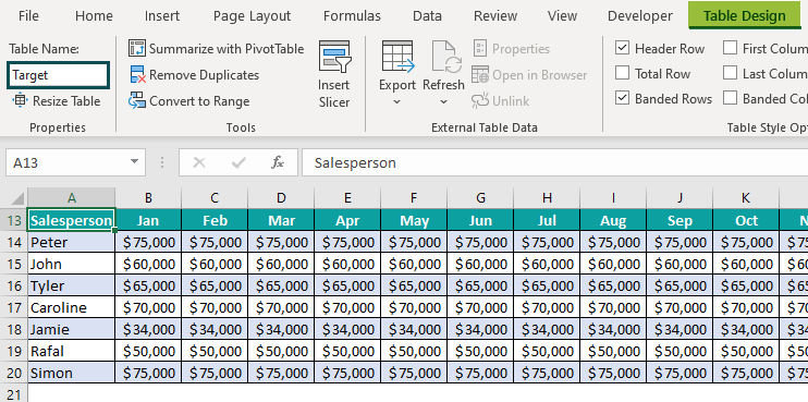
Now, we have the following target table listing each employee’s target across months.
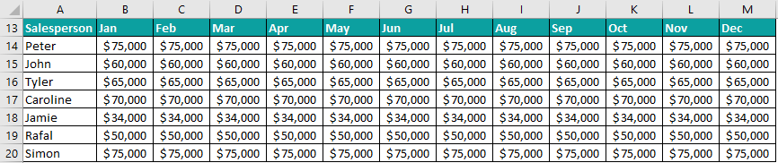
Similarly, convert the above table into Excel Table format and give a name for the table as Target.
Let us use these two tables to create KPI dashboard in excel.
Step 1: First, create a new worksheet and name it Performance Dashboard.
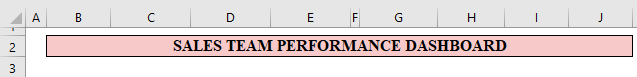
Step 2: Next, give a header for the worksheet as Sales Team Performance Dashboard.
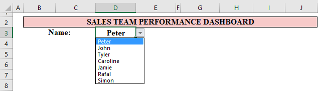
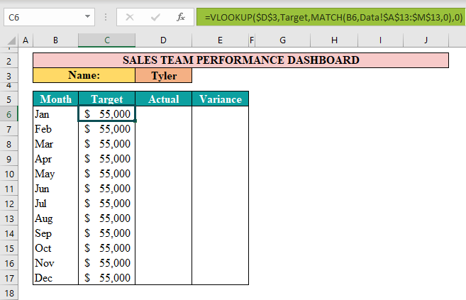
Step 3: In cell D3, create a drop-down list of employees from the data worksheet.
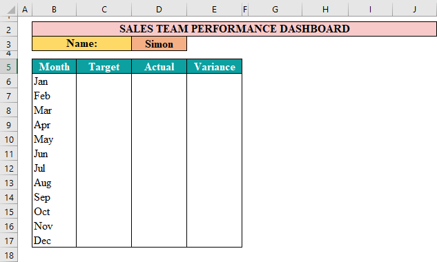
Step 4: Then, create a monthly table like the following.
Step 5: Users will select the required salesperson from the drop-down list cell D3; accordingly, we need to display the target and actual numbers for the selected employee.
For the Target column, retrieve the value from the Target table using the VLOOKUP function.
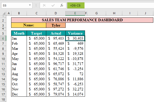
Step 6: Next, retrieve the actual numbers from the Actual table using the VLOOKUP function.

Step 7: Next, arrive at the variance using the Actual – Target formula.
Step 8: Now, create an Excel combo chart that shows the Actuals in the Bar chart and target in the line chart.
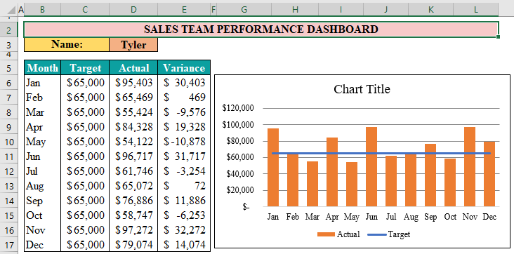
Step 9: Next, format the chart to look better. Apply the techniques of our own.

Step 10: Then, add totals for target, actual, and variance columns.

Step 11: Next, find the efficiency % at the top of the Excel dashboard.
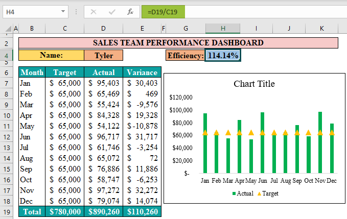
Efficiency is arrived at by dividing the target by actual.
Step 12: For the variance column, apply conditional formatting to show all the negative numbers in red.
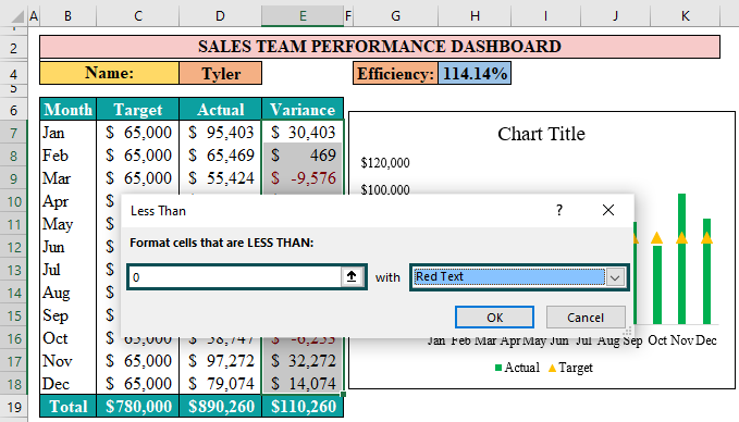
It will show the variance month values in red text.
Now users can select the employee they want to see from the drop-down cell D4, and accordingly, the formulas will display the value for the selected employee.
For instance, let us select the employee, Simon. The result will appear as shown in the following image.
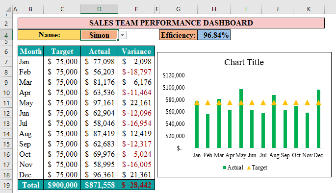
This employee’s overall efficiency level is 96.84%, i.e., he has not met the overall target in the year.
Example #2 – Product KPI Scorecard
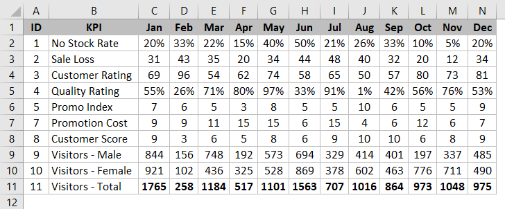
Let us look at the example of building a product scorecard KPI dashboard in Excel. Assume we have the following monthly information.
The steps to build KPI dashboard in Excel are as follows:
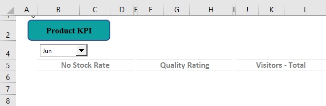
Step 1: To begin with, create a new worksheet and name it as Product KPI.
Step 2: Next, insert a combo box from the Developer tab.
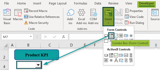
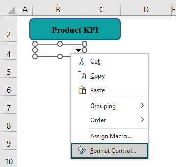
Step 3: Then, right-click on the combo box and click on Format Control.
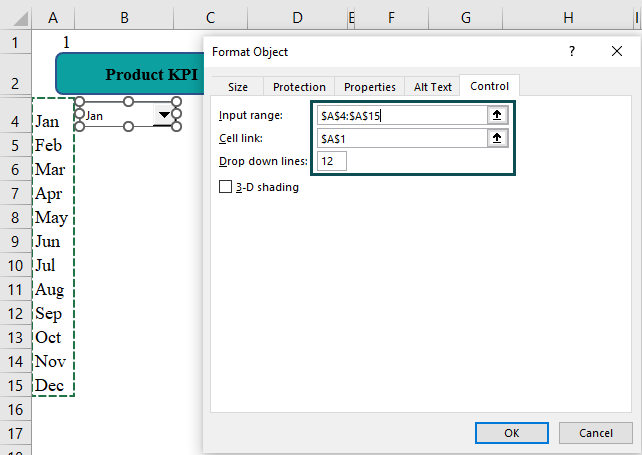
Step 4: Now, create a list of months in one of the columns.
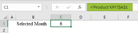
Next, for the Input Range, choose month cells, and cell A1 to cell link in the KPI worksheet.
When we select the value from the combo box, it will display which line item has been selected from the combo box.
For instance, look at the following image.
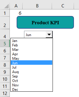
We have selected the month of June, and in lined cell A1 it displays the value as 6 because it is the 6th position data in the combo box list.
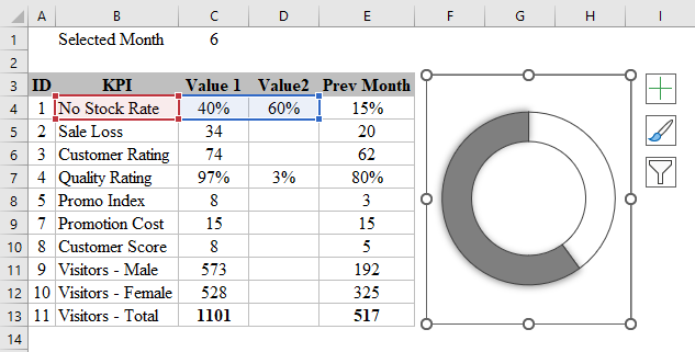
Step 5: Now, we need to create a calculation sheet to retrieve the values based on the month selected from the combo box.
First, we arrive at the selected month number from the combo box in the KPI worksheet, i.e., cell A1.
Next, we arrive at the calculations for the selected by using the VLOOKUP function.

Step 6: Next, we will create visuals to track KPIs in the KPI worksheet. The three important KPIs we will be tracking are as follows.
Step 7: Using Value 1 and Value 2 of No Stock Rate from the calculation sheet, create a donut chart as shown in the following image.
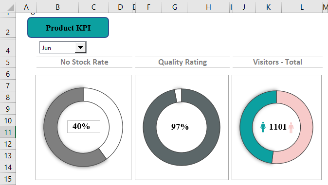
Step 8: Next, adjust this chart in the KPI worksheet.

Step 9: Then, insert a text box and give a link to get the value from the calculation sheet.

Step 10: Next, repeat the same for the other 2 KPIs as well.
Step 11: Next, we need to create comparison numbers for each KPI to show the selected month value, the overall 12 months value, and the previous month’s value.
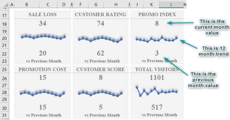
Now we have the full product KPIs ready.

Now, this KPI dashboard is dynamic, and when the users change the month from the combo box, the dashboard will fetch the data from the calculation worksheet.
Basic Steps To Follow While Creating A KPI Dashboard
- Gather Data: The first requirement of any dashboard is to gather the right kind of data. Find the granularity and note down the things we need to present.
- Choose the Right Chart: Choosing the right kind of chart to display our KPI is very important. So, always go for the less fancy visualization.
- Identify the Target Audience: We should know who the end users of the dashboard will be. If it is the C-level executives, then we need to show as little information as possible and convey every top-line story.
- Maintain Calculations in Separate Worksheet: We may need to do a lot of calculations to get the KPI calculations. Hence, it is advised to keep all the calculations in a separate worksheet and hide them at the end.
Important Things To Note
- KPI dashboard in Excel quickly identifies the problems in a business. Using less fancy charts and colors makes the dashboard look neat and clean.
- We should always create KPI dashboard in Excel in a new worksheet and hide all the unused spaces.
- The data should always be up to date and should be in Excel Table format. It will make the data dynamic.
- It is recommended to hide all the unnecessary worksheets like calculation and helper sheets from viewing.
- The combo box accepts only vertical data range to create a drop-down list.
- The KPI dashboard in excel may not work when there are errors in the calculation cells.
Frequently Asked Questions (FAQs)
To create a dynamic KPI dashboard in excel, we should
● Gather the right kind of kind and maintain them in Excel Table format.
● Identify the KPI indicators based on one’s industry.
● Use Form Control and Active X Control to make the chart dynamic.
● Use the right kind of visualizations.
● Allow the user to slice and dice the data.
The uses of the KPI dashboard in excel are as follows:
● It helps the key stakeholders to track their business and compare it with standards.
● Identify the differences and problems of the business quickly.
● Paves the way for better decision-making
● Measure the progress of the business against a set of goals.
● Differentiate between lagging KPI and well-performing KPI and find the possible causes.
If the KPI dashboard in excel is not working properly, we need to look at the following points.
● Make sure data is up to date.
● Make sure calculation cells are working fine without any errors.
Use this KPI Dashboard In Excel Template to follow along with the examples in this article.
Download Excel Template