What is Power BI Matrix Visual?
The Power BI Matrix Visual is like a tabular visualization and supports meaningful data display across multiple dimensions in a stepped layout. It automatically performs data aggregation. It provides powerful features for drill-down functionality, hierarchical grouping, summarizing, and the ability to display subtotals and totals for grouped data.
Users can create the Matrix visuals in the Power BI reports and cross-highlight elements within the matrix with other visuals on that report page. For example, you can select rows, columns, and even individual cells and cross-highlight. You can also copy individual cells and multiple cell selections and paste them into other applications.
Table of contents
Key Takeaways
- The Power BI Matrix Visual allows you to present data in a multi-dimension format in a stepped layout that supports grouping, aggregation, and drill-down capabilities.
- Use the Rows and Columns sections to define the structure of the matrix, and the Values section to display relevant data.
- Enable drill-down functionality by adding fields to the Drill section, allowing users to explore hierarchical data levels. The Power BI Matrix visual supports both row and column level drill down.
- The Power BI Matrix Visual also allows you to apply the Power BI Matrix conditional formatting and Power BI multiple columns for data analysis and visualization.
📊 Unlock Advanced DAX Skills in Power BI!
Take your Power BI skills to the next level with our Advanced DAX in Power BI Training Course. Dive deep into advanced DAX functions, complex calculations, and optimization techniques to enhance your data analysis and reporting capabilities.
How to Create Matrix Visual in Power BI?
To create a Power BI Matrix visual, you can follow these steps:
Step 1: Open Power BI Desktop and import the dataset on which you want to create a Matrix visual, using the data connection to create a new report.
Step 2:
- Select the Matrix visual type.
- Add it to your report canvas.

Step 3: Drag and drop the relevant data fields into the visual’s Rows, Columns, and Values sections to define the row and column headers. Under the Values section, you can specify the numeric or aggregated values to display within the matrix.
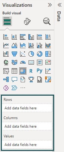
Step 4: Use the formatting options in the Visualizations pane to customize the appearance of the matrix, such as font size, cell formatting, and subtotal visibility.
The Power BI Matrix visual supports the Power BI matrix multiple columns allowing you to organize and compare data across multiple dimensions. It also supports automatically adjusting the Power BI matrix column width based on the content. However, you can manually adjust the Power BI Matrix column width to display the content in the Matrix visual.
The Power BI Matrix visual allows you to perform the Power BI Matrix conditional formatting. It enables you to highlight data based on specific conditions. Power BI Matrix conditional formatting can draw attention to essential values, visualize trends, or compare data across different dimensions.
How To Add Drill Down to Matrix Visual?
Drill-down functionality allows users to explore hierarchical data levels within the Matrix visual. To add the drill-down capability to a Matrix visual in Power BI, follow these steps:
Step 1: Import the dataset into Power BI to create a new report or open an existing Power BI report.
Step 2: Navigate to the Visualization pane and select the Matrix visual. It will create a blank Matrix visual in the report canvas.
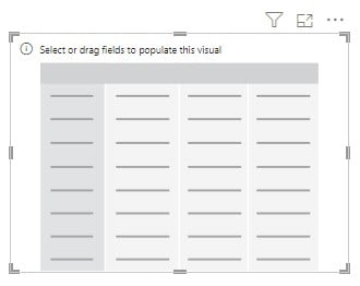
Step 3: Drag and drop the appropriate data fields to the Rows, Columns, and Values section to create a matrix. Ensure that the data is in a hierarchical structure.

Once you add the data fields to the properties of the Matrix visual, you will see the Matrix visual in the report canvas section.
Step 4: Now select the Matrix visual and right-click on the data point you want to drill down in Power BI.
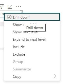
You can also hover your mouse over the Power BI Matrix visual. The Matrix visual will now display a small arrow icon next to the field headers that support drill-down.
Users can click the arrow icon to expand or collapse the corresponding hierarchical level, revealing or hiding additional details.
In the subsequent section, we will see how to create the Power BI Matrix visuals along with drill down and conditional formatting features with the help of examples.
Examples
We will go through a few examples to apply in the Power BI Matrix tabular format and the Power BI Matrix conditional formatting.
Example #1
In this example, we will create a Power BI Matrix visual in a Power BI Matrix tabular format using the Supermarket_sales data. To create the Matrix, follow these steps:
Step 1: Import the Supermarket_sales Dataset into the Power BI using the data connection.

Step 2: Navigate to the Visualization pane and select the Matrix visual.

This will create a blank Power BI Matrix visual in the report canvas.
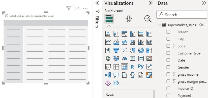
Step 3: In the Visualization pane, add data fields to Rows, Columns, and Values section by selecting the appropriate fields from the Fields pane.
Here we have added the Power BI Matrix multiple columns to perform drill down.
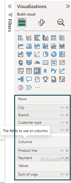
Note that the Rows section has multiple fields that create a grouping in rows and enables drill-down options visible in the upper top corner of the Matrix visual.
It will create a Power BI Matrix tabular format, as shown below.
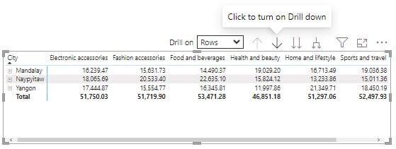
Step 4: Select or hover the mouse on the visual. The Power BI will display all the drill options, including drill-down (downward arrow) and drill the next level in the hierarchy (double downwards arrows) icons.
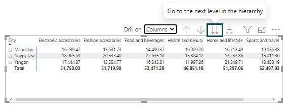
Step 5: Select the row header and click on Click to turn on Drill down icon.

It will set the drill mode on. You can drill down by choosing a data point.

You can perform the same by selecting any row headers, right-clicking on the row headers, and drilling down by choosing from the menu that appears.
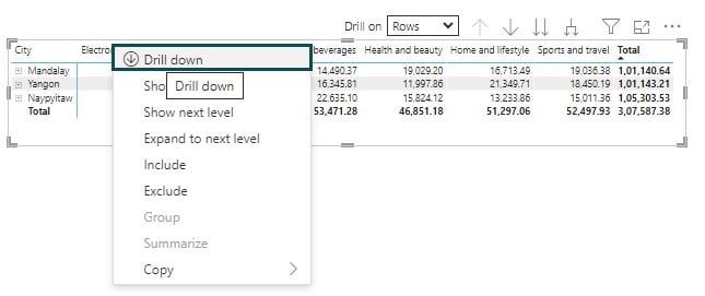
Step 6: Click on drill down next level icon to perform drill down one level down.

As you can see, the aggregation has changed from the City to the Branch level.

Step 7: Click on the drill down next level icon (double downward arrows) again to perform drill down one more level down.
Now the level of aggregation has again changed from Branch to the Customer type level.
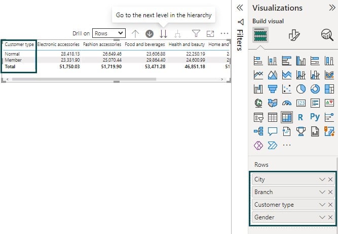
Step 8: Click the Drill up (upward arrow) icon until you return to the top-level view. Once you have returned to the top-level view, choose Drill on Columns and click on the next level icon.

It will enable the Power BI Matrix visual drill down to the column level to display aggregated datasets at the Payments column level.
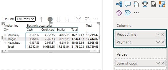
Note that you can also adjust the Power BI Matrix column width by choosing the Auto-size width formatting option or do it manually.

Example #2
In this example, we will apply the Power BI Matrix conditional formatting to a Power BI Matrix visual using the Superstore_sales dataset. To apply the Power BI Matrix conditional formatting, follow the steps highlighted below:
Step 1: Import the Power BI Gantt chart dataset into Power BI using the data connection.
Step 2: Navigate to the Visualization pane, select the Matrix visual and drag and drop the fields into Rows, Columns and Values section to create a Matrix visual.

Step 3: Navigate to the Conditional formatting option in the Visualization pane and select the Data bars excel option.
Here we have applied conditional formatting on the Gross income.
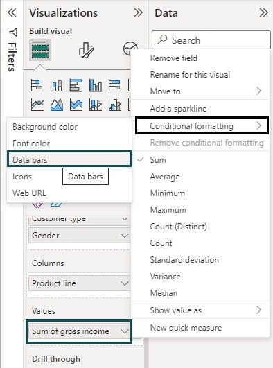
Step 4: Specify the format style, the field on which the formatting is to be applied and the background colors to be applied.
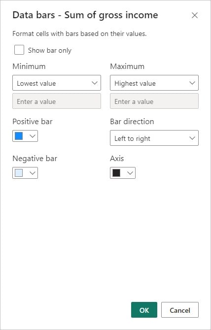
Once you have provided the details, click on OK. It will apply the Power BI Matrix conditional formatting to the Matrix visual.

Important Things to Note
- Ensure your data has appropriate hierarchical relationships to utilize the effective Power BI Matrix visual’s grouping and drill-down features.
- Use appropriate aggregation functions if you include numeric or aggregated values in the Power BI Matrix visual. Choose the appropriate aggregation function (e.g., sum, count, average) to represent the data accurately.
- Depending on the complexity of your data and the number of fields used in the Matrix visual, it is recommended to have a balanced visual clutter for readability and ease of analysis.
- If there is any text data containing new line characters available in the Power BI Matrix cells or headers, then they will be ignored. It is recommended to toggle on the Text wrap option in the Format pane in the Visualization pane.
- Avoid using too many row headers in your Matrix visual, if possible. Too many row headers will hide the body cells, and scrolling will not be effective in your matrix visual. Instead, consider reducing the row headers on your visual, adjusting the Power BI Matrix column width, and formatting the font size to ensure the matrix body cells are visible properly.

Frequently Asked Questions (FAQs)
To remove the total from a matrix in Power BI, follow these steps:
• Select the Power BI Matrix visual in your report.
Navigate to the Visual section under Format your visual tab in the Visualization pane, i.e., Visualization – Format your visual – Visual
• In the Format pane, Turn off the Column subtotals slider and Row subtotals slider.
• The total values for both Rows and Columns will be removed.
There is no option to hide a column in Power BI Matrix visual. You can create a custom Power BI Matrix layout or use the Auto-size width formatting option in the Visualization pane under the Visual tab in Column headers section as a workaround.
You can use the following steps:
• Select the Power BI matrix visual in your report that can be sorted. You will see the drill and expand icons along with the Filter and More options (…) in the upper top corner of the visual.
• Select More options (…) and choose the column you want to sort.
• Choose the Sort descending or Sort ascending option depending on how you want to sort the columns in the Power BI Matrix visual.
• The Power BI matrix visual will be sorted based on the selected column
The main difference between a matrix and a table in Power BI is as follows:
• Table:
• A table visual in Power BI represents data in 2-Dimensional format.
• It supports flat data where data is displayed in rows and columns, including duplicate values with no implicit aggregation or hierarchical grouping.
• Tables are useful for displaying detailed, individual records.
• Matrix:
• A Power BI matrix visual represents data in multiple dimensions format.
• It supports a stepped layout where data is displayed in rows and columns, but it allows for hierarchical grouping, aggregation, and drill down functionality.
• It provides subtotals and totals for grouped data, making it suitable for summarizing and analyzing data across multiple dimensions.
Recommended Articles
This has been a guide to Power BI Matrix Visual. Here we learn to create and use matrix visual in power BI with examples. You can learn more from the following articles –

Leave a Reply