What is the Tableau Bullet Graph?
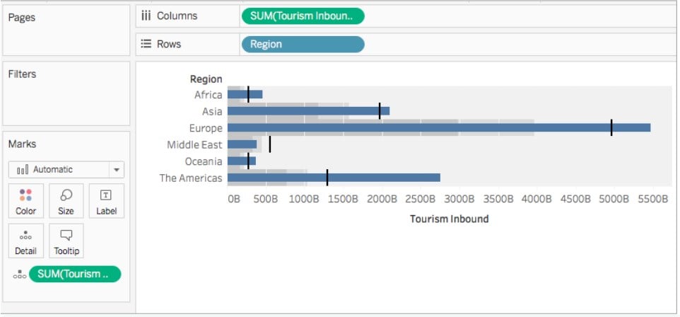
Tableau Bullet graph is a visualization tool that is a bar chart marked with additional marks displaying the progress towards a goal. This graph is a variation of a bar graph that replaces the earlier visualization comprising Tableau dashboard gauges and meters. Tableau bullet graph contains different bars similar to a bar chart, with each bar focusing on a specific measure. It helps the user to include additional information while focusing on a specific measure.
Tableau bullet graph combines different charts such as bar charts, reference lines, and text annotations for data representation in the view. It makes it quite a helpful chart to display actual measures along with reference lines such as target values. For example, you may create a bullet chart to display actual sales and include target sales in the same view.
A typical Tableau Bullet Graph looks like the one highlighted below.

Table of contents
Key Takeaways
- Tableau Bullet graph is a bar chart marked with additional marks displaying the progress towards a goal and helps the user to include additional information in the view while focusing on a specific measure.
- Tableau bullet graph combines different charts such as bar charts, reference lines, and text annotations for data representation in the view, making it quite a helpful chart to display actual measures along with reference lines such as target values.
- You can create a Tableau Bullet chart by using the in-built bullet graph icon under the Show Me toolbar.
- Tableau provides the option to customize the appearance of a bullet graph and add interactivity to the bullet graph.
How to Create a Bullet Graph in Tableau?
To create a bullet graph in Tableau, follow the steps below:
Step 1: Connect your dataset to the Tableau interface.

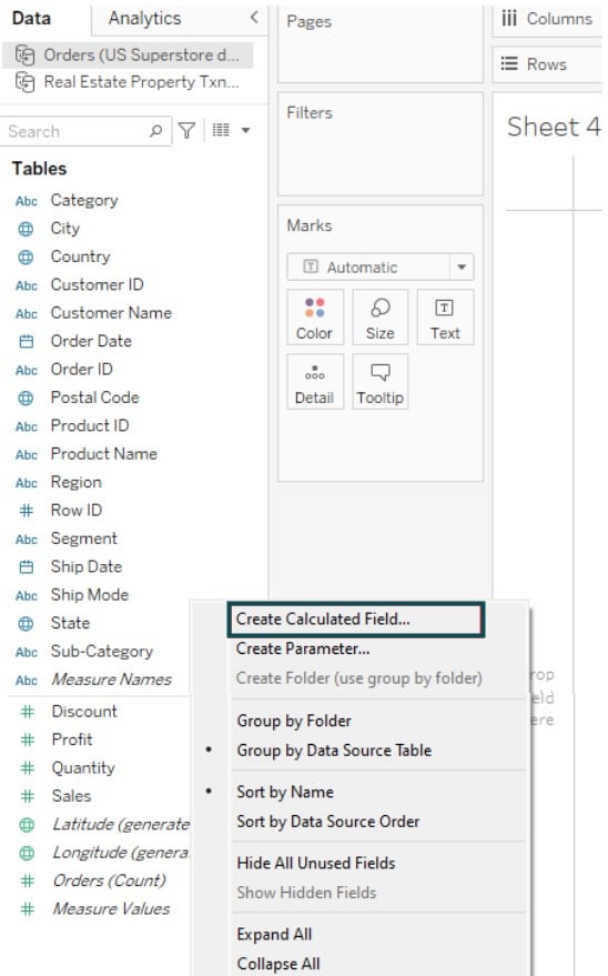
Step 2: In the new worksheet, right-click on the Data pane and select Create Calculated Fields…

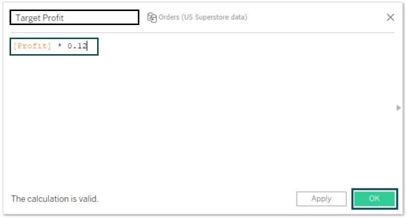
Step 3: Provide a meaningful name to the calculated field. Specify the logic for the calculated field in the window. Click on OK.

Step 4: Control Click on the measures i.e. Profit and Target Profit fields on the Data pane. Under the Show Me toolbar, select the bullet graphs icon.

Tableau will create the graph as shown below.

Step 5: Drag the Region to the Label.

Step 6: Right-click on the x-axis and select the Swap Reference Line Fields.

It will create a Tableau bullet chart in the view. You can see the reference lines in the view that implicate the target values.

Note: The Tableau bullet graph with three measures is not natively supported in Tableau as it requires two measures. However, you can use a workaround on the same to create a Tableau bullet graph with three measures.
Tableau bullet graph change color can be achieved by applying conditional formatting or specifying the configuration on the Reference lines and bands. Use the color palette available in the Color of the Marks card to customize the color coding or appearance of the graph as per your requirements. You may also use custom color coding for your bullet graph as well.
You can also perform Tableau bullet graph swap measures either through the Swap Reference Line Fields option or manually assigning the measures.
When you select a reference line or band, Tableau will create a shading to the view. You can Tableau bullet graph remove shading by using the Edit Reference Line option. In the Edit Reference Line, or Band screen, select the ones you want to remove the shading.
Examples
In this section, we will go through different examples demonstrating the Tableau bullet graphs.
Example #1 – Show YOY Comparison
In this example, we will demo creating a Tableau Bullet graph showing YOY comparison using the Regionwise Sales dataset. The Regionwise Sales is a sample dataset containing current sales, previous year sales, and target sales across different regions.
To create a Tableau bullet graph showing YOY comparison, you may follow the instructions outlined below:
Step 1: Connect with Regionwise Sales to Tableau using the file navigator. The data post successful import can be viewed in the Data Source tab.

Step 2: Drag Region to the Rows shelf and Current Sales to the Columns shelf.

Step 3: Expand the visualization and drag Previous Year Sales and Target Sales to the Detail in the Marks Card.

Step 4: Right-click on the x-axis (Current Sales). Then, select Add Reference Line.

Step 5: On the Add Reference Line, Band, or Box screen, choose Line.

Additionally, choose the below configurations
- Scope – Per Cell
- Value – SUM(Target Sales), Sum
- Label – None
- Specify the line formatting options

You may also choose customized colors by clicking on More colors…
Tableau will refresh the view as per the specified configuration shown below.

Step 6: Drag the Target Sales field from the Marks card to the Columns shelf. Tableau will create 2 different charts as shown below.

Step 7: Click on the down arrow next to the Previous Sales in the Column shelf and choose Dual Axis from the context menu.

Tableau will amend the view as shown below.

Step 8: Expand the All Marks card and choose Bar from the Marks Type dropdown.

Step 9: Right-click on the Previous Year Sales axis. Choose Synchronize Axis.

Step 10: Right-click on the Previous Year Sales axis. Now, deselect Show Header.

Now you can see that Tableau has removed the upper header from the view, as shown below.

Step 11: Rearrange the fields in the Columns shelf. Then, bring the Previous Year Sales before the Current Sales.

Step 12: Click on the Size in the Marks card by expanding the SUM(Previous Year Sales) card. Then, adjust the size to fit your visual requirements.

Step 13: Right-click on the current sales axis, choose Edit Axis, and remove the headers and marks.

Step 14: Similarly, adjust the Previous Year Sales axis by right-clicking the axis. Then, select Edit Axis option.

Step 15: Rename the axis title to a meaningful name.

Tableau will apply the changes to the view and now, your view is now ready for visualization.

You can view the current year sales and previous year sales along with the target sales in a single view for YoY comparison.
Example #2
In this example, we will create a Tableau bullet graph using the BMW Sales dataset. The BMW Sales dataset contains the actual sales of BMW cars across different regions for 12 months against the defined targets for each of those regions and months.
To create a Tableau bullet chart, follow the below steps:
Step 1: Connect to the BMW Sales dataset into Tableau using File – Open functionality. Once the dataset is loaded into Tableau, you can view it in the Data Source tab.

Step 2: In a new worksheet, drag the Units Sold (Actual) and Units Sold (Target) Columns shelf and Region (Dimension) to the Rows shelf.
Tableau will create 2 different bar charts in the view as shown below.

Step 3: Click on the Show Me toolbar on the right corner of the Tableau view.

Tableau will create a bullet chart in the view as shown below.

Step 4: Right-click on the x-axis and select Swap Reference Line Fields from the context menu.

Tableau will update the chart in the view.

Step 5: Drag the Units Sold (Target) field to the Detail.

Step 6: Right-click on the x-axis. Select Add Reference Line from the context menu.

Step 7: On the Add Reference Line, Band, or Box screen, add the below choices
Select Line option
- Scope – Per Cell
- Value – SUM(Units Sold (Target)), Total
- Label – None
Click on the Line dropdown and make your choice.

You can also Tableau bullet graph change color from the available options under Line (Formatting).
Tableau will create a bullet graph view as shown below.

Example #3
In this example, we will demo creating another Tableau bullet graph using the Levis Sales dataset. The Levis Sales dataset contains the different retailers’ details along with the region, state, city, products, sales, profit, and sales method information across different outlets.
To create a Tableau bullet graph, follow the steps outlined below:
Step 1: Connect to the Levis Sales dataset and import it into Tableau. The imported dataset will be visible in the Data Source tab.

Step 2: Drag the Region to the Rows shelf. Control-click on Operating Profit and Total Sales from the Data pane. On the right corner toolbar, under Show Me, click on the Bullet Graph icon.

Tableau will create a bullet graph in the view.
Step 3: On the x-axis, right-click and select Swap Reference Line Fields.

The updated Tableau bullet chart will be visible in the view.

Step 4: Right-click on the x-axis and select Edit Reference Line – 60-70% of Average Operating Profit from the context menu.

Step 5: Amend any configuration on the Edit Reference Line, Band, or Box screen.

Now, the Tableau bullet chart is ready for analysis and visualization.

Important Things to Note
- Bullet graphs may not be the best fit for showing multiple measures or displaying patterns over time.
- Always apply color coding and customized formatting options, including reference lines and shapes for the qualitative range.
- The use of labels, tooltips, and details, where possible, can provide meaningful information to the users.
Frequently Asked Questions (FAQs)
Yes, you can customize the appearance of a bullet graph in Tableau. These include:
Color coding of different bars comprising the bullet graph
Adjusting the size of the bars in the bullet graph
Adding labels to the graph and customizing Title and other details
Adding different formatting options such as reference lines and other analytical information
To add interactivity to a bullet graph in Tableau, you may use parameters, filters, or even actions. These include:
Use parameters to dynamically change the values and generate the bullet graph as per the changed values.
Use filters to restrict the dataset and perform calculations or visualizations over the reduced data
You can add actions to the dashboards or Tableau worksheets to add interactivity
Yes, there are certainly a few best practices you can follow for designing effective bullet graphs in Tableau. These include:
It is recommended to use reference lines, appropriate labels, and sizes to represent accurate context to the view.
Always follow proper color coding to represent the bars in the Tableau bullet charts.
To the extent possible, use a single measure for better clarity.
Avoid cluttering the graph with lots of information. Use only the necessary information for your view.
• Using a consistent scale can be useful for comparison of the measures.
Benefits of using bullet graphs in Tableau:
Bullet graphs can be a very efficient tool for concisely disseminating useful information.
You can customize the graph to include different metrics and choices to view.
These graphs work best when you need to represent a performance comparison against a goal and reference point.
Key limitations of using bullet graphs in Tableau:
Bullet graphs can be tricky to read with multiple measures and may not fit the best for representing the comparison.
Bullet graphs offer limited options to customize the graph.
You need to understand the definition and interpretation of bullet graphs to draw a meaningful insight out of the graph.
Recommended Articles
This has been a guide to What Is Tableau Bullet Graph. We explain how to create a bullet chart in Tableau with examples & points to remember. You can learn more from the following articles –

Leave a Reply