What Is Tornado Chart In Excel?
The Tornado Chart in Excel is an advanced version of the Bar Chart used to compare different data types or categories. It shows data in horizontal order and pictorially resembles a Tornado.
Excel doesn’t have an inbuilt Tornado Chart. However, we can use the Bar Charts and modify them to generate a Tornado Chart.
📥Download the ready-to-use Excel template to practice this tutorial yourself.
Tornado-Chart-in-ExcelFor example, the two variables have different values shown in columns B & C. We have to form the Excel Tornado Chart using the given data, as shown in the following image.
Select the table data to create a Tornado Chart. Choose the required chart from the “Insert Column or Bar Chart” option.

The Tornado Chart is formed, as shown below.

The chart pictorially resembles a Tornado, hence the name.
Table of contents
Key Takeaways
- The Tornado Chart in Excel helps us graphically represent data and display the comparison as a Tornado, Butterfly, or Funnel.
- The Conditional Formatting and the REPT function create an in-cell Excel Tornado Chart.
- Independent variables cannot be used in forming a Tornado Chart, also, two variables are mandatory to show the comparison. However, if we have multiple variables, we can also format or delete variables to display only the required data.
- The chart dynamically updates with any changes or modifications in the data values.
How To Make Tornado Chart In Excel?
Since Excel doesn’t have an inbuilt Tornado Chart type, we use the Bar Charts and modify them accordingly using the “Format Data Series” to generate the Excel Tornado Chart.
Basic Example – Comparison of Two Variables
For example, the image below shows the Department, the allotted budget, and the actual budget. We will make the Tornado Chart comparing the two variables from the given data.
In the table, the data is,
- Column A shows the Department.
- Column B contains the Budget.
- Column C contains the Actual Budget.

The steps to generate the Tornado Chart are as follows:
1: Choose the table data, A1:C6 – select the “Insert” tab – go to the “Charts” group – click the “Insert Column or Bar Chart” option drop-down, as shown below.

2: Select the “Stacked Bar” chart type from the “2-D Bar” category, as shown below.

The following chart is generated, as shown below.

3: To convert the chart into Tornado Chart, right-click on the first variable of the chart, i.e., the blue colour, and click the “Format Data Series” option, as shown below.

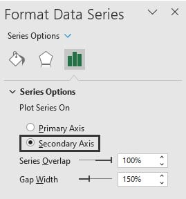
4: In the “Format Data Series” pane that opens on the right, select the “Secondary Axis” option from the “Plot Series On” from the list, as shown below.
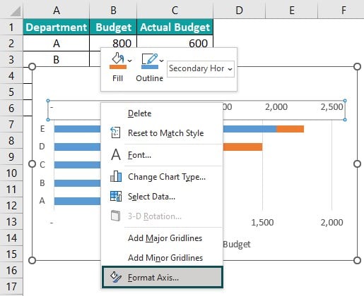
5: Right-click on the numbers on top of the graph, and select the “Format Axis…” option from the list, as shown below.
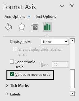
6: In the “Format Axis” pane that opens on the right, set the Bounds of the “Axis Options”, “Minimum” as -2500, and “Maximum” as 2500.

7: Check/Tick the “Values in reverse order” option checkbox.
8: Choose the “Primary Axis” option from the “Plot Series On” from the list.

Finally, the Tornado Chart is generated, as shown in the image below.

Examples
We will consider some scenarios to form a Tornado Chart.
Example #1 – Excel Tornado Chart (Butterfly Chart)
The Butterfly Chart of the Tornado Chart, also known as the Divergent Chart, is a type of bar chart that compares two values gap data points.
The Chart formed using data as two horizontal bars looks like the butterfly wings, which is called Butterfly Chart.
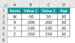
For example, the image below shows the two sets of values. And we will create the Tornado Chart (Butterfly Chart) comparing the two variablesfrom the given data.
In the table, the data is,
- Column A shows the Item.
- Column B contains Value 1.
- Column C contains Value 2.
- Column D contains the Gap.
The steps to form the Tornado Chart are as follows:
1: Choose the table data, A1:D5 – select the “Insert” tab – go to the “Charts” group – click the “Insert Column or Bar Chart” option drop-down, as shown below.

2: Select the “Stacked Bar” chart type from the “2-D Bar” category, as shown below.

3: Select the Gap section on the chart, right-click on it, and click the “Select Data…” option from the list, as shown below.
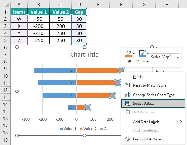
4: The “Select Data Source” window opens.
Now, to place the “Gap” section in the middle of two values, select the “Gap” option, click the “Move Up” button, and click “OK” to implement, as shown in the below image.

Now, the chart will be as shown below after the changes.
We can see that the Gap series has moved from the right end to the middle, as per the allocation.
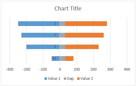
5: Select the “Gap” section on the chart, right-click on it, and select the “Format Data Series” option from the list, as shown below.

6: The “Format Data Series” pane opens on the right.
Choose the “No Fill” button in the “Fill” list, and the “No Line” button in the “Border” list.
We can see in the image that the Gap section from the graph has disappeared, as shown below.

7: Select the Gap on the chart, right-click on it, and select the “Delete” option from the list to delete the Gap section from the scale.

Finally, the Butterfly Chart is created, as shown below.

Example #2 – Sensitivity Analysis
The Sensitivity Analysis reflects the variation in the input values that will form an impact on an output value.
The Tornado Chart of Sensitivity Analysis is formed to analyze the comparison between data values, one variable with a negative value and another with a positive value.
For example, the image below shows the two sets of values. We will make the Tornado Chart of Sensitivity Analysis comparing the two variablesfrom the given data.
In the table, the data is,
- Column A shows the Item.
- Column B contains Value 1.
- Column C contains Value 2.

The steps to demonstrate the Tornado Chart in Excel are as follows:
1: Choose the table data, A1:C7 – select the “Insert” tab – go to the “Charts” group – click the “Insert Column or Bar Chart” option drop-down, as shown below.
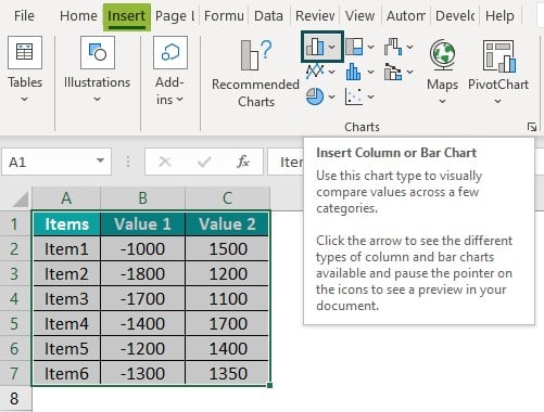
2: Select the “Stacked Bar” chart type from the “2-D Bar” category, as shown below.

The Sensitivity Analysis Chart is formed, portraying the comparison between the negative and positive values, as shown in the image below.

Important Things To Note
- The Tornado Chart is a modified type of Bar Chart in Excel.
- The data is set in decreasing order, which means the longest graph is on the top.
- The data is kept side-by-side in the graph horizontally to compare the values.
- The Tornado diagram is used for decision-making in comparison of two variables.

Frequently Asked Questions (FAQs)
• The Tornado Chart is used for analyzing the data and comparing the values.
• It is used in the Sensitivity Analysis of data, which is used to detect the behavior of the input and output values.
• The two variables of opposite directions represent a Tornado, known as a Tornado Chart, Butterfly chart, or Funnel Chart in Excel.
The Chart used for Tornado Chart is the Bar Chart, which represents the data horizontally. To build a Tornado Chart, the Stacked Bar Chart is used.
The Stacked Bar Chart is formatted in the following ways;
– Select the Chart that we want to format.
– Go to the “Insert” tab.
– Select the “Insert Column or Bar Chart” option from the “Charts” group.
– Click the down arrow button of the “Insert Column or Bar Chart” option.
– Select the formatting of an Excel Bar Chart you want from the drop-down list.
– The “Chart Design” tab is formed.
– Select the format of the Bar Chart from the “Chart Style” group.
The Bar Chart in Excel is the easiest type to form by selecting the parameters and values set for them. One value for each parameter should be assigned.
• The Tornado diagrams are used for sensitivity analysis that compares the relative importance of variables. The estimates are set for each value as input or output according to the low, base, and high outcomes.
• We use Tornado Chart to Identify the data patterns and trends.
• The points in the chart are grouped based on the values, which makes us identify outliers. The form of correlation estimation is based on a specified level. The Chart displays the relationship between two variables, the Tornado Chart in Excel is used in the season’s data analysis, and the experts reflect the correlation between the two variables. The correlation between variables can be positive or negative. The Chart is also used to Identify correlations and associations; the chart is used to uncover hidden correlational relationships of business data.
• The Tornado Diagram in Excel is easy to use and form. They used two kinds of variables: independent variables on the horizontal axis and dependent variables on the vertical axis.
Download Template
📥Download the ready-to-use Excel template to practice this tutorial yourself.
Tornado-Chart-in-ExcelRecommended Articles
This has been a guide to Tornado Chart In Excel. Here we compare data in the form of Tornado, Butterfly, Funnel Chart, examples & downloadable excel template. You can learn more from the following articles –

Leave a Reply