
What Is 100 Stacked Bar chart In Google Sheets?
The 100 Stacked Bar chart in Google Sheets, helps users to compare the categories in a dataset to 100% of its proportion, that appear horizontally stacked one after the other. Using this chart, we can compare data over multiple interrelated categories, such as sales figures and statistics that change over time.
Use this 100 Stacked Bar Chart In Google Sheets Template to follow along with the examples in this article.
Download Excel TemplateIn simple terms, Google Sheets 100 Stacked Bar chart is a type of Bar Chart where we compare different variables within a dataset, projected as a long horizontal bar as a whole and not w.r.t any numeric value, meaning, all the stacked bars will be of same length because the X-axis is set to a scale of 100. Hence, the name 100 Stacked Bar Chart. For example, the below table shows a firm’s region-wise quarterly sales and we will analyze the data visually using the 100 Stacked Bar chart.

Select cell range B2:E6 and enter the 100 Stacked Bar chart from the charts group.
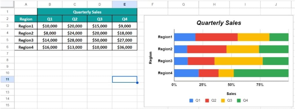
The 100 Stacked Bar chart generates as shown in the above image. We see four stacked horizontal bars for each quarter representing the sales in the four regions in a 100% scale.
Key Takeaways
- The 100 Stacked Bar chart in Google Sheets displays the data categories in a single dataset that is horizontally stacked, but the bar length is 100% as the X-axis scale is set to 100.
- Users can use this chart to assess data across interrelated categories and stats which change over the specified period.
- Ensure to use the chart for smaller datasets. As, the dataset keeps increasing, it gets confusing and makes it difficult to compare more than one data at a time. Therefore, it is not recommended for larger datasets.
- However, irrespective of the data, one advantage is that the bars do not spill out of the chart, as it is set to a 100% scale. Unlike the Bubble Chart, the Clustered Column Chart or the Bar chart for which we have to set the maximum and minimum range to prevent that from happening.
- We can format or customize the chart according to our requirements or highlight the columns in a presentable way, while generating reports.
How To Create 100 Stacked Bar Chart In Google Sheets?
We can create the 100 Stacked Bar Chart in Google Sheets as follows:
- First, organize the dataset in a way so that we know the X and the Y axes variables.
- Next, choose the entire dataset – select the “Insert” tab – choose the “Chart” option.

- A default chart, i.e., the “Column chart”, appears and the “Chart editor” window opens on the right-side.

- To select a different “Chart type”, select the “Setup” menu, click the “Chart type” drop-down and select the “100% stacked bar chart” from the “Bar” section, as shown below.

Finally, we will have the 100 Stacked Bar Chart. We can then customize it as per our requirements.
Examples
We will consider some examples using the 100% Stacked Bar chart in Google Sheets.
Example #1 – Sales Revenue Across Different Product Categories
We will plot a 100 Stacked Bar chart for the below table that shows the Sales Revenue Across Different Product Categories.

The steps to create a 100 Stacked Bar chart for the given data are,
Step 1: Choose the cell range A2:E5 – select the “Insert” tab – choose the “Chart” option and the “Chart editor” window opens on the right-side and select the “100% stacked bar chart”, as shown below.

The chart generates as shown below.

Step 2: Next, let us add titles to the chart and format them accordingly. Therefore, in the “Chart editor” under the “Customize” menu, select the “Chart & axis titles”, as shown below.

Step 3: Click the “Title type selector” drop-down and select each option to update the title as follows:

- First, select the “Chart title” option, type “Monthly Sales Revenue Of Products” in the “Title text” field, select “Bold” and “Center alignment” in the “Title format” field and color Black in the “Title text color” field, as shown below.

- Next, select the “Horizontal axis title” option, type “Sales” in the “Title text” field, select “Bold” and “Center alignment” in the “Title format” field and color Black in the “Title text color” field, as shown below.

- Finally, select the “Vertical axis title” option, type “Brands” in the “Title text” field, select “Bold” in the “Title format” field and color Black in the “Title text color” field, as shown below.

The final 100 Stacked Bar Chart is shown below. We can either stop here, or customize further by exploring the options available in the “Customize” menu in the “Chart editor”.

Here, the bars represent the sales, where, the blue part represents the data of Apple, the red part is One-Plus’s data and the yellow part is Samsung’s data.
Example #2 – Customer Satisfaction Ratings Across Retail Stores
The below table shows the Customer Satisfaction Ratings Across 10 Retail Stores. We will create a 100 Stacked Bar Chart in Google Sheets.

The steps to create a 100 Stacked Bar chart for the given data are,
Step 1: Choose the cell range A2:D11 – select the “Insert” tab – choose the “Chart” option and the “Chart editor” window opens on the right-side and select the “100% stacked bar chart”, as shown below.

The 100 Stacked Bar Chart appear as shown.

Step 2: Follow the steps learnt in Example 1 to update the titles, chart styles, range values within the chart, etc. Then, the final 100 Stacked Bar Chart is shown below.

Example #3 – Employee Attendance and Absences by Department
The below table that shows the Employee Attendance and Absences of the sales Department. We will create a 3-D 100 Stacked Bar Chart.

The steps to create a 100 Stacked Bar chart In Google Sheets for the given data are,
Step 1: Choose the cell range B1:E6 – select the “Insert” tab – choose the “Chart” option and the “Chart editor” window opens on the right-side and select the “100% stacked bar chart”, as shown below.

The following chart appears.
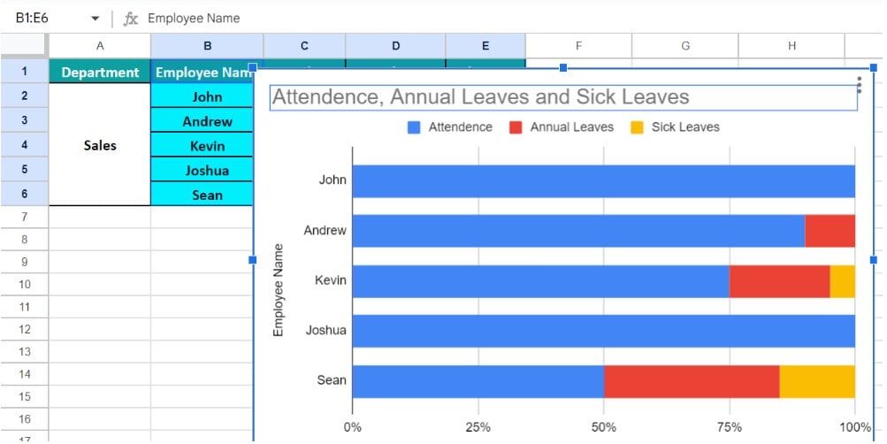
Step 2: First, click the “Customize” option in the “Chart editor” window, then, click the “Chart style” option right arrow and check/tick the “3D” option, Now, the chart is a 3D Chart, as shown below.

Step 3: Follow the steps learnt in Example 1 to update the titles, chart styles, range values within the chart, etc. Then, the final 3D 100 Stacked Bar Chart is shown below.

Example #4 – Insurance Claims by Type
The below table shows the Insurance Claims by Type. We will create a 100 Stacked Bar Chart in Google Sheets.

The steps to create a 100 Stacked Bar chart for the given data are,
Step 1: Choose the cell range A2:D7 – select the “Insert” tab – choose the “Chart” option and the “Chart editor” window opens on the right-side and select the “100% stacked bar chart”, as shown below.

The following 100 Stacked Bar Chart appears.

Step 2: Follow the steps learnt in Example 1 to update the titles, chart styles, range values within the chart, etc. Then, the final 100 Stacked Bar Chart is shown below.

Important Things To Note
- Ensure the source data contains smaller datasets to avoid clutter in the plotted 100 Stacked Bar chart in Google Sheets.
- Avoid 3-D effects in a 100 Stacked Bar chart, as they might distort and misrepresent the data.
- We can generate a chart in multiple ways, namely,
- First, select the cell range and then insert the chart. Then we will get a default chart, after which we can select the required chart type. Or
- We can first insert the required chart type, a blank chart appears with only a border, and then, enter the data range in the “Chart editor” window to get the required chart.
Frequently Asked Questions (FAQs)
An alternate way to insert a 100 Stacked Bar Chart in Google Sheets is,
First, select the dataset – click the “More” option on the toolbar, as shown below.
Next, click the “Insert chart” icon, as shown below, to open the “Chart editor” and we know the rest.
A few reasons the Google Sheets 100 Stacked Bar Chart may not work are,
a) The dataset used to generate the chart is modified or deleted.
b) The dataset is not organized in a right way to understand which variable will be X or Y axis.
c) The cell range to generate the chart is not rightly selected, so that different headers appear in different axis.
We use the 100 Stacked Bar Chart in Google Sheets because it represents discrete values for multiple variables that share the same category. Thus, it helps visualize data grouped into categories.
Use this 100 Stacked Bar Chart In Google Sheets Template to follow along with the examples in this article.
Download Excel Template