
What Is Doughnut Chart In Google Sheets?
Doughnut chart in Google, sheets, as the name suggests, is a chart that looks like a doughnut. In other words, the chart will appear in the shape of a doughnut. Doughnut chart is an inbuilt chart type used to represent the data visually in a effective way. It is also available in Excel.
For example, consider the below table showing name and age in columns A and B, respectively.

Now, let us learn how to create doughnut chart. To begin with, we need to select the cell range A1:B4 and then, click on Insert and chart. In the Chart Editor window, select Doughnut chart as the chart type.
Use this Doughnut Chart In Google Sheets Template to follow along with the examples in this article.
Download Excel TemplateWe will be able to see the doughnut chart, as shown in the below image.

In this article, let us learn how to create Doughnut chart with detailed examples.
Key Takeaways
- Doughnut chart in Google sheets is an inbuilt chart type used to visualize the data in a doughnut-shaped chart.
- Using this doughnut chart type, we can easily visualize data and compare the different values that make the chart.
- We can readily create a doughnut chart using Chart Editor tab in Google sheets.
- Remember, we need to select the entire cell range and then, click on the Insert tab. Here, we need to choose the Chart type to open the Chart Editor tab.
Explanation And Uses
Doughnut chart in Google sheets helps users create chart that visualizes whole data in the chart type. Similarly, we can compare, analyse, and find the data, thus helping users identify and decide financial allocations with ease.
How To Create Doughnut Chart In Google Sheets?
We can create a doughnut chart under the Insert tab with the help of the following steps. They are:
Step 1: To begin with, we need to enter the data in the Google spreadsheets. Next, we need to select the data for which we want to create the chart.
Step 2: Next, select the Insert tab and click on the Chart option.

Step 3: The Chart Editor tab opens up at the right-side of the screen. Here, select the Chart Type option and scroll down to click on Doughnut chart.

Step 4: We will be able to see our chart for the selected data.
Likewise, we can use doughnut chart in Google sheets.
Examples
Example #1
For example, consider the below table showing place and values in columns A and B, respectively.

We can create a doughnut chart with the help of the following steps.
The steps are:
Step 1: To begin with, we need to enter the data in the Google spreadsheets. In this example, the data is available in the cell range A1:B4. Next, we need to select the data for which we want to create the chart. In this example, the data is A1:B4.
Step 2: Next, select the Insert tab and click on the Chart option.
Step 3: The Chart Editor tab opens up at the right-side of the screen. Here, select the Chart Type option and scroll down to click on Doughnut chart.
Step 4: We will be able to see our chart for the selected data.

Likewise, we can use doughnut chart.
Example #2 – Customer Age Group Distribution
For example, consider the below table showing name and age in columns A and B, respectively.

We can create a doughnut chart showing customer age group distribution with the help of the following steps.
The steps are:
Step 1: To begin with, we need to enter the data in the Google spreadsheets. In this example, the data is available in the cell range A1:B8. Next, we need to select the data for which we want to create the chart. In this example, the data is A1:B8.
Step 2: Next, select the Insert tab and click on the Chart option.
Step 3: The Chart Editor tab opens up at the right-side of the screen. Here, select the Chart Type option and scroll down to click on Doughnut chart.
Step 4: We will be able to see our chart for the selected data.

Likewise, we can use doughnut chart showing customer age group distribution.
Example #3 – Market Share By Company
For example, consider the below table showing company and share in columns A and B, respectively.

We can create a doughnut chart in Google sheets showing market share by company with the help of the following steps.
The steps are:
Step 1: To begin with, we need to enter the data in the Google spreadsheets. In this example, the data is available in the cell range A1:B8. Next, we need to select the data for which we want to create the chart. In this example, the data is A1:B8.
Step 2: Next, select the Insert tab and click on the Chart option.
Step 3: The Chart Editor tab opens up at the right-side of the screen. Here, select the Chart Type option and scroll down to click on Doughnut chart.
Step 4: We will be able to see our chart for the selected data.

Likewise, we can use Doughnut chart showing market share by company.
Example #4 – Sales Revenue Breakdwn By Product Category
For example, consider the below table showing product and sales in columns A and B, respectively.

We can create a doughnut chart showing sales revenue breakdown by product category with the help of the following steps.
The steps are:
Step 1: To begin with, we need to enter the data in the Google spreadsheets. In this example, the data is available in the cell range A1:B8. Next, we need to select the data for which we want to create the chart. In this example, the data is A1:B8.
Step 2: Next, select the Insert tab and click on the Chart option.
Step 3: The Chart Editor tab opens up at the right-side of the screen. Here, select the Chart Type option and scroll down to click on Doughnut chart.
Step 4: We will be able to see our chart for the selected data.

Likewise, we can use doughnut chart showing sales revenue breakdown by product category.
Example #5 – Marks Obtained By Students
For example, consider the below table showing subject and marks in columns A and B, respectively.

We can create a doughnut chart showing marks obtained by students with the help of the following steps.
The steps are:
Step 1: To begin with, we need to enter the data in the Google spreadsheets. In this example, the data is available in the cell range A1:B8. Next, we need to select the data for which we want to create the chart. In this example, the data is A1:B8.
Step 2: Next, select the Insert tab and click on the Chart option.
Step 3: The Chart Editor tab opens up at the right-side of the screen. Here, select the Chart Type option and scroll down to click on Doughnut chart.
Step 4: We will be able to see our chart for the selected data.

Likewise, we can use doughnut chart in Google sheets showing sales revenue breakdown by product category.
Important Things To Note
- Doughnut chart in Google sheets helps users create doughnut shaped chart for the given data.
- We can customize the chart using the chart editor tab in Google sheets.
- Remember, users can find the title, color and chart background color, font type and font size using Customize tab in Google sheets.
Frequently Asked Questions (FAQs)
For example, consider the below table showing region and projects in columns A and B, respectively.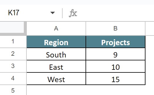
We can create a doughnut chart in Google sheets with the help of the following steps.
The steps are:
Step 1: To begin with, we need to enter the data in the Google spreadsheets. In this example, the data is available in the cell range A1:B4. Next, we need to select the data for which we want to create the chart. In this example, the data is A1:B4.
Step 2: Next, select the Insert tab and click on the Chart option.
Step 3: The Chart Editor tab opens up at the right-side of the screen. Here, select the Chart Type option and scroll down to click on Doughnut chart in Google sheets.
Step 4: We will be able to see our chart for the selected data.
Likewise, we can use doughnut chart in Google sheets.
We can easily customize the entire chart using the Chart Editor tab. Simply double-click on the chart and then, click on the Customize tab. Here, we can change the background color, font, chart border color, maximize or even change into 3D form.
Doughnut chart in Google sheets is available by default such as line, column or bar chart in Google sheets. We do not need any add-on or extension to create doughnut chart in Google sheets.
Use this Doughnut Chart In Google Sheets Template to follow along with the examples in this article.
Download Excel TemplateRecommended Articles
Continue with these related resources when you want the next practical step in this topic.
- Graphs And Charts In Google Sheets
- Types of Charts in Google Sheets
- Google Sheets Pie Chart
- Bar Chart In Google Sheets
- Column Chart In Google Sheets
Explore the full Google Sheets Charts Dashboards and Pivot Tables guide or browse Google Sheets Resources.