
What Is Frequency Distribution In Google Sheets?
The frequency distribution in Google Sheets is a standardized tabulated or graphical representation of the data distribution over time intervals. It helps us analyze whether the observations are concentrated or spread over the whole stretch.
Users can utilize frequency distribution in Google Sheets during statistical analysis, sales and marketing pattern review, and customer and employee satisfaction analysis.
Use this Frequency Distribution In Google Sheets Template to follow along with the examples in this article.
Download Excel TemplateFor example, the source dataset shows the monthly inventory levels.

We must organize the source data to get the data distributed over appropriate intervals and check how the inventory levels are spread over the entire stretch.

Then, considering the definition of frequency distribution in Google Sheets explained earlier, we can prepare a frequency distribution table based on the source dataset to meet the requirement.
In the above frequency distribution table Google Sheets example, we first find the minimum and maximum inventory levels using the MIN and MAX functions in cells E1:E2. The functions work similarly to the Excel MIN function and Excel MAX function.
Next, based on the inventory levels, we shall take each interval’s class width as 10, cited in cell E3. So, we can use the three values mentioned above to determine the number of classes using the cell E4 formula, which is 2.5.
We shall round off the value to 3 to get the total classes or intervals in column H. The first interval starts from 0 to the class width value of 10. The next class starts from the upper limit of the first class, to which we add the class width to get the second class’s upper limit, and so on till the last class.
So, we can update the bins from the classes in column I, which are the upper limits of the classes.
Finally, we apply the FREQUENCY(), which works like the Excel FREQUENCY function, in cell J2 to create frequency distribution in Google Sheets.
The function accepts two inputs. While the first is the range containing the source data range we want to distribute among the classes, the second is the range containing the bins. Thus, the function executes as an array formula, similar to Excel array formulas. It shows the counts of the inventory level values in each class interval.
For example, there are 5 inventory level values between 10-20, which are 17, 15, 15, 19, and 18. Further, if a value were 20, it would fall in this interval.
Next, the value of 1 in cell J5 is an outlier, and it represents the inventory level value of 40, which does not fall in any class.
Key Takeaways
- The frequency distribution in Google Sheetsis a form of data representation used in statistics. It can either be graphical or in a tabulated form. The distribution displays the frequency of occurrence of an outcome as obtained from the sample data.
- The Google Sheets frequency distribution is useful in the sales and marketing, business, and finance domains. For instance, the distribution helps analyze where a person spends and saves money across a span of one year.
- While we can use the FREQUENCY() to achieve the frequency distribution, the inbuilt functions such as the COUNTIF() and QUERY() are the other practical alternatives.
Frequency Distribution() In Google Sheets Formula
The formula to create frequency distribution in Google Sheets is FREQUENCY(), with the following syntax:

Where,
- data: The array or cell range holding the values we wish to count.
- classes: The array or cell range holding the classes. Furthermore, classes should be sorted. However, the FREQUENCY() will sort the values internally when they are not, and it returns the correct outcome.
Please note that we must supply the two mandatory arguments to the FREQUENCY() when using the function to find frequency distribution in Google Sheets.
How To Use Frequency Distribution In Google Sheets?
The steps to determine the Google Sheets frequency distribution are as follows:
- Select a cell, enter the MIN() with the range of values we aim to count as the input, and press Enter. We will get the least value in the specified range.
- Select a cell, enter the MAX() with the range of values we aim to count as the input, and press Enter. We will get the highest value in the specified range.
- Please choose the appropriate class width based on the values we aim to count in the source dataset.
- Choose a cell, enter the following formula, and press Enter.
=(Max_value – Min_value)/Class_width
The above formula will give the total number of classes.
- Based on the number of classes and class width, list the classes in a separate column. The first interval is from 0 to the class width value. The next class starts from the upper limit of the first class, to which we add the class width to get the second class’s upper limit, and so on till the last class. Next, update the upper bounds of the classes in the corresponding cells of a new column. Thus, now we have the classes and bins in two columns.
- Select the target cell, which is in the same row as the first cells of the columns containing the classes and bins. Next, enter the FREQUENCY().
We can use the FREQUENCY() to create a frequency distribution table Google Sheets in the following ways:
- Access the function from the ribbon.
- Enter the function into the sheet manually.
Method #1 – Access The Function From The Ribbon
Choose a target cell, with adequate cells below it available for displaying the result à-The Insert tab – The Function option right arrow – The Array function group right arrow – The FREQUENCY function.

The select function shows in the target cell, with the cursor inside the function brackets. Next, update the function argumentinside the brackets.

Moreover, we can select the ‘?’ symbol against the function name to view the function syntax.

Next, click the down arrow in the syntax pane to view the meaning of the frequency distribution in Google Sheets explained with the help of a basic illustration.

Finally, press Enter to secure the formula output.
Method #2 – Enter The Function Into Sheet Manually
- Choose the target cell, with adequate cells below it available for displaying the result.
- Type =FREQUENCY( in the cell. [Alternatively, type =F or =FR and click the function name FREQUENCY from the options listed to select the function.]
- Supply the argument values and close the brackets.
- Press Enter to acquire the FREQUENCY function output in Google Sheets.
The FREQUENCY() will return an array of frequencies, with the values in the cells corresponding to the listed classes. Furthermore, if there are values that do not fall into any of the classes, the count of such values will appear at the end of the list of frequencies below the frequency for the last class.
Examples
Let us see the various ways to find frequency distribution in Google Sheets with examples.
Example #1
The source dataset contains the daily prices of a specific stock.

We must arrange the source data to secure the data distributed over appropriate intervals and analyze how the prices are spread across the entire span. We shall use the cells E1:E4 and columns G to I cells to show the required calculations.
Step 1: Select cell E1, enter the MIN(), and press Enter.
=MIN(B2:B11)

Step 2: Select cell E2, enter the MAX(), and press Enter.
=MAX(B2:B11)

Next, based on the given stock prices, we shall set the class width as 20, which is specified in cell E3.
Step 3: Choose cell E4, enter the following expression, and press Enter.
=(E2-E1)/E3

Firstly, we find the least and the highest stock prices in cells E1 and E2 using the MIN() and MAX(), which are $10 and $100. Next, we find the number of classes in cell E4, to categorize the stock prices into, using the least and highest stock prices and the class width. In this case, we get 4.5 as the number of classes. We shall round off the value to 5.
So, since the class width is 20 and we need 5 classes, the classes we must update in column G are 0-20, 20-40, 40-60, 60-80, and 80-100. Therefore, the bins, which are the classes’ upper limits, are 20, 40, 60, 80, and 100, which we update in column H.

Step 4: Select cell I2, enter the FREQUENCY(), and press Enter.

The FREQUENCY() appears where we enter the argument values.
=FREQUENCY(B2:B11,H2:H6)

[Alternatively, select cell I2 and choose Insert – Function – Array – FREQUENCY.

The selected function is shown in the target cell.


Next, enter the function arguments, as depicted above.]
Step 5: Press Enter to execute the FREQUENCY() as an array formula.

The result shows that 2, 5, 2, and 1 stock prices in the source dataset are in the ranges of $0-$20, $20-$40, $40-$60, and $80-$100. In contrast, there are no stock prices in the range of $60-80. Also, the 0 in cell I7 indicates that there are no outliers.
Example #2 – Relative Frequency Distribution
We express the relative frequencies as a decimal number of a percentage. We determine each relative frequency by dividing the frequency of an event by the total frequencies of all events.
Each relative frequency is a value between 0 and 1, and when we add all the relative frequencies, we get the sum value of 1.
For example, the source dataset shows the frequencies of feedback ratings of 1-10.

We must find the relative frequency distribution for the given source dataset and display the output in cells C2:C11.
Step 1: Select cell B13, enter the SUM(), which works like the Excel SUM function, and press Enter.
=SUM(B2:B11)

Step 2: Choose cell C2, enter the following formula, and press Enter.
=B2/$B$13

Next, utilize the fill handle option, which is similar to Excel fill handle, to implement the formula in the remaining target cells.

Step 3: Select cell C13, enter the SUM(), and press Enter.
=SUM(C2:C11)

Example #3 – Cumulative Frequency Distribution
The Cumulative Frequency Distribution displays the total count of occurrences of the events not above (or not below) a specific event in a cited group of events.
We evaluate the Cumulative Frequency Distribution by summing the frequencies from a frequency distribution with the total of the frequencies prior to it (or ensuing it). So, the cumulative frequency of the last class should equal the sample size.
For example, the source dataset lists the number of working days and the number of employees who have worked for the cited number of working days. Thus, the counts of employees are the frequencies.

We must find the Cumulative Frequency Distribution for the given source dataset and display the output in cells C2:C6.
Step 1: Select cell B8, enter the SUM(), and press Enter.
=SUM(B2:B6)

Step 2: Select cell C2, enter the first frequency cited in cell B2, and press Enter.

Step 3: Select cell C3, enter the following formula, and press Enter.
=B3+C2

Next, use the option of the fill handle to feed the formula in the remaining target cells.

Thus, the sum of all the frequencies equals the last cumulative frequency.
Important Things To Note
- Ensure that the chosen class width is appropriate. Otherwise, we will not get the precise classes and will not be able to achieve the correct frequency distribution in Google Sheets.
- All the class intervals in the frequency distribution table must be equal to avoid losing data while grouping the values into the corresponding classes.
Frequently Asked Questions (FAQs)
We can perform frequency distribution in Google Sheets using the Pivot table in the following way, explained with an example.
The source dataset shows the order data at a store.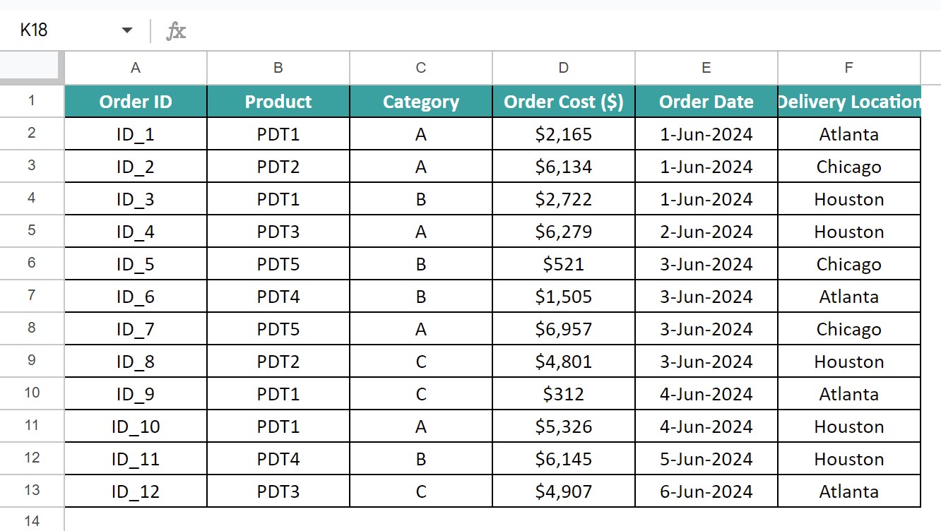
We must find the frequency distribution based on the order cost data cited in the source dataset using the Pivot table option.
Step 1: Select the entire dataset and choose the Insert tab – The Pivot table option.
The Create pivot table window appears, where we update the target location to show the Pivot table. We choose cell H1 in the current sheet to display the frequency distribution Pivot table.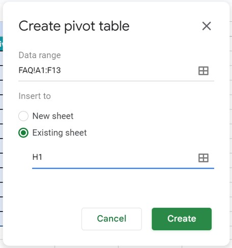
Click Create to access the Pivot table editor.
Step 2: Click the Order Cost ($) column heading from the list of column headings in the editor pane. Next, drag and drop the specific column heading into the Rows and Values sections in the editor pane.

Step 3: Set the Summarize by field as COUNT in the VALUES section to view the counts of order costs in the Pivot table.

Step 4: Right-click an order cost value in column H and select the Create pivot group rule option from the pop-up menu.
The Grouping rule pane will appear, where we must update the class details. We specify the least and highest values of the classes and the class width or interval size.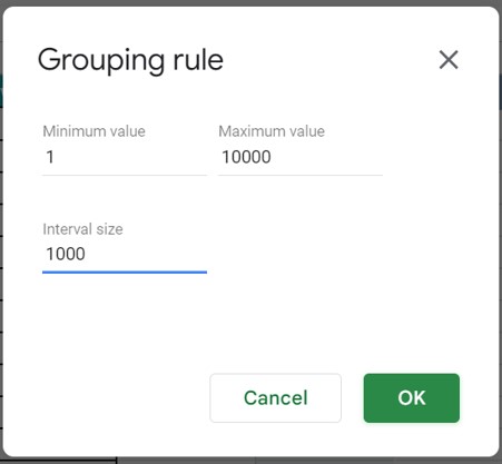
Once we click OK, we see the grouped order costs in the form of class intervals in column H, with column I showing the count of order cost values in each interval.
There are other functions we can use instead of FREQUENCY() to perform frequency distribution in Google Sheets, which are COUNTIF() and QUERY().
We can make a frequency distribution graph in Google Sheets using the following steps:
Once we have the frequency distribution table, select the range containing the values we aim to count and the range containing the frequencies.
Choose the Insert tab – The Chart option to access the Chart editor.
Set the required plot type in the Chart type field in the Setup tab in the pane to achieve the desired frequency distribution plot in Google Sheets.
Use this Frequency Distribution In Google Sheets Template to follow along with the examples in this article.
Download Excel Template