


Introduction to Excel Stock Data Types with AI
Many finance and BI teams still rely on Power BI’s built‑in visuals, bar charts, line charts, and standard tables, because creating custom visuals traditionally requires TypeScript, JSON specs, or external libraries they do not have time to learn. The result is reports that look similar from one project to the next, even when the underlying business questions are very different. Power BI Custom Visuals Copilot code‑free creation changes that by letting analysts describe the visual they want in plain language and then generating a working configuration or template with minimal coding.
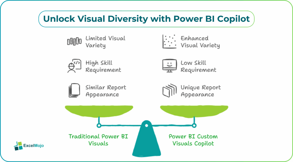
This approach falls under AI powered Power BI Custom Visuals creation, where Copilot interprets a user’s request, such as “show quarterly revenue by region with icons and trend arrows”, and converts it into a custom visual definition or a scaffold that can be dropped into the report. At the same time, analysts retain control over DAX, security, and performance; the AI simply accelerates the visual‑design legwork. For teams already using Power BI Custom Visuals with Copilot, this workflow can shave hours off report development and make it easier to align visuals closely with business KPIs and stakeholder expectations .
How Copilot Integrates with Custom Visuals
In Power BI, Copilot is positioned as an AI‑driven assistant that operates over the semantic model, the report canvas, and, increasingly, the visual layer. For code‑free Power BI Custom Visuals Copilot workflows, the interaction usually follows this pattern:
- A user opens or selects a visual placeholder on the canvas and triggers Copilot (for example, via the “Ask Copilot” bar or a right‑click context option).
- They submit a natural‑language request such as “Create a quarterly KPI card that shows revenue, margin, and headcount, with trend arrows and color‑coded variance.”
- Copilot parses the request, maps the required fields to the model (Measures and Dimensions), and then either:
- Configures an existing Power BI visual using the underlying DAX and formatting.
- Or generates a JSON or spec‑based configuration for a custom visual, such as one built with Deneb (SVG) or other code‑backed visual types .
This behavior is documented in Microsoft’s guidance on Power BI Custom Visuals Copilot and Copilot, where the platform is described as capable of generating visuals, narratives, and formatting suggestions while still respecting workspace security and governance policies.
How to Generate a Custom Visual From a Prompt
A concrete example of AI powered Power BI Custom Visuals creation is to build a multi‑metric KPI card that goes beyond the standard Card or Multi‑row card visuals.
A typical workflow:
- In the target report page, select an empty area or a blank visual placeholder and open the Copilot prompt.
- Type a request such as:
- “Create a vertical bar chart with region on the axis, stacking revenue by product line, and overlaying a line for prior‑year revenue.”
- Copilot returns a suggested configuration or layout, which may map onto:
- An existing Power BI visual with the right fields and formatting.
- Or a JSON‑style specification for a custom visual such as a Deneb‑based chart.
- The analyst then tests the visual in the report, adjusts colors, labels, and tooltips, and verifies the underlying DAX measures.
Behind the scenes, this pattern leverages the fact that many custom visuals expose a declarative schema (often JSON‑based); Copilot can generate a valid configuration once the model fields and measures are known. For analysts, this is similar to using Copilot‑assisted DAX generation or Power Query M generation from natural language, where the assistant produces the formula and the user owns the logic and business meaning
Practical example: Multi‑metric KPI dashboard
A common use case is a finance dashboard that must show several related metrics at once like revenue, margin, headcount, and variance, without overwhelming the user.
Using Power BI Custom Visuals Copilot code‑free creation, the workflow might look like this:
- The user has a model with measures such as Revenue, Margin %, Headcount, and Prior‑Year Revenue.
- They then prompt Copilot: “Create a KPI row with Revenue, Margin %, Headcount, and year‑over‑year variance, each with a small icon and color‑coded trend.”
- Copilot generates either:
- A custom visual configuration that can be imported into the report.
- Or a layout that closely matches a composite visual built from multiple core visuals.
- The analyst then refines formatting, aligns the layout with the dashboard theme, and adds filters and drill‑downs as needed.
This example illustrates how to create Power BI custom visuals without code Copilot expands the visual vocabulary beyond the standard chart types while still letting the user control measures, security filters, and formatting.
Pitfalls and best‑practice tips
Power BI Custom Visuals Copilot code‑free creation is a productivity booster, but it is not a hands‑off magic tool. Analysts should be aware of a few key constraints and best practices.
One common issue is over‑designed visuals. Copilot can suggest complex layouts or heavily annotated charts that are hard to maintain and slow to render. Best practice is to keep measures simple, limit the number of simultaneous interactions (drill‑downs, cross‑filtering, and dense tooltips), and stress‑test the visuals with production‑sized data before publishing.
Another risk is misaligned DAX logic. Copilot typically infers measures from the model but may not fully capture subtle business rules such as currency conversions, ownership splits, or custom time intelligence. Analysts should review the underlying measures and, where necessary, replace generated expressions with explicit DAX that matches the accounting or finance policy.
A third pitfall is governance and security. Custom visuals from the marketplace or generated via Copilot can introduce external dependencies or data‑export behaviors. Teams should learn about custom‑visual governance, including validating marketplace visuals, controlling which visuals are allowed in the tenant, and periodically reviewing third‑party code or configurations.
Frequently Asked Questions (FAQs)
Copilot can drastically reduce the need to write code when designing visuals, especially for common layouts such as bar charts, KPI cards, or simple Deneb‑based charts. However, advanced scenarios such as custom interactions, security rules, or complex visual behaviors still require some manual configuration or DAX work.
Visuals generated or configured via Copilot use the same underlying model and visual engine as regular Power BI visuals, so they can be published to Power BI Service and used in embedded reports as long as the tenant policy allows them. Custom visuals from the marketplace may need to be explicitly enabled in the tenant.
Copilot’s accuracy depends heavily on the clarity of the prompt and how well the underlying model is documented. Vague prompts such as “show a chart of everything” usually produce generic or suboptimal results, while specific, field‑level prompts (for example, “show revenue by region as a stacked bar chart, with prior‑year revenue as a line”) yield much better‑aligned visuals.
Copilot can help structure visuals that are easier to read by suggesting logical layouts, consistent colors, and clear labels, which improves accessibility. However, manual checks are still needed for screen‑reader compatibility, color‑contrast ratios, and how the visuals behave in export formats such as PDF or PowerPoint.