


Introduction
Many report authors still default to standard Power BI charts and grids, even when their users need something more specific: multi‑metric dashboards, hierarchical trees, or interactive scorecard widgets that blend text, icons, and KPIs. The usual workaround is to either wrestle with DAX and layout constraints or build a custom visual in TypeScript, which pushes most finance and operations analysts out of the comfort zone. Power BI Custom Visuals with Copilot changes that by letting you describe what you want in plain language and then having the assistant generate a suitable visual configuration or even scaffold the underlying code.
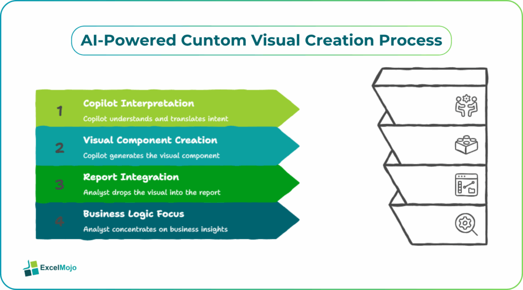
This approach falls under AI powered Power BI Custom Visuals creation, where Copilot interprets intent and translates it into a visual component that can be dropped into a report page. For analysts already used to Power BI’s drag‑and‑drop modeling, moving to create Power BI custom visuals without code Copilot means less time debugging SMX manifests and more time focusing on business logic and design. In practice, this workflow is most powerful when paired with a clear understanding of DAX measures, hierarchy handling, and performance‑sensitive visuals such as large grids or heat maps.
How Copilot Interfaces with Power BI Visuals
Microsoft’s Copilot features in Power BI are designed to act as a conversational assistant over the semantic model, report canvas, and, increasingly, the visual layer.
For Power BI Custom Visuals with Copilot, the interaction typically looks like this:
- The user selects a visual placeholder or blank area on the canvas and invokes Copilot (for example, via the “Ask Copilot” bar or a right‑click context option).
- They type a description such as “Create a vertical bar chart with region on the axis and revenue stacked by product line, with tooltips showing prior month variance.”
- Copilot parses that request, maps entities to the underlying model, and either:
- Configures an existing Power BI visual with the right fields and formatting.
- Or suggests a custom visual template or configuration that can be imported or scaffolded.
Copilot in Power BI is an AI‑driven assistant that interprets natural‑language questions and generates DAX, queries, or visual options, while still respecting the security and governance model of the workspace .
How to Create a Custom Visual From a Prompt
A concrete example of AI powered Power BI Custom Visuals creation is to generate a multi‑metric KPI card that goes beyond the standard Card or Multi‑row card visuals.
A typical workflow:
- In the target page, select an empty area of the canvas and open the Copilot prompt.
- Submit a request such as:
- “Create a KPI card for Revenue, showing current month, prior month, and year‑to‑date, with trend arrows and percentage changes.”
- Copilot returns a suggested layout or configuration, which may map onto:
- A custom visual template already published to the marketplace.
- Or a configuration string that can be pasted into a new visual instance.
Behind the scenes, this pattern relies on the fact that many custom visuals expose a JSON‑style configuration schema; Copilot can generate a valid configuration blob once the semantic model’s measures and fields are known. For analysts, this is similar to using Power Query M generation from natural language, where the assistant writes the formula while the user validates the logic and business meaning .
Practical Example: Hierarchical Organization Chart
A common request in HR and finance dashboards is a hierarchical organization chart that shows headcount, budget, or attrition by department, directorate, and business unit.
Using Power BI Custom Visuals with Copilot:
- The user uploads a table with fields such as Employee ID, Name, Manager ID, Department, and Cost Center.
- They then prompt Copilot: “Create an org‑chart style visual that shows reporting hierarchy by department and color‑codes cost centers by budget bucket.”
- Copilot either suggests an existing organizational‑chart‑style visual from the marketplace or generates a template configuration that can be imported.
- The analyst then fine‑tunes formatting, tooltips, and drill‑down behavior manually.
This example illustrates how to createPower BI custom visuals without code Copilot expands the visual vocabulary beyond the builtin chart types, while still letting the user control titles, filters, and security filters on the underlying model.
Pitfalls and Best‑Practice Tips
Power BI Custom Visuals with Copilot is powerful but not a magic wand. Analysts should keep a few constraints and best practices in mind.
One common issue is overly complex visuals. Copilot can suggest highly detailed charts or trees that are hard to maintain and slow to render when the dataset grows. Best practice is to keep measures simple, limit the number of simultaneous interactions (drill‑downs, cross‑filtering, and tooltips), and test with real‑sized data before rolling out to end users.
Another risk is misalignment with DAX logic. Copilot usually infers measures from the model but may not always respect subtle business rules (for example, adjusting for currency conversions or ownership splits). Analysts must review the underlying measures and filters and, where necessary, replace generated expressions with explicit DAX that matches the accounting or finance policy.
A third pitfall is governance and security. Using custom visuals from the marketplace or hand‑crafted components can introduce external dependencies or data‑export behaviors. Teams should follow Microsoft’s guidance on custom‑visual governance, including validating marketplace visuals, controlling which visuals are allowed in the tenant, and reviewing third‑party code where possible.
Frequently Asked Questions (FAQs)
Copilot can drastically reduce the need to write code when designing visuals, especially for common chart types or layouts, but it rarely eliminates coding entirely. Advanced use cases, such as custom formatting, security rules, or complex DAX measures, still require manual work.
Visuals created or configured via Copilot use the same underlying model and visual engine as regular Power BI visuals, so they can be published to Power BI Service and used in embedded reports as long as the tenant policy allows them. Custom visuals downloaded from the marketplace must also be explicitly enabled in the tenant.
Copilot’s accuracy depends on how clearly the request is phrased and how well the underlying model is documented. Unclear prompts such as “show a chart of everything” usually yield generic or suboptimal results, while specific, field‑level prompts produce much better‑aligned visuals.
Copilot can help structure visuals that are easier to read by suggesting logical layouts, consistent colors, and clear labels, which improves accessibility. However, manual checks are still needed for screen‑reader compatibility, color contrast, and export formats such as PDF or PowerPoint.
Recommended Articles
Continue with these related resources when you want the next practical step in this topic.
Explore the full Power BI Visuals and Reports guide or browse Power BI Resources.