
What is Timeline Visual in Power BI?
The Timeline visual in Power BI is a data visualization tool that allows you to display chronological data along a timeline axis. It’s beneficial for presenting events, activities, or changes that have occurred over time. The visual helps users understand patterns, trends, and relationships in the chronologically unfolding data.
Key Takeaways
- The Timeline visual in Power BI is used to display chronological data events or activities.
- You can import a Timeline visual by adding it to a report page and configuring it with your date-related data.
- Timeline slicers can be created to allow users to filter data within a date range.
- Proper data preparation and formatting enhance the effectiveness of the Timeline visual.
How to Import Timeline Visual to Power BI?
To add a Timeline visual to your Power BI report, follow these steps:
Step 1: Ensure your dataset contains a date or time-related field you want to display on the Power BI timeline.
Step 2: Launch Power BI Desktop on your computer.
Step 3: Import the dataset into Power BI by connecting to your data source (Excel, SQL Server, etc.) and Load your data in Power BI.

Step 4: Apply Data Transformation to perform data cleaning, filtering, and transformation as needed.
Step 5: Create a New Report Page by clicking on Report view in the left panel in Power BI.

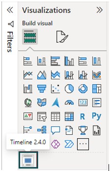
Step 6: Navigate to the Visualizations pane and click on Get more visuals icon (…).
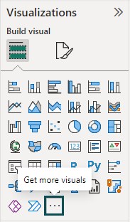
Then, select the Get more visuals option from the menu bar.

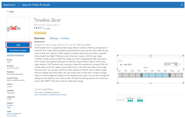
Step 7: Once the Microsoft AppSource page loads, search for the keyword Timeline in the search text box in the right corner. You will see the Timeline Slicer tile in the search result.

Step 8: Click on the Timeline Slicer tile to open the page in the AppSource window. Click on the Add button to download the visual to Power BI.
Notice the date this article is written; the latest version available in Microsoft AppSource is Power BI Timeline 2.4.0.
Once the download is complete, you will see a confirmation pop-up message in Power BI Desktop.
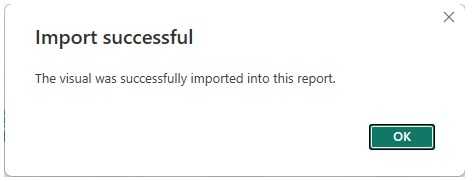
You will also notice the Power BI Timeline 2.4.0 visual icon visible in the Visualizations pane in Power BI Desktop, indicating that the Timeline visual is successfully imported to Power BI.
In the next section, we will learn how you can create a Timeline Slicer in Power BI.
Create Timeline Slicer in Power BI
To create a Timeline slicer in Power BI (a filter that lets users select a range of dates), follow these steps:
Step 1:
- Navigate to the Visualizations pane.
- Click on the Power BI Timeline 2.4.0 visual icon.
- Drag and drop the data field from the Fields pane to the Time column in the Visualizations pane.
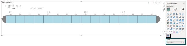
It will create an Order Date Timeline Slicer where the user can choose from Year/Quarter/Month/Week/Day wise, i.e., Y/Q/M/W/D data display.
Step 2: Navigate to the Visual tab under the Format Visual tab in the Visualizations pane to customize the appearance of the Timeline visual, including date format, colors, and labels.
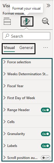
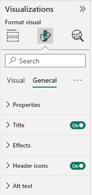
Step 3: Navigate to the General tab under the Format Visual tab in the Visualizations pane to customize the Title, Effects, Header icons, and other properties.
Now that we know how to import Timeline Visual to Power BI and create a timeline Slicer in Power BI let’s see some examples to demonstrate the above steps in the subsequent section.
Examples
This section will demonstrate how to create Timeline Slicer in Power BI in a step-by-step process with two examples.
Example #1
In this example, we will create a Power BI timeline chart showing the stock price of Apple stock over 42 years using the AAPL dataset. AAPL dataset contains the stock price time-series data of Apple stock from 1980 to 2022 with Open and Close, High and Low, Total Volume of trades, and Adjusted Close Price.
To create the Power BI timeline chart with the Power BI Timeline slicer visual, follow the steps highlighted below:
Step 1:
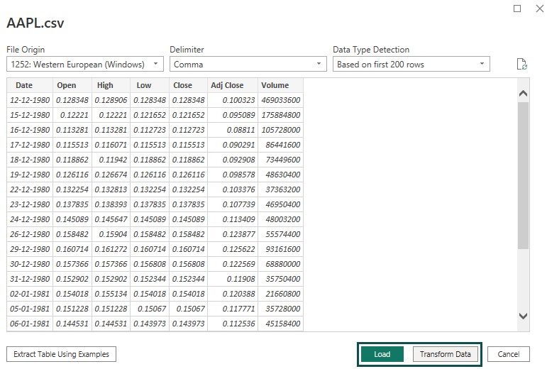
- Open the Power BI Desktop.
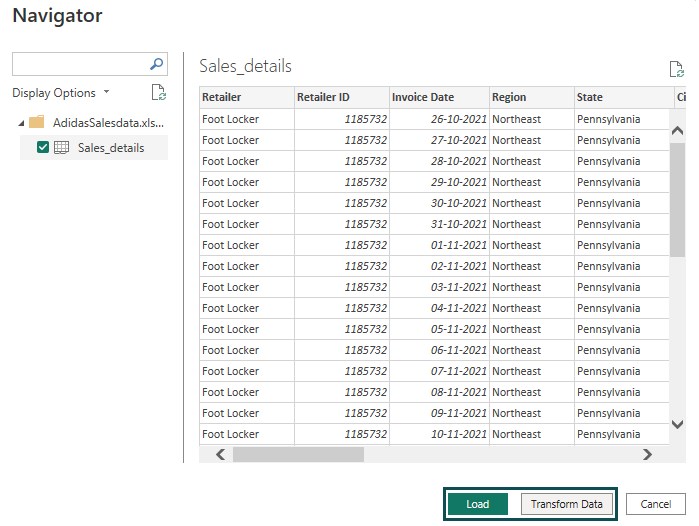
- Import the AAPL dataset using the Get Data option.
- Click on the Load button.
You can choose the Transform Data option to perform data transformation as needed.
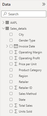
Once the data is loaded, you can view it by navigating to the Fields pane.

Step 2: Navigate to the Visualizations pane and click on Get more visuals icon (…).
Select Menu bar’s Get more visuals option to navigate the Microsoft AppSource page.
Step 3: Once the Microsoft AppSource page loads, search for the keyword timeline in the search text box in the right corner. You will see the Timeline Slicer tile in the search result.
Step 4: Click the Timeline Slicer tile to open the page in the AppSource window. Click on the Add button to download the visual to Power BI.
Once the download is complete, you will see a confirmation pop-up message in Power BI Desktop.
You will also notice the Power BI Timeline 2.4.0 visual icon visible in the Visualizations pane in Power BI Desktop, indicating that the Timeline visual is successfully imported to Power BI.
Step 5:
- Navigate to the Visualizations pane.
- Click on the Power BI Timeline 2.4.0 visual icon.
- Drag and drop the data field from the Fields pane to the Time column in the Visualizations pane.
It will create a Power BI Timeline chart with various layouts to choose from, such as Y (Year), Q (Quarter), M (Month), W (Week), and D (Day).
Step 6: Navigate to the Visualizations pane, click on the Line chart visual icon, and drag and drop the data fields from the Fields pane to the X-axis, Y-axis, and Secondary y-axis sections of the chart.
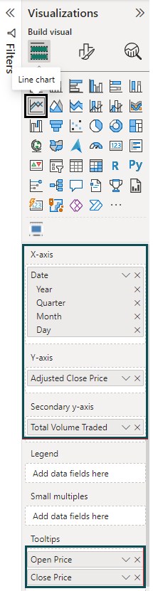
You can also add Tooltips for the visual to create a Power BI Line chart of Apple stock price and volume on time-series data.
Step 7: Navigate to the Visualizations pane, click on Slicer visual, and drag and drop the data field from the Fields pane to the Field section.
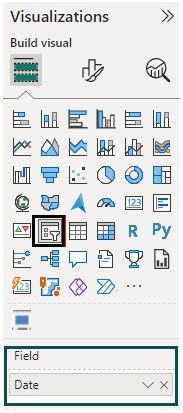
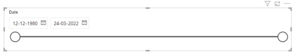
It would create a date slicer in Power BI. Format the slicer to choose Style as Between, as shown below.
Step 8: N Navigate to the Format visual tab in the Visualizations pane to format the report’s appearance, font, and other properties.
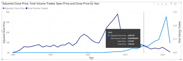
You can see that after all the above changes, your Power BI report will look as below.

It provides a view of Apple stock price and volume variation Year/Quarter/Month/Week/Day wise for the entire time frame.
You can use SHIFT+click to choose the timeline in the Timeline slicer to see the variation in the result.
Here, we have chosen the 1989 Q2 – 1991 Q3 timeframe for the report view. The line chart shows the Apple stock price and volume variation per the timelines.

Example #2
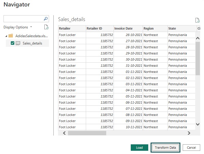
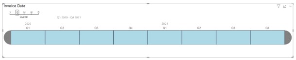
In this example, we will create a Power BI timeline storyteller highlighting various Sales KPI metrics across invoice date timelines for Adidas retail sales using the Adidas_Sales_details dataset. Adidas_Sales_details contains the sales data over 2020-21 across various product categories, retailers, genders, regions, cities, etc.
To create the Power BI timeline storyteller with the Power BI Timeline slicer visual, follow the steps highlighted below:
Step 1:
- Open the Power BI Desktop.
- Import the Adidas_Sales_details dataset using the Get Data option.
- Click on the Load button.
You can choose the Transform Data option to perform data transformation as needed.
Once the data is loaded, you can view it by navigating to the Fields pane.
Step 2: Navigate to the Visualizations pane and click on the Power BI Timeline 2.4.0 visual icon.
Drag and drop the data field from the Fields pane to the Time column in the Visualizations pane.
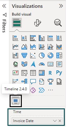
It will create a Power BI Timeline chart with various layouts to choose from, such as Y (Year), Q (Quarter), M (Month), W (Week) and D (Day)
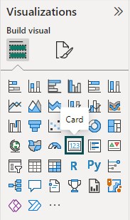
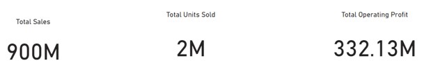
Step 3: Navigate to the Visualizations pane, click on the Card visual icon, and drag and drop the data fields from the Fields pane to the Fields sections of the chart.
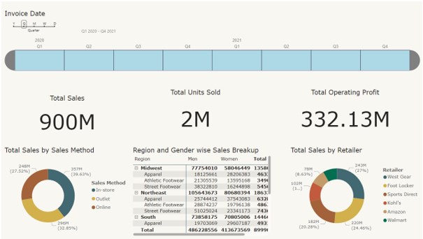
Here, we have created 3 Card visuals, i.e., Total Sales, Total Units Sold, and Total Operating Profit.
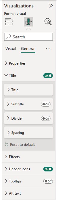
Apply formatting to the Card visuals by navigating to the Format visual tab under the Visualizations pane.
Step 4: On the Visualizations pane, click on the appropriate visual icon, and drag and drop the data fields from the Fields pane to the relevant visual sections.
We have created two donut charts and 1 Matrix visual for our report.
Donut charts include Total Sales by Sales method and Total Sales by Retailer. The Matrix visual is a sales breakup based on Region and Gender.
Apply formatting to the visuals by navigating the Format visuals tab under the Visualizations pane. Post the changes, the report looks as shown below.
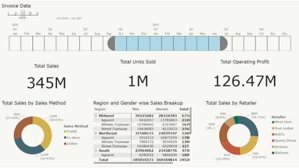
Note: To view the variation in the report results, you may apply the SHIFT + click button to select the timeline in the Timeline slicer.
Here, we have chosen the timeframe for the report view from Sep 2020 to Jul 2021. The Power BI Timeline storyteller shows the various sales KPI metrics across product lines, gender, sales method, and retailer for Adidas products per the specified timelines.
Note that you can also create a Power BI Timeline with Milestones to display critical milestones in your project or stream using the similar steps mentioned in previous sections.
Important Things to Note
- The Timeline visual is most effective when used with chronological datasets.
- The Timeline visual works similarly to a filter or slicer for dates or timelines.
- Consider the granularity of your data (e.g., day, month, year) and how it should be displayed on the timeline.
- Formatting options allow customization of the visual’s appearance and labeling.
- Ensure that your dataset contains date attributes before you apply Timeline Visual in Power BI.
Frequently Asked Questions (FAQs)
Power BI had no specific built-in feature to export or print the Power BI Timeline visual directly. However, you can export the entire Power BI report containing the Power BI Timeline.
To export the report page in Power BI, click on the File tab.
Click on the Export option and choose either Export to PDF or Power BI template.
When you export to PDF, a PDF version of the report page will be created by Power BI Desktop.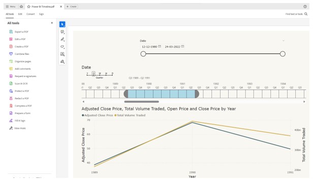
You can use the Power BI Timeline visual in a Power BI Service report. When you design your report using Power BI Desktop and include a Timeline visual, that visual will be included in the published report on Power BI Service.
Power BI provided some basic customization options for visuals, including the Timeline. You could customize aspects like colors, fonts, and labels to a certain extent. However, advanced customization might require using custom visuals or incorporating JavaScript, which could be more complex.
A Power BI Timeline visual is specifically designed to display chronological data over a period of time. It’s suitable for scenarios where you want to show events, activities, or changes that occurred along a timeline. Suitable data includes:
• Historical events: Key dates, milestones, and events in history.
• Project timelines: Tasks, milestones, and deadlines for projects.
• Sales or marketing campaigns: Start and end dates of campaigns.
• Product releases: Dates of product launches or updates.
• Event schedules: Dates and times of events, conferences, or meetings.
• Personal or business timelines: Significant life events, career progression, or company history.