
What Is S Curve In Excel?
The S Curve in Excel helps to visually describe and predict an entity’s or a business’s progress over a period based on cumulative data. It is a logistic plot representing a variable’s progress relative to another variable.
Users can use the Excel S Curve to assess a business’ growth rate, potential roadblocks in a project, schedule analysis, and for cash flow forecasting.
Use this S Curve In Excel Template to follow along with the examples in this article.
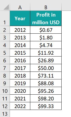
Download Excel TemplateFor example, the table below shows the annual profit data of a firm from 2012-22. We will analyze the firm’s profit trend over time visually.
We will create an S Curve in Excel using the Line or Scatter chart to perform the required performance review, as shown below.
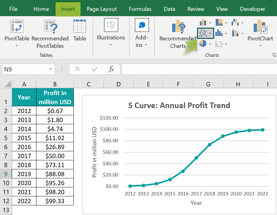
The above S Curve in Excel template shows the profits made by the firm in the initial and final stages are gradual and slow. On the other hand, the firm has an accelerated increase in its profit in the middle phase.
Key Takeaways
- The S Curve in Excel helps analyze an entity’s performance progressively over a period. It shows the entity’s cumulative data, such as man hours, progress, and cost. Users can use the S Curve in project management and domains such as finance.
- The four stages in an S Curve are initial gradual growth, accelerated growth, later-stage gradual growth, and constant demand.
- We can use the Line or Scatter chart to create an S Curve.
- The Target, Cost vs. Time, Man hours vs. Time, and Baseline are a few of the S Curves we can create using Excel.
Explanation And Usage Of S Curve In Excel
Explanation of Excel S Curve
Typically, the curve has an S shape with four stages.
- The first stage shows gradual growth,
- The second stage displays accelerated progress.
- The third stage again shows slow progress with a drop in momentum, and
- The last stage shows the curve has a zero slope, with a constant or a drop in the entity’s growth.
And the causes of the inflection points in an S Curve can be factors such as evolving technology, funding changes, regulatory changes, and sluggish innovation rate.
Uses of the Excel S Curve
- It is useful for project management, such as tracking progress and sales using cumulative data and mapping out expenses vs. cash flows.
- It helps in financial data modeling and cash flow forecasting.
- It helps compare planned versus actual budgets.
- It helps analyze facets, such as performance progress, cash flow predictions, task schedules, planned versus actual figures, man hours vs. time, costs vs. time, and baseline.
How To Make S Curve In Excel?
We can create an S Curve in Excel using the Line or Scatter chart in the Insert tab. And the steps are as follows:
- Ensure the data to plot the S Curve is valid and accurate.
- Method 1: Select the data range,
- Click the Insert tab → select the Recommended Charts option to open the Insert Chart window. [Alternatively, select the data range and follow the path Insert tab → Line or Area chart → Line with Markers chart.]
- Click the All Charts tab in the Insert Chart window → click the Line chart → choose the required Line with Markers plot.
- Method 2: Select the data range,
- Click the Insert tab → select the Recommended Charts option to open the Insert Chart window. [Alternatively, select the data range and follow the path Insert tab → Scatter (X, Y) or Bubble chart → Scatter with Smooth Lines and Markers chart.]
- Click the All Charts tab in the Insert Chart window → click the X Y (Scatter) chart → choose the required Scatter with Smooth Lines and Markers plot.
- Using the Chart Elements option, update the chart title and axis titles to complete the S Curve plot.
Let us see the above steps with an S Curve in Excel template example.
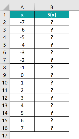
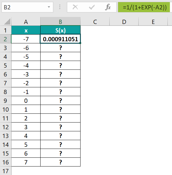
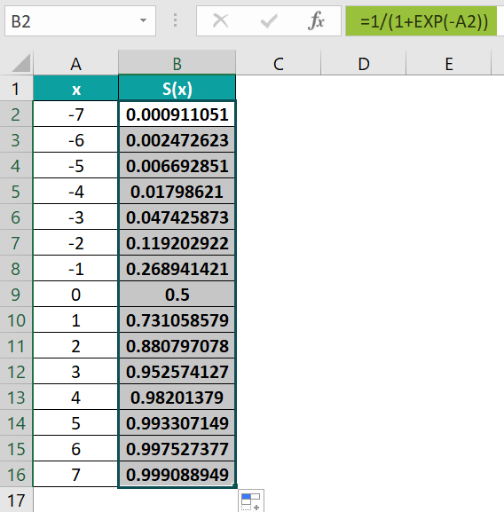
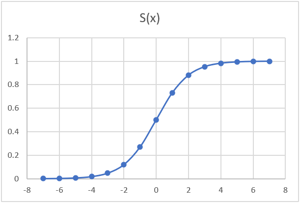
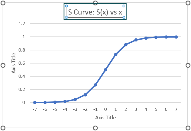
The following mathematical expression helps calculate the Sigmoid function, S(x).
S(x) = 1 / (1 + e-x)
where,
- e : Euler’s number
- x : Given values for which we must find the Sigmoid function.
Further, the Sigmoid function represents the formula for an S Curve in Excel.
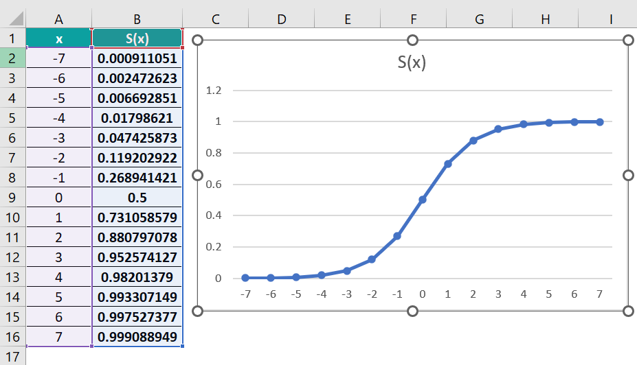
The table below contains a list of x values. We will determine the Sigmoid function (S(x)) value for each x value and plot S(x) vs. x.
The steps to create an S Curve in excel are as follows –
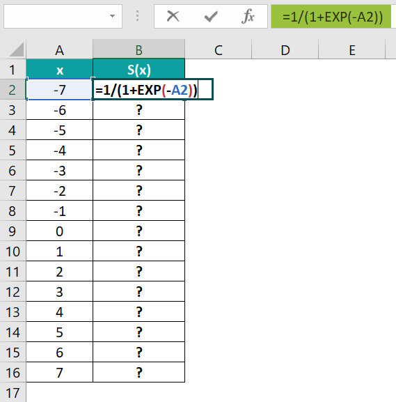
- Select cell B2, and enter the formula representing the Sigmoid function mathematical expression.
=1/(1+EXP(-A2))

- Press Enter to view the output in cell B2.
- Using the fill handle, update the formula in cells B3:B16.
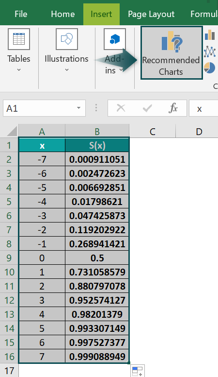
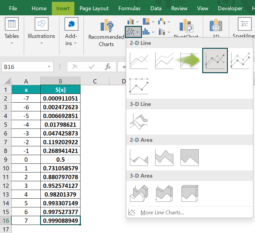
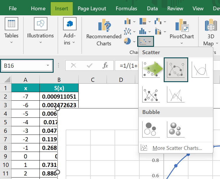
- Click on a cell in the data range A1:B16, and follow the path Insert → Recommended Charts.

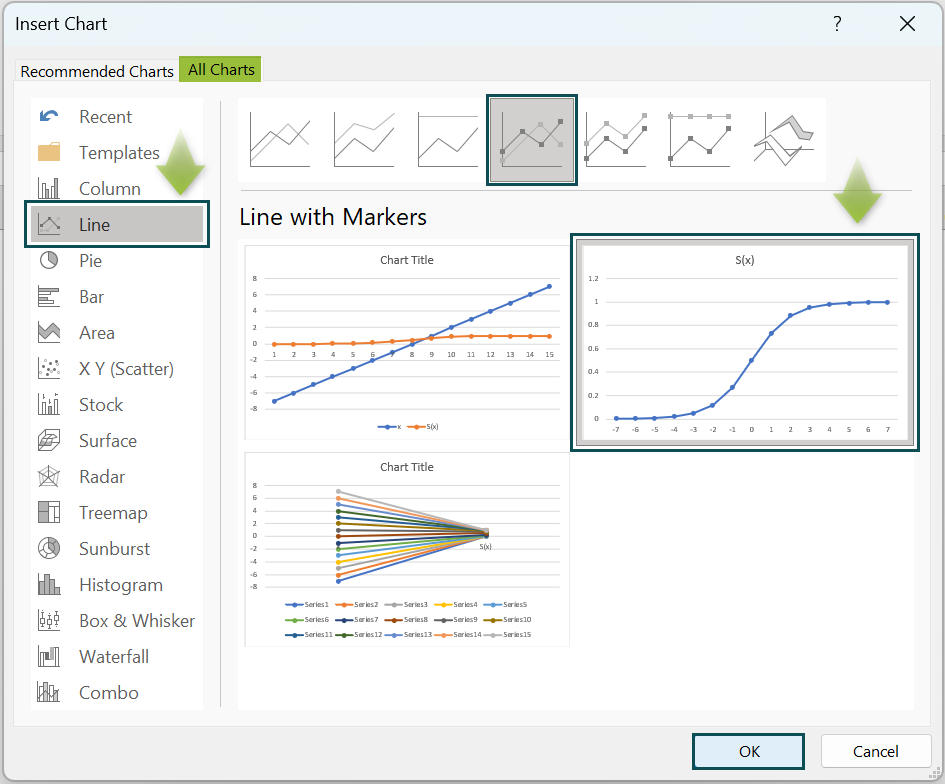
The Insert Chart window opens, where we must select the Line chart → Line with Markers chart type → The required plot option under Line with Markers chart type.
Click OK to get the below S Curve.
Otherwise, we can click a cell in the cell range A1:B16, and follow the path Insert → Line or Area Chart à Line with Markers chart to insert the required S Curve.
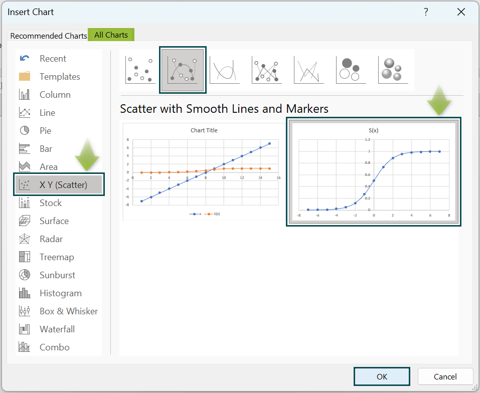
[Alternatively, select the cell range A1:B16, and select Insert → Recommended Charts to open the Insert Chart window. And then, select X Y (Scatter) → Scatter with Smooth Lines and Markers chart type → The required plot under Scatter with Smooth Lines and Markers chart type.
Click OK to get the following S Curve.]
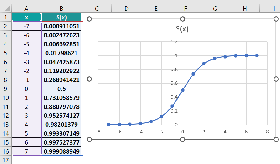
Otherwise, we can click a cell in the cell range A1:B16. And then, select the Scatter with Smooth Lines and Markers chart from Insert → Scatter or Bubble Chart to insert the required S Curve.
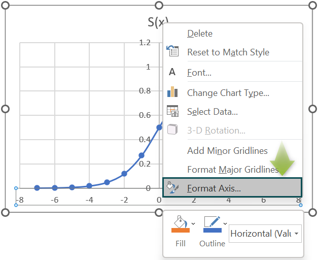
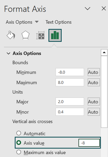
The Y-axis position differs in the two charts. So, to get the identical plot, right-click on the X-axis and select Format Axis from the context menu.
The Format Axis window opens, where we must set the Axis value under the Vertical axis crosses setting as -8 to move the Y-axis from the center to the left.
Closing the Format Axis window will give the below S Curve.
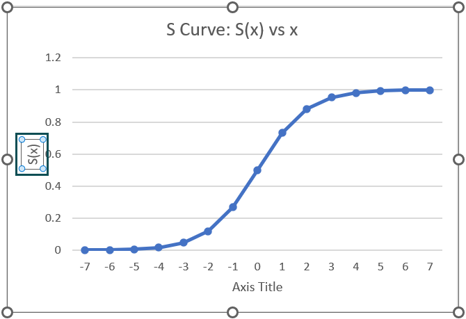
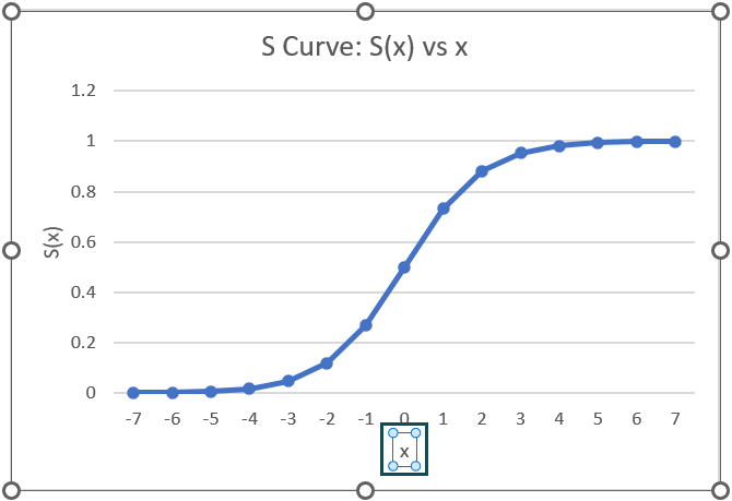
- Click the chart area to enable the Chart Elements option (‘+’ icon), and check the Axis Titles box.

And double-click on the chart and axis titles elements, one at a time, to update each element.
Thus, the above example suggests that the Sigmoid function gives the formula for an S Curve in Excel.


Examples
The following illustrations will help us use the S Curve concept in Excel effectively.
Example #1
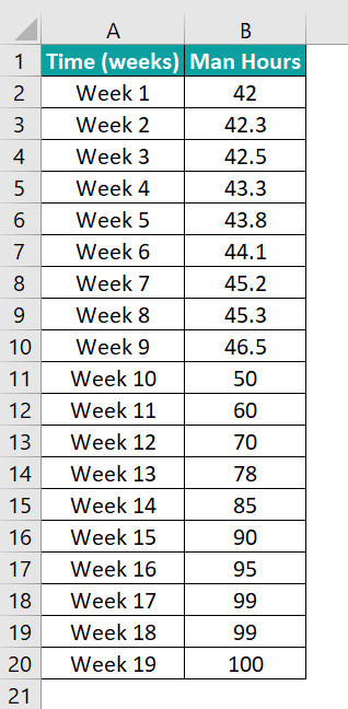
The table below shows the man-hours utilized per week. We will achieve the man-hours versus time S Curve for the given data.
The steps to get the S Curve are as follows:
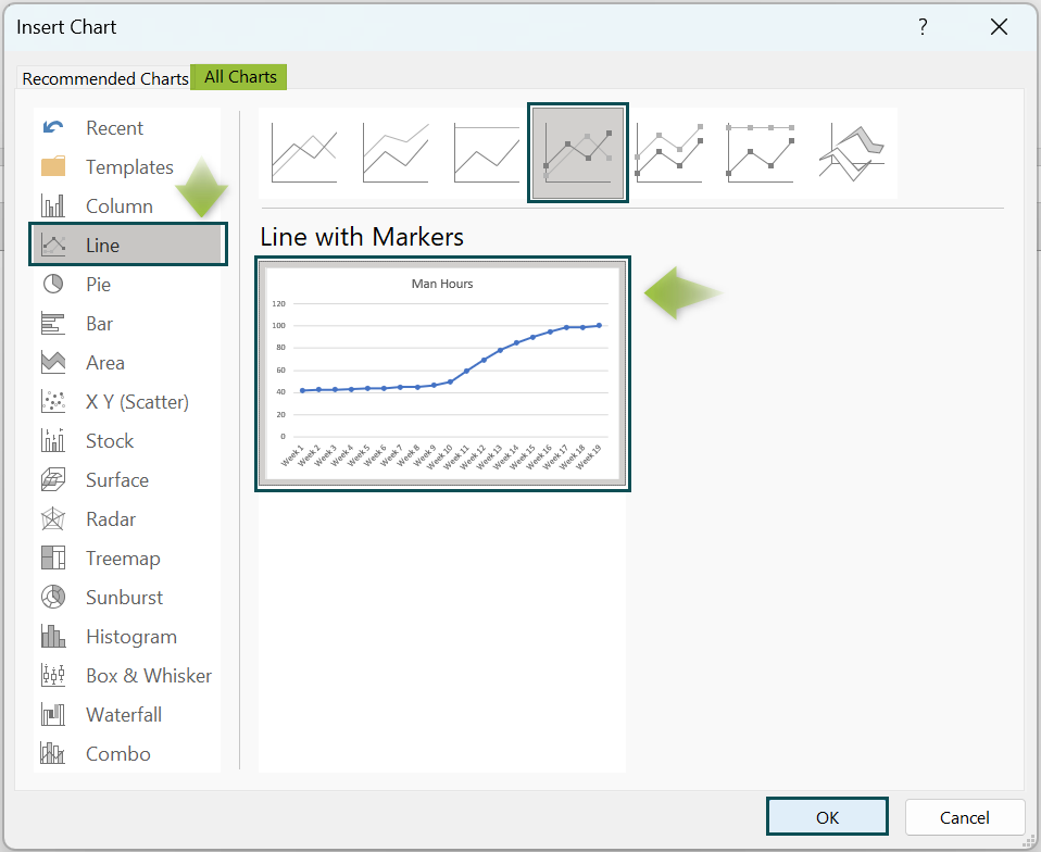
- Step 1: Click on a cell in the given data range, and select Insert → Recommended Charts to open the Insert Chart window.
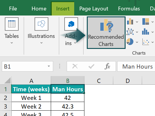
- Step 2: In the Insert Chart window, select Line chart →Lines with Markers chart type, and click OK.
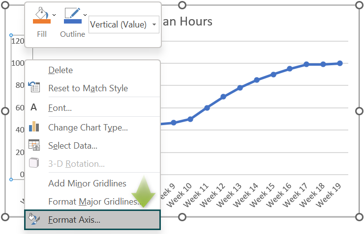
- Step 3: Right-click on the Y-axis in the chart, and select Format Axis from the context menu.
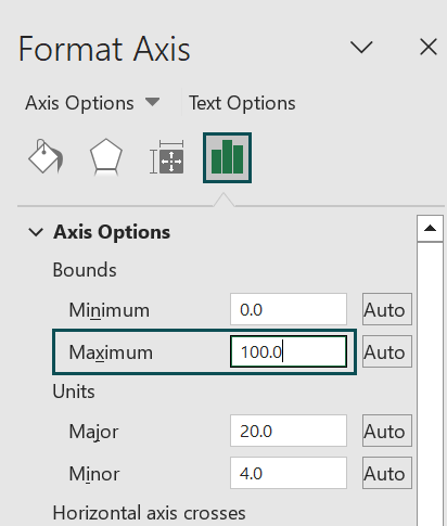
The Format Axis window will open, where we shall set the Maximum field under Axis Options as 100 to display the Y-axis units up to 100.
- Step 4: Click the chart area to enable the Chart Elements option (‘+’ icon), and check the Axis Titles option.

Finally, updating the chart and axis titles will result in the following graph.
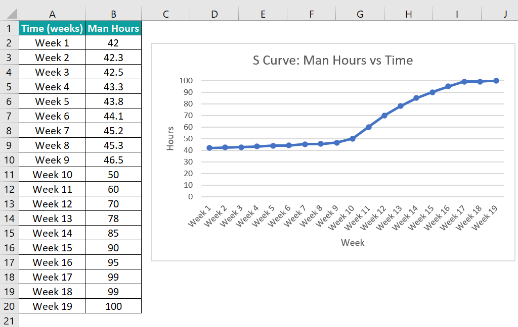
The above plot is nearly an S Curve, with the increase in man hours gradual till Week 10 and from weeks 17 to 19. And in the intermediate phase, from weeks 11 to 16, the man hours utilized per week expedites.
Example #2
We shall see an example of an S Curve in Excel planned vs actual.
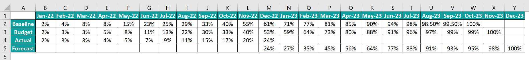
The table below shows a firm’s baseline planned percentages, the targeted budget, and the actual and forecasted figures from Jan-22 to Dec-23.
The steps to plot an S Curve in Excel planned vs actual, to perform the required analysis are,
- Step 1: Select the given data range, and click Insert → Recommended Charts.
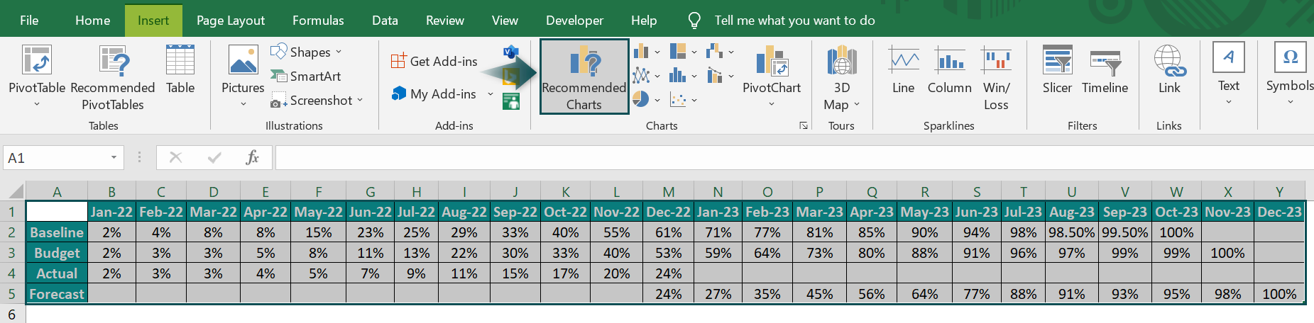
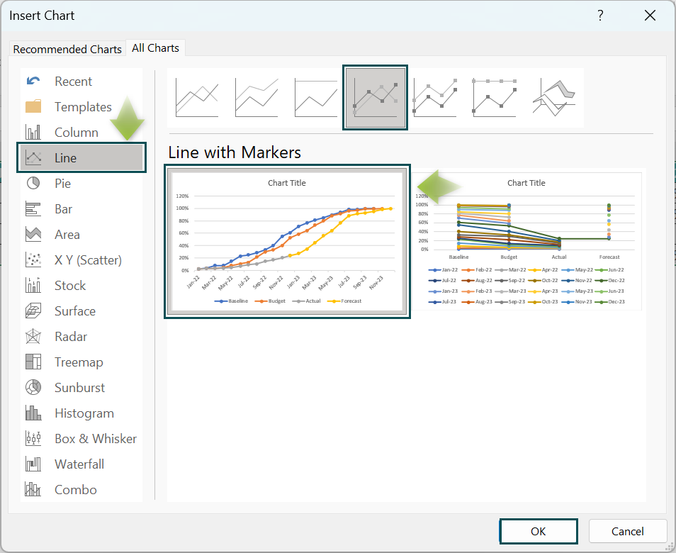
The Insert Chart window will open, where we must select Line chart → Line with Markers → Select the appropriate chart option under the Line with Markers chart.
Clicking OK will give the below S Curve.
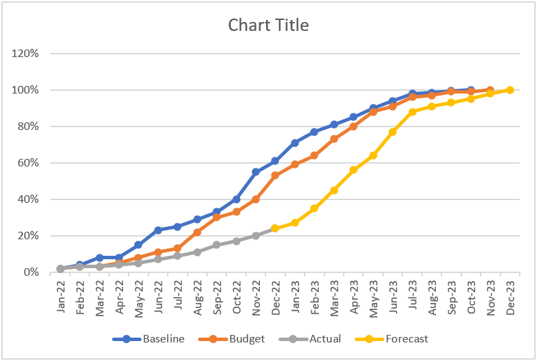
And update the chart title as shown below.
- Step 2: Click Insert → Shapes → Double arrow to insert the chosen shape in the chart.
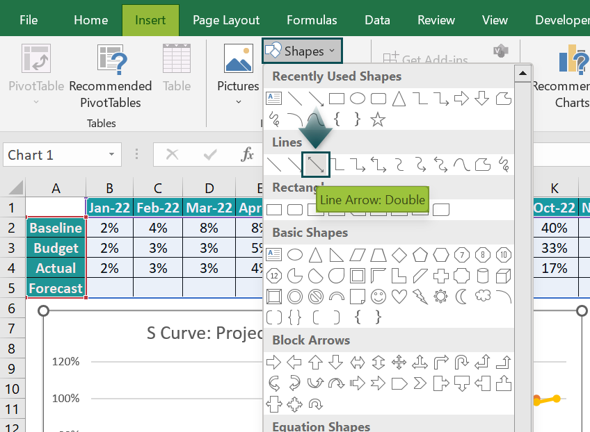
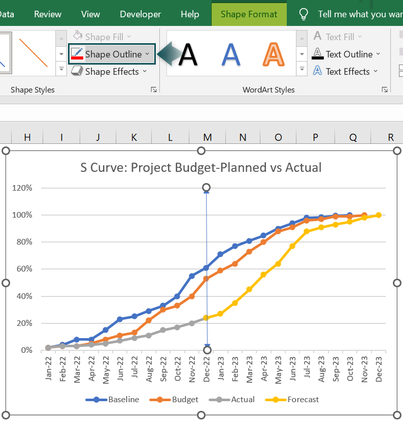
Click the inserted double arrow line to enable the Format tab, and use the Shape Outline option to change its color.
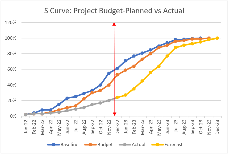
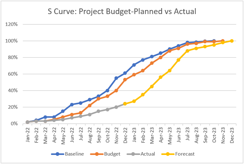
Here is how we can analyze the above planned versus actual S Curve.
In Dec-22, the deviation of the actual figures from the targeted budget is nearly 30% (highlighted by the red double arrow line). And we can determine the reasons for the deviation, such as labor strikes and material shortages, by mapping the factors with the timeline.
And then, based on the graph and the findings, we can estimate the required minimum monthly growth rate to overcome the shortfall.
Example #3
The first table shows the projects, tasks, and their start and end dates and durations.
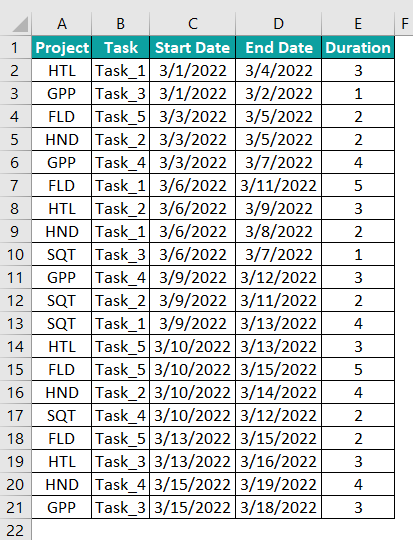
The steps to visually analyze the specified projects’ tasks’ duration allocations across a range of dates using an S Curve are as follows:
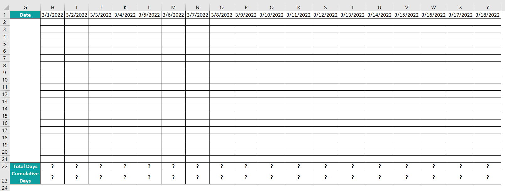
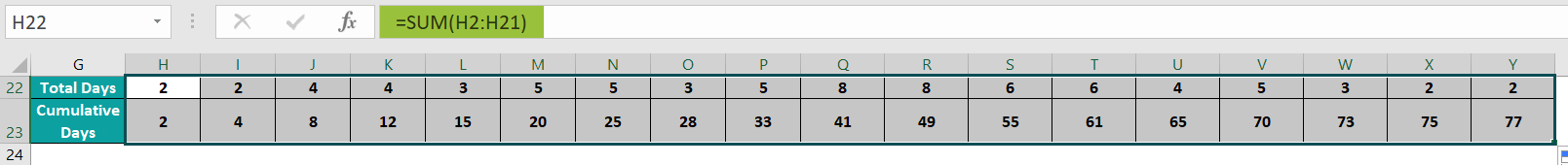
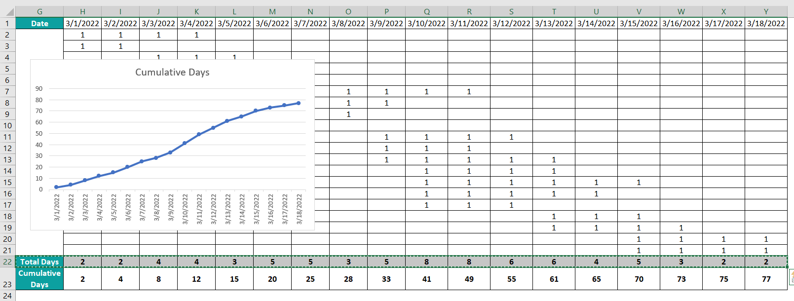
- Step 1: We shall list the dates in cells H1:Y1 of the Date row, ranging from the first start date to the last end data in the given data. And then, we shall use the cell ranges H22:Y22 and H23:Y23 to display the total and cumulative days, as shown in the above image.
- Step 2: Select the cell range A1:E21, and press Ctrl + T to convert it into an Excel table.
The Create Table dialog box will open, where we must click OK if the specified data range is correct.
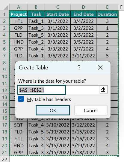
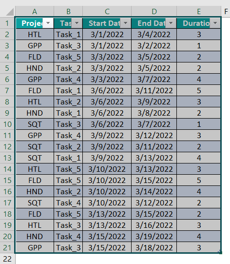
Clicking OK will result in the Excel table, as shown below.
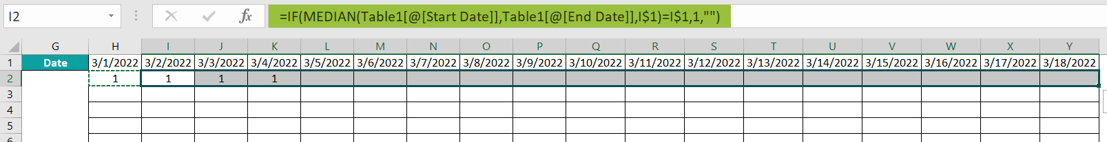
- Step 3: Select cell H2, enter the below formula, and press Enter.
=IF(MEDIAN(Table1[@[Start Date]],Table1[@[End Date]],H$1)=H$1,1,””)
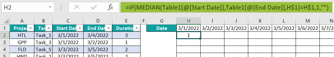
Table1 in the above formula is the Excel table name. And the terms Table1[@[Start Date]] and Table1[@[End Date]] reference the cells C2 and D2 values.
Also, as we require the row number to remain constant in all the cells in each row, we use the absolute reference in excel for the row number in the cell address H1.
- First, the MEDIAN excel formula finds the median of cells C2, D2, and H1 values, which is the value that appears in maximum cells among the three specified cells. Thus, the MEDIAN() returns the date 3/1/2022, as it appears in two cells out of the three.
- Next, the IF() checks if the MEDIAN() output equals the cell H1 value. And as the IF() condition holds, it returns 1 as the output.
- Step 4: Select cell H2, press Ctrl + C to copy the formula, and select the cell range I2:Y2.
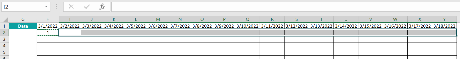
And press Ctrl + V to paste the formula in the chosen cells.
And using the fill handle in excel, enter the formulas in the cell range H3:Y21. As the formula is Excel table-based, the formulas in each row use the corresponding row values in the Excel table.
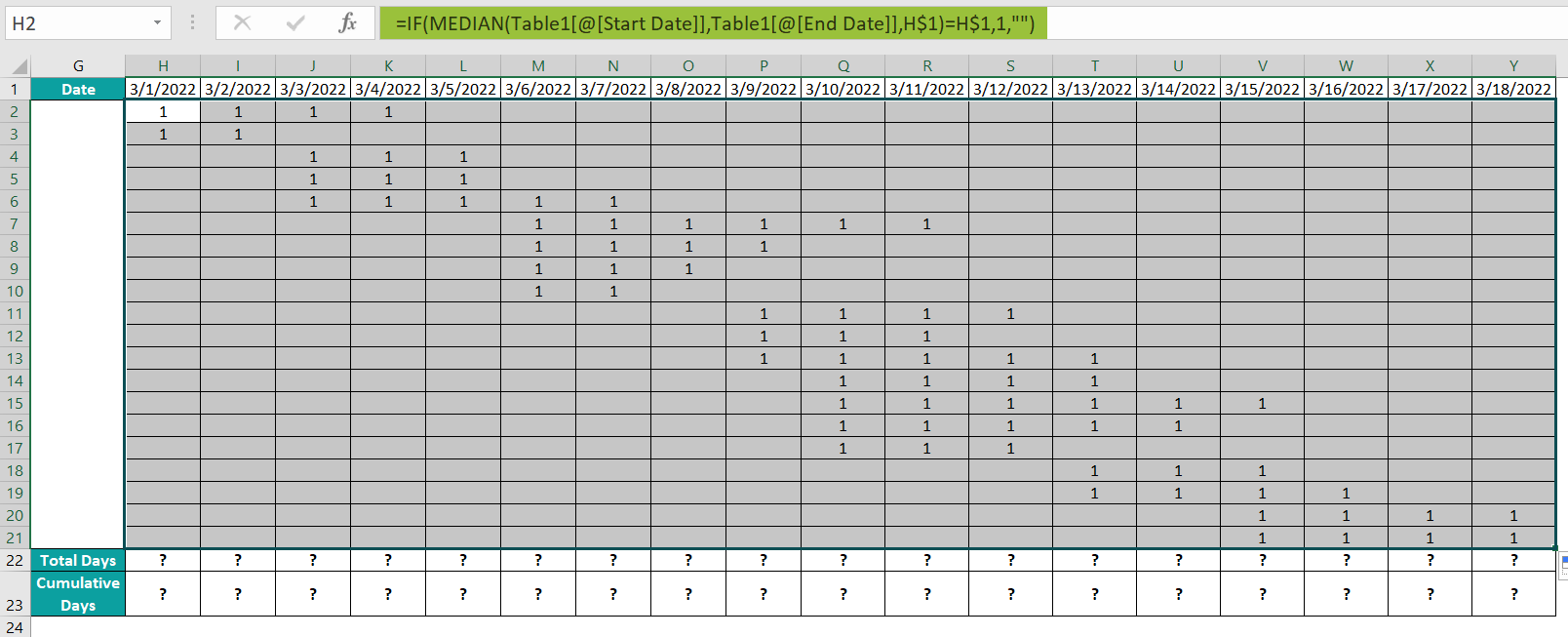
Thus, the durations get allocated for each task during each project period.
Next, we need the date-wise cumulative allocated days data to plot the S Curve required for the analysis.
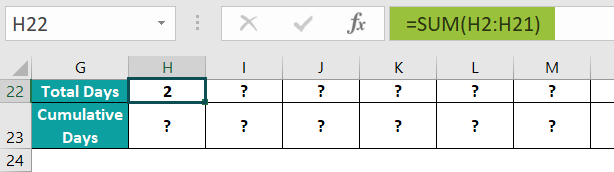
- Step 5: Select cell H22, enter the SUM excel formula =SUM(H2:H21), and press Enter.
Next, select cell H23, enter the SUM() formula =SUM($H$22:H22), and press Enter.
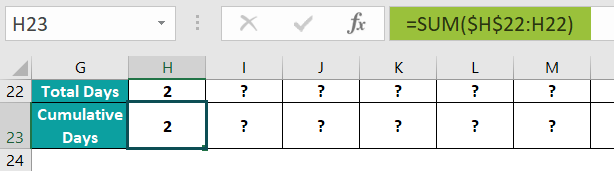
And then, select cells H22:H23, and using the fill handle, implement the formulas in cells I22:Y23.
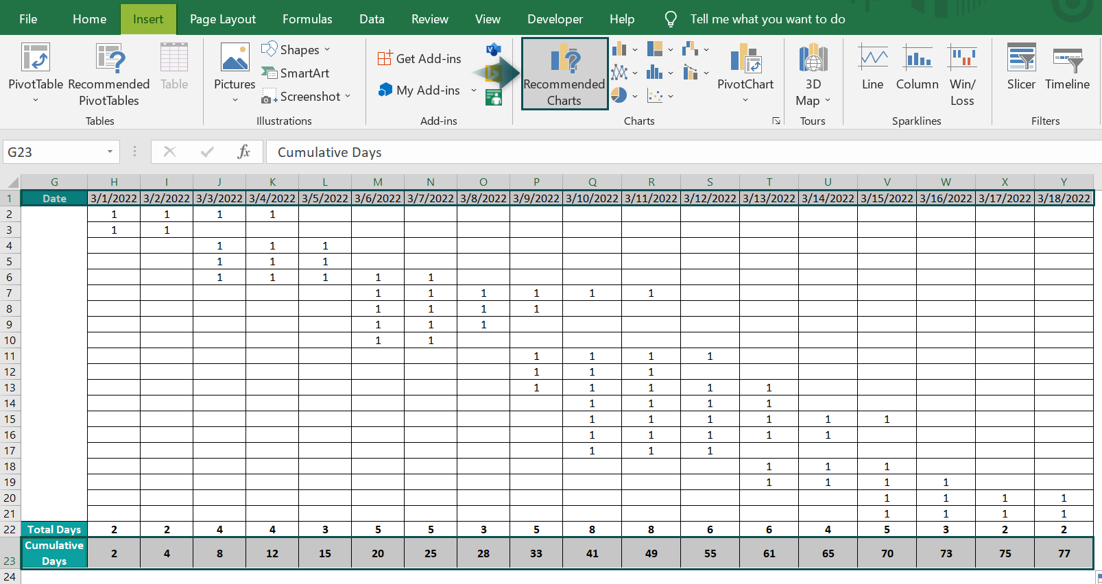
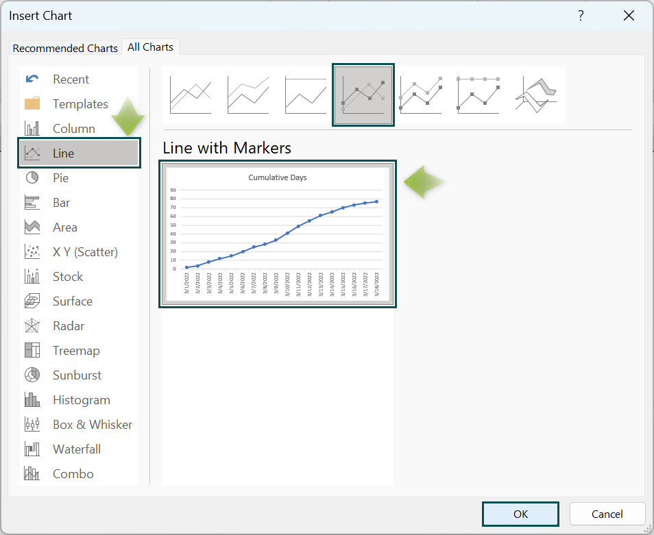
- Step 6: Select the rows Date and Cumulative Days ranges, and go to Insert à Recommended Charts to open the Insert Chart window.
Select Line chart → Line with Markers chart type.
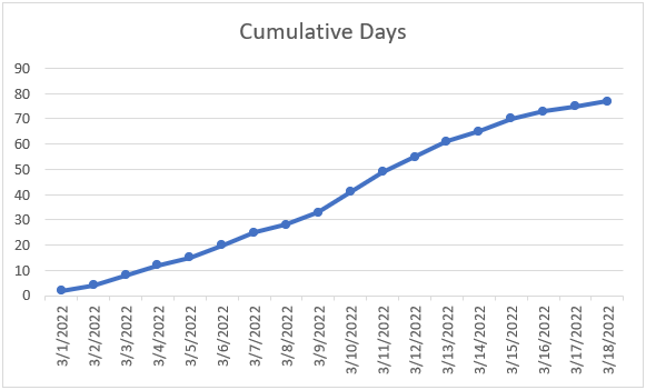
Clicking OK will result in the below chart.
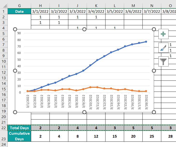
- Step 7: To introduce the Total Days S Curve to understand why the S Curve appears lumpy along the path, select the Total Days row range, and press Ctrl + C to copy the data.

Click in the chart area and press Ctrl + V to show the trend for the copied data.
- Step 8: Right-click on the Total Days data series, and choose the option to modify the series chart type from the context menu.
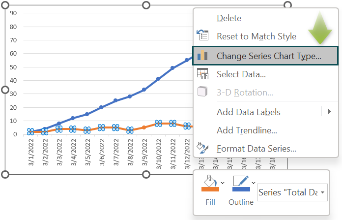
The Change Chart Type window opens.
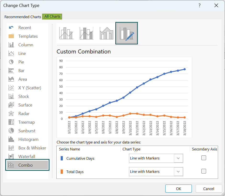
Change the Total Days data series chart type to a 2-D Clustered Column chart.
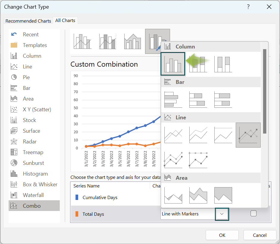
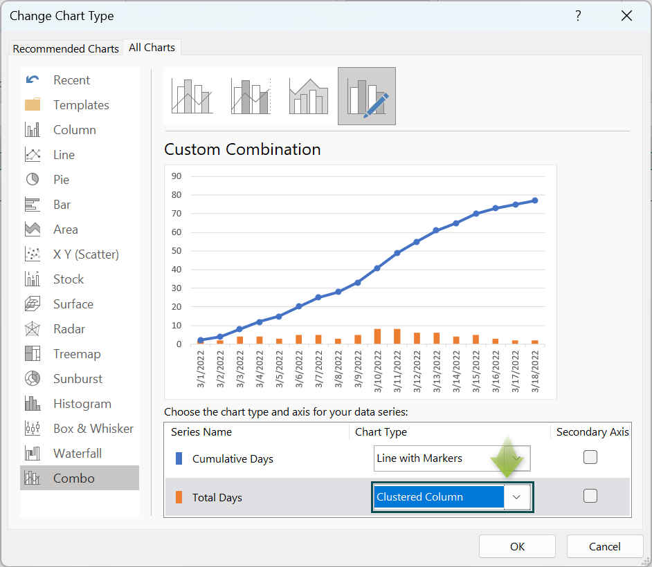
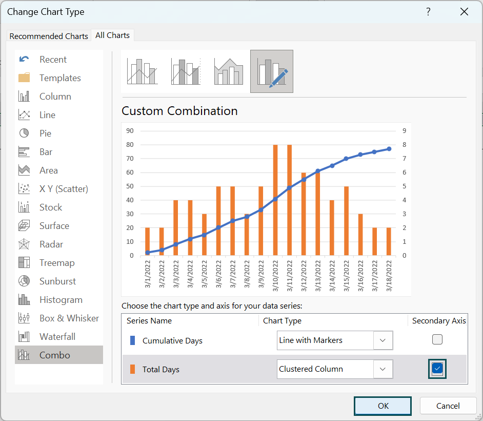
And enable the Secondary Axis option for the Total Days data series. Click OK to complete the action.
- Step 9: Click the chart area to enable the Chart Elements option, and select the Chart Title and Axis Titles options.
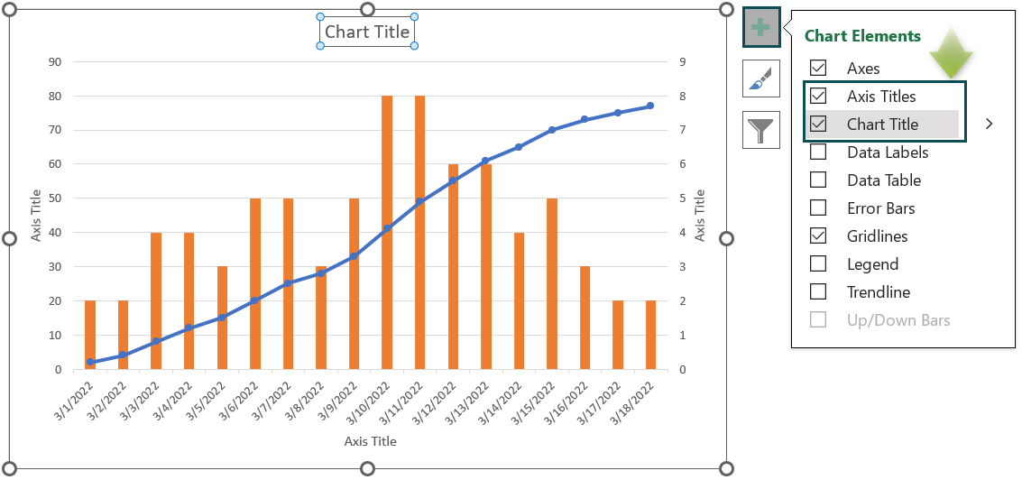
And updating the chart and axis titles will result in the below chart.
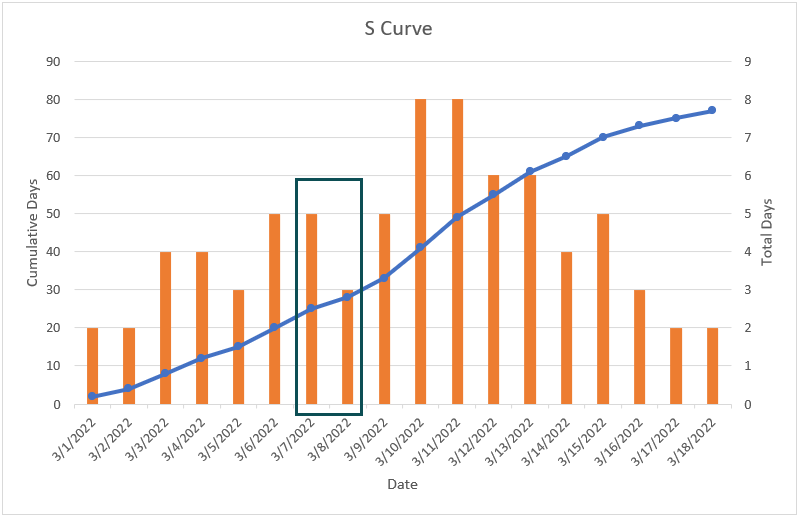
The above plot shows momentum across the dates 3/7/2022 and 3/8/2022, leading to the lumpiness in the S Curve (Highlighted in the above image).
Important Things To Note
- The Sigmoid function represents the S Curve in Excel.
- The inflection points in an S Curve can be due to factors including labor strikes, material shortages, market saturation, and funding changes.
- When using the S Curve to review aspects such as project progress, ensure to plot the cumulative progress over time.
Frequently Asked Questions (FAQs)
We can create S Curve in Excel for construction using the following steps, shown with an example.
Consider the below-mentioned construction work scope and the amounts allocated for each task.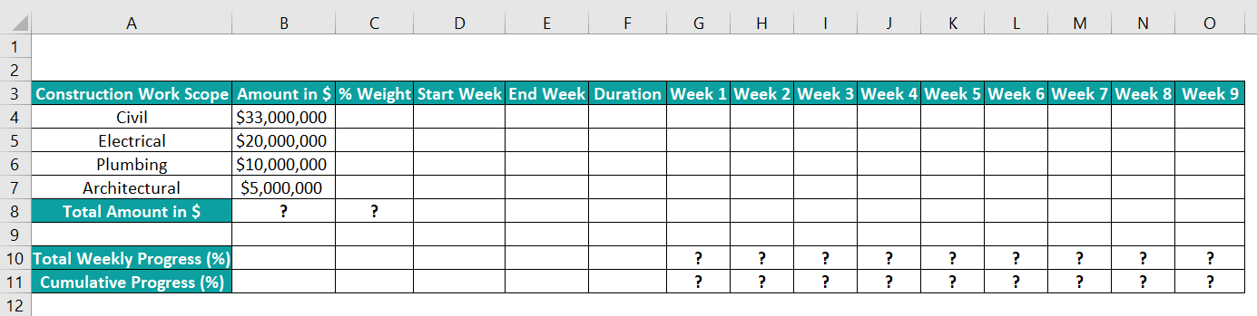
The steps to review the construction work progress using an S Curve visually are as follows:
• Step 1: Select cell B8, enter the SUM() formula =SUM(B4:B7) to determine the total amount allocated for all the tasks, and press Enter.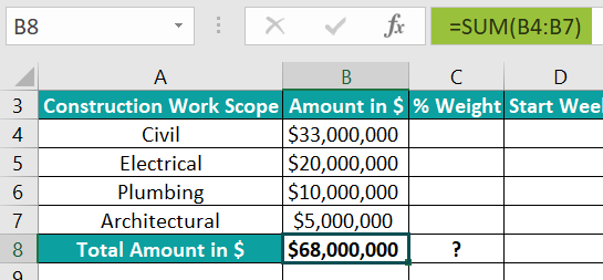
• Step 2: We need to calculate each task’s allocated amount as a percent weightage.
So, select cell C4, enter the formula =B4/$B$8, and press Enter.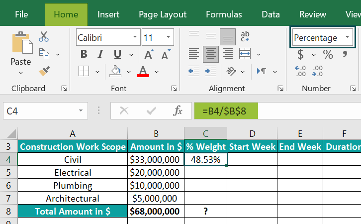
Using the fill handle, enter the formula in cells C5:C7. The values in cell range C4:C7 are percentages.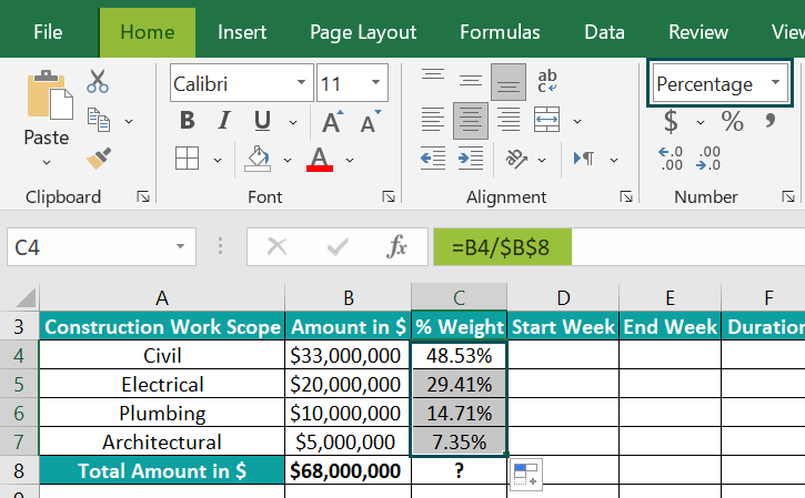
Select cell C8, enter the SUM(), press Enter, & SUM() will return 100%, i.e., total percent weightage.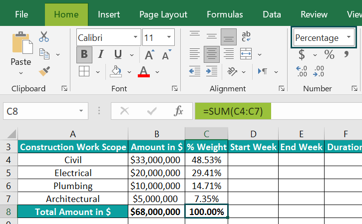
• Step 3: Update the task start and end week and duration data for each task in the cell range D4:F7.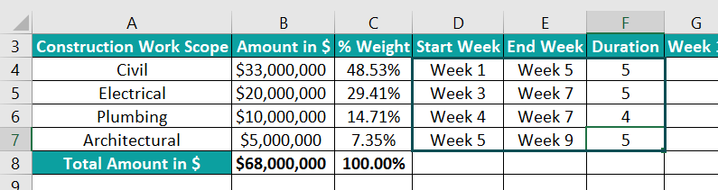
We shall now equally distribute the percent weightage across the specified duration (weeks) for each task. And the data format of the cell ranges G4:O7 and G10:O11 is Percentage in the Home tab à Number Format.
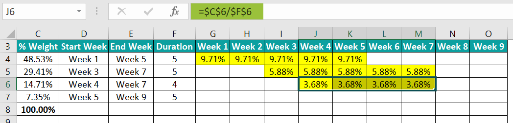
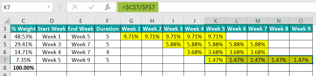
• Step 4: Highlight the cell range from the start to the end weeks specified in row 4, as shown below.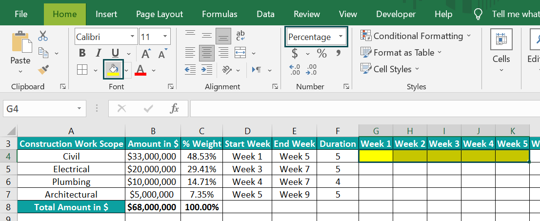
Select cell G4, enter the formula =$C$4/$F$4, and press Enter.
We use the absolute cell references as we require the same value in all the highlighted cells in the specific row. Next, using the fill handle, update the values in cells H4:K4.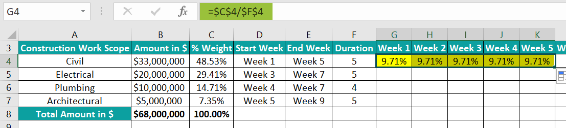
And repeat the process for each task in rows 5 to 7.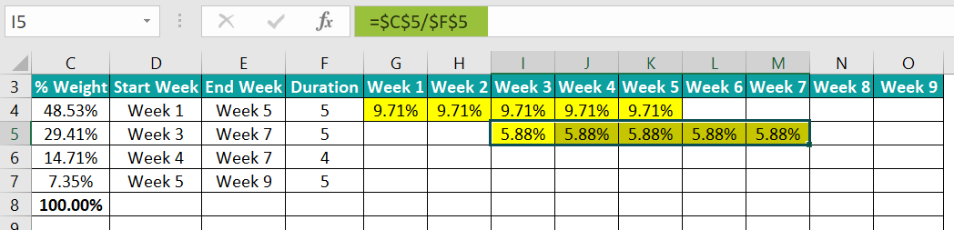
• Step 5: We shall calculate the total weekly percentage of work completed in row 10. And for that, select cell G10, enter the SUM() formula =SUM(G4:G7), and press Enter.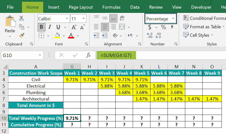
And we require cumulative work progress each week. So, select cell G11, enter the SUM() formula =SUM($G$10:G10), and press Enter.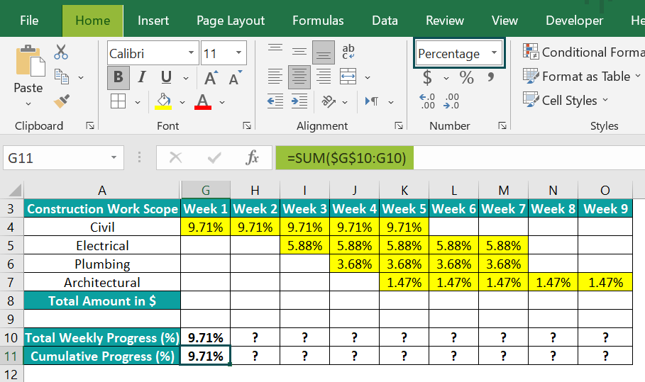
Next, select cells G10:G11, and using the fill handle, enter the formulas for all the weeks.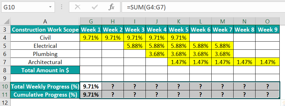
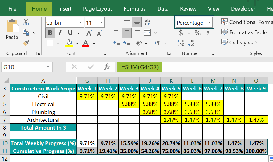
• Step 6: We must plot the S Curve for the weekly cumulative progress in the construction work. So, for that, select cell ranges G3:O3 and G11:O11, and follow the path Insert → Recommended Charts.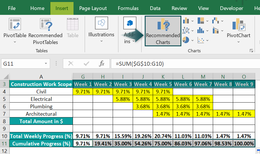
The Insert Chart window will open, where we can select Line chart → Line with Markers chart type.
Clicking OK will give the below chart.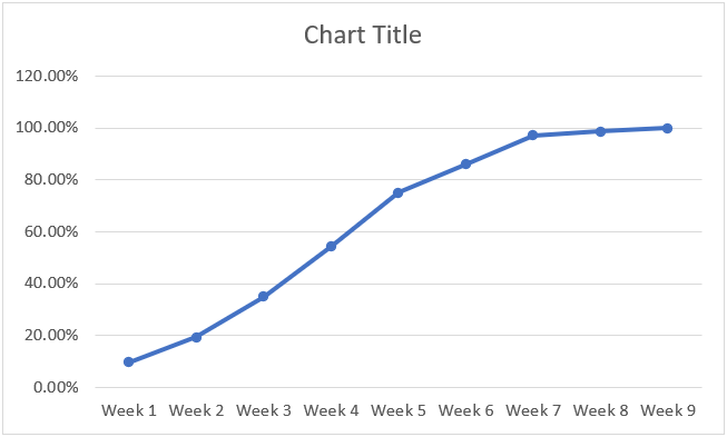
• Step 7: Click the chart area, and select Chart Elements → Axis Titles.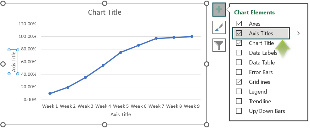
Thus, the final S Curve for construction after updating the chart and axis titles, and resizing the chart will be as shown below: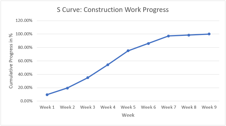
The difference between S Curve and histogram in Excel is that the S Curve displays the cumulative data. And the graph increases at each point along the curve, indicating the accumulation of assets and costs.
On the other hand, the histogram represents periodic data for the specified period.
The inputs for S Curve in Excel are a monitoring entity and a time interval.
The entity can be cost, progress, man-hours, or task duration. And typically, we will monitor, review, analyze, and forecast the entities over time using the S Curve.
Use this S Curve In Excel Template to follow along with the examples in this article.
Download Excel Template