


Introduction – AI‑powered Excel charts bullet graphs heatmaps
Visuals tell the story faster than tables, but many analysts spend more time choosing chart types than interpreting results. AI‑powered Excel charts bullet graphs heatmaps change that by suggesting the right visual for the metric, building it, and applying business‑friendly formatting in seconds. For a finance analyst preparing monthly performance packs, that means fewer fiddly formatting edits and more time testing assumptions and writing insights.
This article shows how AI can recommend and create bullet graphs for performance vs target and heatmaps for matrixed comparisons, how to validate the automated output, and how to adapt AI suggestions to governance and printing constraints.
Why AI Helps with Chart Choice – AI‑powered Excel charts bullet graphs heatmaps
Chart choice is a function of data structure, audience, and question. AI Excel chart selection uses simple rules: if the goal is performance vs target, propose a bullet graph; if the goal is cross‑sectional intensity across two dimensions, propose a heatmap. AI speeds the mapping from question to chart by inspecting column types and distributions and recommending aggregation logic such as SUM, AVERAGE, or MEDIAN.
AI features can generate visuals and suggest aggregations when the model is well structured. That reduces the cognitive load of manual trial and error while preserving analyst control over measure definitions.
How to Generate Bullet Graphs and Heatmaps with AI in Excel
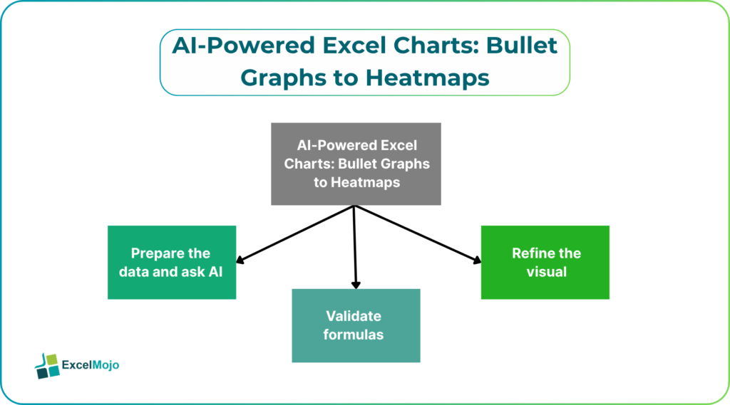
A straightforward workflow produces repeatable, audit‑ready visuals.
- Prepare the data
Convert source ranges to tables, ensure date columns are real dates, and create verified measures for revenue, cost, margin, and target. AI reads structured tables more reliably.
- Ask the AI
A clear prompt such as “Create a bullet chart that shows actual margin vs target by product and a heatmap of revenue by region and product” yields a first draft. The AI will select the measure and aggregation, build the visual, and apply basic formatting.
- Validate formulas
Check that the AI used the intended measure (for example, a [Margin %] measure defined as (Revenue-Cost)/Revenue) and not a simple column ratio. Use a sample pivot or SUMPRODUCT check for totals.
- Refine the visual
- Adjust axis ranges, color scales, or target markers; then save the chart as a template or replicate via VBA/Office Scripts for consistency.
Thus, AI assists in report creation by reading models and suggesting visuals, provided the semantic model and measures are accessible. For teams, saving templates and documenting measure definitions ensures AI‑created charts remain consistent across reports.
Example: From Prompt to Production Visual
As an example, let us look at the following scenario. An analyst needs two visuals – a performance bullet for margin and a regional product revenue heatmap.
- Data layout: A table named Sales with columns Date, Region, Product, Revenue, Cost, TargetMargin. Create measure MarginPct = (SUM(Sales[Revenue]) – SUM(Sales[Cost])) / SUM(Sales[Revenue]).
- Prompt to AI: “Create a bullet chart using MarginPct by Product with target as TargetMargin; create a heatmap of SUM(Revenue) with Region on rows and Product on columns.”
- AI action: builds a bullet‑style bar that marks actual margin, draws a thin target marker and a qualitative banding (poor/ok/good), and creates a conditional‑format heatmap on a pivot or matrix visual using a diverging color scale.
- Validation: compare SUM(Revenue) in the heatmap to a pivot table using the same filters and confirm target markers align with the target measure; verify formatting prints legibly.
This pattern follows AI‑assisted visualization practices where the AI suggests visuals and the analyst verifies business logic and presentation.
Best Practices and Pitfalls
AI accelerates visual creation but can introduce subtle risks.
- Verify measure mapping. AI may infer a column as the metric but choose a different aggregation; always confirm the DAX or formula used for a measure.
- Watch color semantics. For financial reports, red typically denotes downside; ensure AI color scales follow corporate accessibility and printing rules. Test color ramps in grayscale for print.
- Avoid over‑aggregation. AI might aggregate at an unintended grain; check grouping levels to avoid hiding variance or outliers.
- Maintain an audit trail. Save original AI prompts, generated DAX or formulas, and any templates used so the process is reproducible for auditors or stakeholders.
These governance and validation points align with industry guidance on AI in analytics and the need for analyst oversight when using automated visualization tools.
Two focused snippets to apply immediately.
- Bullet chart logic (conceptual): create a single horizontal bar for actual, overlay a vertical line for target, and add three shaded bands for performance thresholds. In Excel this can be implemented with stacked bar series for bands, a bar for actual, and an XY series for the target marker.
- Heatmap logic: build a pivot or matrix of aggregation values, then apply conditional formatting with a two‑color or three‑color scale. Use normalization like Z‑score or percent of max when comparing across products with very different scales to improve interpretability.
These formula and layout tactics are standard when translating AI suggestions into robust, reproducible charts.
Frequently Asked Questions (FAQs)
Can AI create complex visuals like bullet graphs and heatmaps without manual work?
Yes. When the data is structured and measures are defined, AI tools can generate both visual types and apply suitable formatting. The analyst must validate measure definitions and formatting for audience and printing needs.
Are AI‑generated charts production‑safe for executive packs?
AI drafts can be production ready after validation. The analyst should confirm measure logic, ensure color accessibility, and save chart templates to maintain consistency across packs.
How do I ensure AI follows corporate visualization standards?
Provide the AI with clear instructions or templates, and maintain a style guide with color hex codes, font sizes, and axis treatments. Save chart templates and use them as the standard output target.
Can AI help with visual interpretation or narrative captions?
Yes. Many AI assistants will propose short narratives or key insights alongside visuals. Treat these as initial drafts and refine language to reflect causal understanding and limitations.