
Introduction
Dashboards are built by analysts with multiple visuals stacked for different views: one chart for revenue by region, another by product, and a third by customer segment. Changing each view manually is tedious. Power BI field parameters Copilot dynamic axes solve this by letting users switch the X‑axis or Y‑axis of a single chart on the fly, using a slicer that points to a small list of fields or measures. When paired with Copilot, the pattern can be accelerated: analysts describe the desired dimension switches and Copilot helps draft the DAX logic or layout that underpins the dynamic axis.
This article explains how to use Power BI field parameters with Copilot to design AI powered Power BI field parameters that let users toggle between dimensions such as Region, Segment, and Category or between measures such as Revenue, Profit, and Cost on the same visual. We learn how Copilot Power BI dynamic axes workflows can cut the need for redundant visuals, improve storytelling, and keep the canvas clean. Power BI documentation on field parameters states that the feature creates a hidden table in the model, binds it to a slicer, and lets that slicer control the axis or measure in the visuals. This massively reduces the need for bookmarks or unpivoted data tables. For analysts, that means more flexible, user‑driven reports with fewer manual configuration steps.
How Field Parameters Create Dynamic Axes
Field parameters in Power BI are a modeling construct that exposes a list of fields or measures as a slicer‑driven control. Once defined, a field parameter can:
- Control the X‑axis of a chart so that users toggle between categorical fields such as Region, Segment, or Product.
- Control the Y‑axis so that the same chart switches between measures such as Sum of Revenue, Profit Margin, or Average Cost.
The typical lifecycle is:
- In the Modeling tab, select New parameter -> Fields and name the parameter (for example, DynamicDimension or DynamicMeasure).
- Add the relevant fields or measures (columns or measures) to the parameter list.
- Place a slicer for that parameter on the page.
- Wire the slicer to the visual’s X‑axis or Y‑axis field well.
Behind the scenes, Power BI generates a small hidden table whose rows correspond to the selected fields. Then, the chart dynamically updates its axis based on the slicer choice. This is the core of AI powered Power BI field parameters and shows how one visual can behave like several, depending on the user’s selection.
How to Accelerate Design with Copilot
Copilot does not directly create or edit field parameters in the current Fabric exposure, but it can accelerate the design and DAX logic around them.
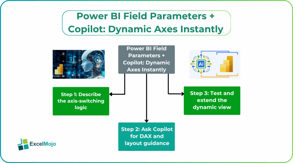
Step 1: Describe the Axis‑Switching Logic
Write down the intended behavior:
- “Users should be able to toggle the bar chart’s X‑axis between Region, Segment, and Product.”
- “A line chart should let users switch the Y‑axis between Revenue, Profit, and Cost using the same slicer.”
These plain‑language rules form the basis for AI‑assisted prompts.
Step 2: Ask Copilot for DAX and Layout Guidance
A strong prompt for Power BI field parameters Copilot dynamic axes includes:
- The table and column names.
- The list of fields or measures to include in the parameter.
- The desired behavior (X‑axis vs. Y‑axis, which visuals are affected).
Example:
“In Power BI Desktop, I want to create a clustered bar chart where the X‑axis is controlled by a field parameter that lets users choose between Region, Segment, and Product. The Y‑axis should be the sum of Revenue.
- Suggest how to set up the field parameter in the Modeling tab.
- Show how to wire the slicer to the visual’s X‑field.
- Provide the steps to ensure the chart updates when the slicer changes without duplicates or performance issues.”
Copilot typically replies with a clear, step‑by‑step outline, including how to add Region, Segment, and Product to the new field parameter, how to place the slicer, and how to bind the chart’s X‑axis to the parameter’s generated field. This is the essence of Copilot Power BI dynamic axes support.
Step 3: Test and Extend the Dynamic View
After implementing the parameter and slicer, test the chart with different selections and ensure that filters and page‑level slicers still behave as expected. Extend the pattern to additional visuals or measures if the use case expands.
Practical Example: A Multi‑Dimensional Sales Dashboard
Suppose a sales team tracks performance across several dimensions and wants a compact, user‑driven view. Using Power BI field parameters with Copilot, the team can:
- Create a field parameter SalesDimension that includes Region, Segment, and Product.
- Add a slicer for SalesDimension and bind it to the X‑axis of a clustered bar chart.
- Use another field parameter SalesMetric for Revenue, Profit, and Cost, and wire it to the Y‑axis of the same or a second chart.
- Use Copilot to draft short notes or tooltips that explain what each axis‑switch means, such as “Switching to Segment breaks down revenue by customer type instead of geography.”
This workflow is a practical example of AI powered Power BI field parameters and shows how Copilot Power BI dynamic axes can reduce clutter while increasing interactivity.
Pitfalls and Best Practices
Power BI field parameters Copilot dynamic axes introduce a few subtle issues.
One common problem is misaligned field types. Mixing categorical columns with measures or including incompatible fields in the same parameter can cause errors or unexpected behavior. Analysts should group similar types (dimensions vs. measures) into separate parameters and keep the list focused.
Another risk is performance overhead for Power BI Field Parameters Copilot Dynamic Axes. Field parameters create an additional table and increase the complexity of visual bindings, especially when used across many visuals. Teams should test performance on a representative data set and avoid redundant parameter‑driven charts where simple slicers suffice.
A third issue is user confusion. If the axis‑switching logic is not clearly labeled or documented, stakeholders may not understand what the chart is showing. Teams should pair dynamic X‑Y axes with clear titles that update with the parameter value and, where possible, use Copilot‑assisted narrative text to explain the current view.
Frequently Asked Questions (FAQs)
Power BI field parameters Copilot dynamic axes can replace some bookmark‑based navigation by letting users switch axes or measures within a single visual, but they do not fully replace bookmarks for multi‑page story flows or complex filter combinations. Many teams use both, with bookmarks for page‑level stories and field parameters for within‑visual flexibility.
AI powered Power BI field parameters reduce the need for multiple nearly identical visuals, each tied to a different dimension or measure. A single chart paired with a field‑parameter slicer can take the place of several static charts, freeing up canvas space and making the report easier to maintain.
Field parameters are supported on most Power BI visuals that allow axes (bar charts, line charts, etc.), but Copilot’s role is limited to suggesting setup steps and DAX‑style explanations rather than directly manipulating the parameter. The visual compatibility is governed by Power BI’s own field‑parameter support, not by Copilot.
No, Power BI field parameters with Copilot should not replace proper ETL‑level unpivoting. They are best used for presentation‑layer flexibility on already‑structured measures and dimensions, while real‑world data‑modeling complexity should be handled in the underlying data‑engineering pipeline.