


Introduction – Excel Data Bars AI in‑Cell Visualization
Across finance and operations teams, spreadsheets often end up with long lists of transactions, KPIs, or scores that look similar at a glance. A user can quickly scan a column of numbers, but it is harder to see where the outliers or trends sit without creating a separate chart. A simple but powerful tool is Excel Data Bars, which draw colored bars inside the cells so each value takes up space proportional to its size. When combined with AI‑driven Excel Data Bars AI in‑cell visualization, the user can ask an assistant to suggest which ranges to format, how to align the bars, and how to read the patterns, rather than trying everything manually. By pairing Excel Data Bars with AI visualization and AI in‑cell Data Bars Excel, teams can turn a raw table into a quick‑scan, insight‑rich layout without leaving the sheet.
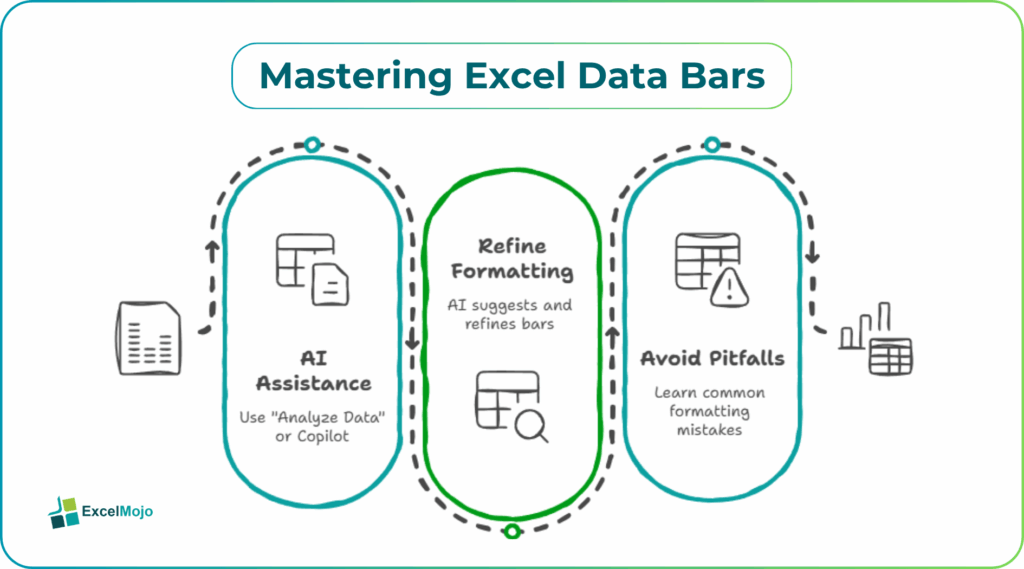
This article explains how to apply Data Bars in Excel, how to use AI tools such as “Analyze Data” or Copilot to suggest and refine the formatting, and how to avoid common formatting pitfalls. Excel’s conditional‑formatting help explains that Data Bars are part of Conditional Formatting. They can use either gradient‑fill or solid‑fill bars, whose length depends on the value relative to the rest of the selected range. That means smart Data Bars visualization Excel AI can generate both the layout and a short explanation of what the bars are showing for users’ understanding.
How Excel Data Bars AI in‑Cell Visualization Work
Excel Data Bars are a type of Conditional Formatting rule that turns numeric values into short horizontal bars directly inside the cell. Instead of reading every number, the user can see which rows are higher or lower just by the length of the bar.
Typical behavior includes:
- The lowest value in the selected range has the shortest visible bar, and the highest value has a bar that fills most of the cell.
- The bar can be drawn with a gradient fill (a smooth color ramp) or a solid fill (a uniform‑color strip), depending on the chosen style.
- The rule can be customized to treat the Minimum and Maximum either as the actual smallest and largest values or as fixed numbers or percentages.
Data Bars update formatting automatically when the values change. They are useful for dynamic reports that refresh daily or monthly. This is the core idea behind AI in‑cell Data Bars Excel and why they shine in dashboards where speed of interpretation matters more than pixel‑perfect design.
How to Apply and Customize Data Bars
Applying Data Bars in Excel is straightforward. It can be paired with AI suggestions to speed up the process.
A typical workflow is:
- Select the numeric range where the bars should appear (for example, a column of monthly sales).
- On the Home tab, choose Conditional Formatting > Data Bars and pick a style (blue gradient, green solid, etc.).
- If needed, use Conditional Formatting -> Manage Rules to tweak the Minimum and Maximum or change the color.
Many guides show how to create custom data bars with specific minimum and maximum values or formulas. When the user adds Excel Data Bars AI formatting to the mix, they can ask an AI assistant to suggest which columns should get bars and how to style them (for example, using solid fills for KPIs and gradient fills for raw scores).
How AI Can Guide the Data‑Bar Layout
Smart Data Bars visualization Excel AI works best when the user describes the table and the goal and lets AI suggest a formatting pattern.
A typical workflow is as follows:
- Describe the data, such as “I have a table of sales reps with monthly sales, margin, and order count. I want to see which reps are strong in each metric at a glance.”
- Ask the assistant to suggest where to apply Data Bars (for example, “Apply Data Bars to sales and order count, but not to margin because it is already in percentage form”).
- Use the assistant’s recommendations to apply the formatting and then adjust the colors or thresholds if needed.
Some versions of Excel also include an Analyze Data or Ideas‑style AI feature that can automatically create charts and visualizations for a selection, and users can then translate that feedback into Data Bars where they want in‑cell visuals instead of separate charts. This is the practical side of Excel Data Bars AI in‑cell visualization and shows how AI‑driven insight can sit alongside conditional formatting rather than replace it.
Practical Example: Sales Performance Heat‑Map in a Table
A common use case is a monthly sales report where each row is a salesperson and several columns show different metrics. Using Excel Data Bars with AI visualization, the pattern becomes:
- Mark the Sales and Order Count columns for Data Bars, leaving the numeric but percentage‑based Margin column as plain text for now.
- Ask AI for a suggestion such as “Apply solid‑fill green Data Bars to sales, and solid‑fill blue to order count, so that the strongest performers are easy to spot.”
- Apply the suggested colors and adjust the bar style to show the trend at a glance while keeping the actual numbers readable.
This workflow is a concrete example of AI in‑cell Data Bars Excel and demonstrates how a simple formatting layer can compress what would otherwise be a separate chart into the same row‑based layout.
Pitfalls and Best Practices
Excel Data Bars AI in‑cell visualization can clarify a table but also introduce subtle issues.
One common problem is cluttering the sheet. Adding bars to too many columns can make the layout busy and harder to read. Best practice is to choose only the most important numeric metrics (for example, revenue and volume) and leave percentages, rates, or text‑heavy fields as plain values.
Another risk is misleading scaling. If the Minimum and Maximum are set to fixed values that do not match the current range, some bars may look uniformly short or long even though the underlying numbers vary. Users should usually keep the default Automatic range unless they have a clear business reason to lock the scale.
A third issue is over‑relying on AI suggestions. An assistant may recommend bars for columns that are better left as straight numbers or graphs, especially when the data is highly skewed or sparse. Analysts should still test the formatting with real‑world data and ask stakeholders how easy it is to read.
Frequently Asked Questions (FAQs)
Excel Data Bars AI in‑cell visualization cannot fully replace traditional charts, but it can complement them. Data Bars are best used within tables to show relative ranks, while bar charts, line charts, and other visuals are better for detailed trend analysis and external reporting.
Excel Data Bars with AI visualization use Excel’s built‑in Conditional Formatting engine, which is fast and consistent. Manual in‑cell charts (for example, using the REPT function or custom shapes) are more flexible but harder to maintain. AI‑driven suggestions can help decide which approach is right for each metric.
AI in‑cell Data Bars Excel formatting suggestions can be safe if they are tested on representative data and do not change the meaning of the numbers. Users should also ensure the layout is still legible at smaller zoom levels and on shared devices.
Yes, AI‑driven tools can generate short explanations of what the Data Bars show, such as which rows are outliers or which columns are most extreme. Those notes can be added as small text boxes or comments next to the table, turning the in‑cell visualization into a guided insight.
Recommended Articles
Continue with these related resources when you want the next practical step in this topic.
- Format Cells In Excel
- Data Validation In Excel
- Conditional Formatting in Excel
- Format Painter In Excel
- Border In Excel
Explore the full Excel Formatting guide or browse Excel Resources.