


Introduction
Business teams often know what their key metrics are, but they struggle to answer the next question: “What is really driving this number up or down?” A common instinct is to slice the data by a few obvious fields—region, product, or salesperson—and hope the pattern becomes clear, but this manual exploration is slow and can miss subtle interactions. Power BI Key Influencers with Copilot Driver Analysis helps by combining the built‑in Key Influencers visual, which uses machine learning to rank the top contributors to a measure, with Copilot‑driven narratives that summarize those drivers in plain language. When paired with Power BI Key Influencers Visual and Copilot in Power BI Analysis, the result is a more systematic way to perform Driver Analysis in Power BI without needing to write complex DAX or statistical models.
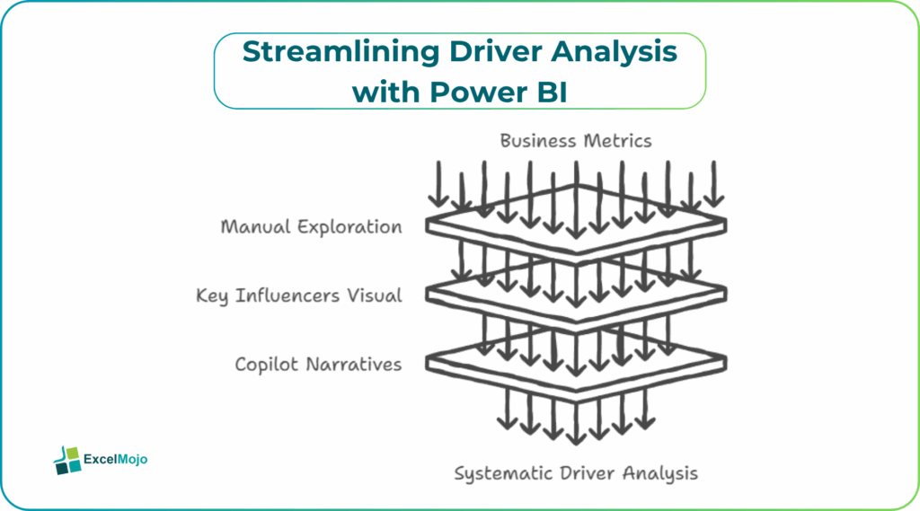
This article explains how to set up the Key Influencers visual for a target metric, how to use Copilot to interpret and explain the results, and how to avoid common misreads of the AI‑driven output. Key Influencers analyze your data, ranks the factors that matter most, and groups them into Top segments and Key influencers tabs, which underpins the AI Insights Power BI Key Drivers pattern. For analysts, that means Copilot can translate those ranked fields into a short, actionable story for stakeholders.
How the Key Influencers Visual Works for Driver Analysis
The Power BI Key Influencers Visual is an AI‑powered chart that identifies which fields and values are most associated with a given metric, such as a high or low rating, churn, or margin.
Typical behavior includes:
- A Key influencers tab that shows individual fields (for example, Region, Subscription Type, Company Size) and how much they influence the target metric.
- A Top segments tab that combines values (for example, “Customers in the West region with premium subscription”) to show the most impactful groups.
The visual uses a combination of regression and tree‑based methods under the hood, which means it can capture both simple linear effects and some non‑linear interactions. This is the core idea behind Driver Analysis in Power BI and why it is more structured than ad‑hoc slicer‑driven exploration. Analysts can focus on the top‑ranking influencers and then test those findings with additional visuals or DAX. Learn more on this at Power BI tutorials.
How to Configure the Key Influencers for a Metric
A solid Power BI Key Influencers with Copilot Driver Analysis setup starts with a clear choice of the target metric and the fields that might influence it.
Typical steps are:
- Choose the Analyze field, such as Customer Rating, Churn Rate, or Margin.
- Add likely Explain by fields, such as Region, Product Category, Customer Segment, or Tenure.
- Review the two tabs and restrict the field list if the visual becomes too noisy or starts showing low‑impact variables.
The user should keep the number of explain‑by fields reasonable and ensure the data types and relationships are clean, which avoids misleading or over‑fitted results. For AI Insights Power BI Key Drivers, this means the AI can focus on the most relevant combinations rather than random noise.
How Copilot Can Interpret and Explain the Drivers
Copilot in Power BI Analysis can sit on top of the Key Influencers output and turn the ranked fields into a short narrative tailored to the business context.
A typical workflow is:
- Build the Key Influencers visual for the metric of interest (for example, low customer rating).
- Select the top influencers or top segments that the visual highlights.
- Ask Copilot a question such as, “Explain the top reasons why customer rating is low, based on the Key Influencers visual.”
Copilot can then summarize the findings in plain language, such as which customer segments or regions are most associated with low scores and how strongly each factor appears to drive the metric. This is the practical side of Power BI Key Influencers with Copilot Driver Analysis and shows how AI‑driven insights can bridge the gap between a technical visual and a business discussion.
Practical Example: Why Customer Satisfaction is Low
A common use case is a customer‑experience dashboard where the team wants to understand why satisfaction scores have dropped. Using Power BI Key Influencers Visual and Copilot in Power BI Analysis, the workflow becomes:
- Place the Key Influencers visual on the CX page and set the Analyze field to Customer Rating.
- Add Explain by fields such as Region, Subscription Type, Support Channel, and Tenure.
- Review the Key influencers and Top segments tabs to identify the strongest predictors.
- Ask Copilot to summarize the findings in a short paragraph that can be shared with leadership.
This pattern is a concrete example of Driver Analysis in Power BI and demonstrates how AI Insights Power BI Key Drivers can turn a complex, model‑driven visual into a simple, story‑driven insight.
Pitfalls and Best Practices
Power BI Key Influencers with Copilot Driver Analysis is powerful but not foolproof.
One common issue is misinterpreting correlation as causation. The visual highlights fields that are statistically associated with the metric, but that does not prove that changing one field will directly cause a change in the outcome. Analysts should treat the results as hypotheses to test with further analysis or experiments, not as definitive causal statements.
Another risk is overfitting with too many fields. Adding dozens of explain‑by fields can make the model sensitive to random noise and harder to interpret. Teams should keep the field list focused on business‑meaningful categories and remove low‑impact or highly correlated variables.
A third pitfall is trusting summaries without checking the data. Copilot‑generated narratives can be misleading if the underlying data has gaps, biases, or errors. Users should cross‑check the AI‑driven story against the raw metrics and visual distributions before acting on it.
Frequently Asked Questions (FAQs)
Power BI Key Influencers with Copilot Driver Analysis can speed up exploratory analysis and provide quick insights, but it should not fully replace formal statistical modeling. The Key Influencers visual is a heuristic, AI‑assisted tool, while Copilot adds interpretive narratives on top.
The Power BI Key Influencers Visual uses built‑in machine learning to rank and group factors, while a manual DAX approach would require writing regression‑like measures or detailed filters. The visual is faster for discovery, while DAX offers more control and transparency for advanced users.
Copilot in Power BI Analysis summaries can be useful for initial insight generation, but decisions should always be grounded in the underlying data and business context. Teams should treat Copilot outputs as conversation starters rather than final verdicts.
AI Insights Power BI Key Drivers are primarily designed for explanation and discovery, not direct forecasting. For predictive models, teams should use Power BI’s forecasting visuals or external AutoML tools that explicitly build time‑series or classification models.
Recommended Articles
Continue with these related resources when you want the next practical step in this topic.
Explore the full Power BI Visuals and Reports guide or browse Power BI Resources.