What is Power BI Heat Map?
A Power BI Heat Map is a data visualization tool that displays data values as colors on a grid, using a color gradient to represent variations in the data. It’s particularly helpful in visualizing data trends and patterns across two categorical variables, often used to show the concentration or distribution of data points within a grid or matrix. Power BI Heat Maps provide significant spontaneous visualization at different levels and are extremely useful in Geographical data visualization, financial performance analysis, new-age sports analytics, and web-related displays.
Table of contents
Key Takeaways
- A Power BI Heat Map is a visual representation of data using colors on a grid. You can create a geographical heat map in Power BI, a zip-code heat map in Power BI, and an ArcGIS heat map in Power BI using the heat map layer in Power BI.
- You can build a Heat Map in Power BI by selecting the Heat Map visual, configuring fields, customizing formatting, and adding interactivity.
- Data quality, color choices, and performance considerations are essential when creating Heat Maps.
- Power BI Heat Maps are effective for displaying patterns, concentrations, and distributions of data across two categorical variables.
- You can download third-party visuals from Appsource store for implementing the Heat map in Power BI.
📊 Unlock Advanced DAX Skills in Power BI!
Take your Power BI skills to the next level with our Advanced DAX in Power BI Training Course. Dive deep into advanced DAX functions, complex calculations, and optimization techniques to enhance your data analysis and reporting capabilities.
How to Build Heat Map in Power BI?
There are 2 different ways of building a heat map in Power BI. They include using:
- the heat map functionality in Power BI
- third-party apps that can be downloaded from Microsoft Appsource.
To build a Power BI Heat Map i.e. Option 1, follow the steps below:
Step 1: Data Preparation – Prepare and load the data into Power. Ensure your dataset should have geographical attributes such as states, cities, countries, etc.
Step 2: Create a New Page or Visual – Open your Power BI report, and either create a new page or select an existing one where you want to add the Heat Map.
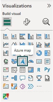
Step 3: Choose Map Visual – Navigate to the Visualizations pane and choose the Azure map visual icon.
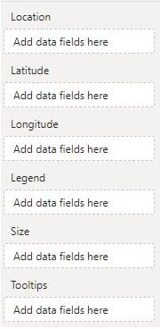
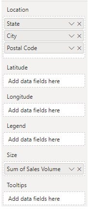
Specify the details such as Location, Latitude, Longitude, Legend, Size, and tooltips by dragging and dropping the categorical attributes from the Fields pane as per the reporting requirements.
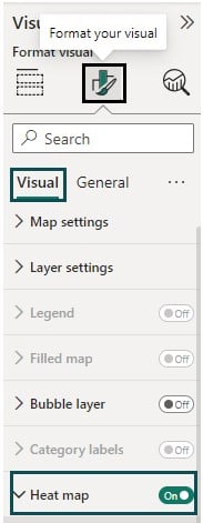
Step 4: Enable Geographical Heat Map in Power BI – Once the Azure map is created, navigate to the Visualizations pane, and toggle on the Heat map option under Visualizations – Format your visual – Visual tab.
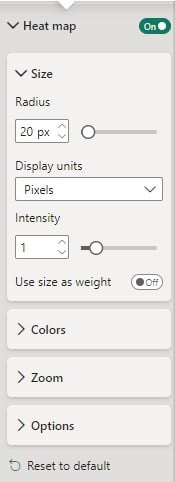
Step 5: Customize Formatting (Optional) – You can customize the formatting of your Heat Map once you have toggled on the Heat Map option. You can choose from different options under the Heat map header.
Step 6: Save and Publish – Save your report, and publish it to the Power BI Service for sharing
Note: You can build a zipcode heat map in Power BI and an ArcGIS heat map in Power BI with similar steps.
To build a heat map using third-party apps, i.e., Option 2, follow the steps highlighted below:
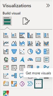
Step 1: Navigate to the Visualizations pane and click on the ellipsis (…), i.e. Get more visuals icon.
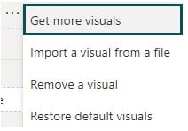
Step 2: Choose the Get more visuals option from the menu.
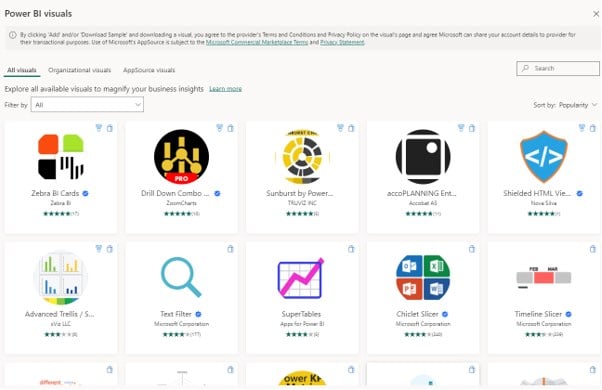
This will navigate you to the Microsoft Appsource page in a new window.
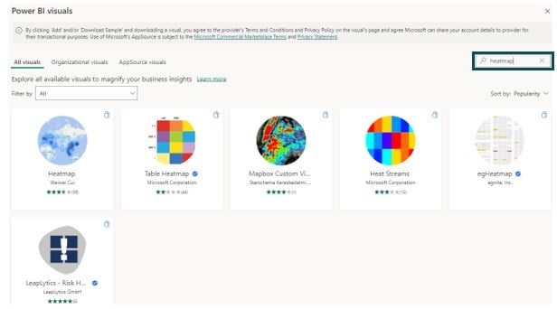
Step 3: Search for keyword heatmap in the text field on the top right corner of the Appsource page.
Step 4: Choose a visual and click on the Add button to add it to the Power BI Desktop screen.
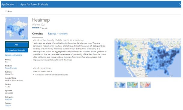
Once the visual is successfully added to the Power BI Desktop screen, a confirmation message window will be displayed.

You will be able to view the Heat map visual in the Visualizations pane.
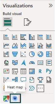
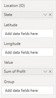
Step 5: Click on the Heat map visual in the Visualizations pane and drag and drop the fields from the Fields pane.
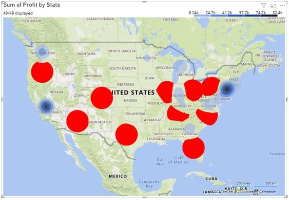
Now your visual is ready with heat map level as per the data specifications.
This section will show two examples; we will provide a step-by-step process to build heat maps in Power BI.
Examples
In this section, we will see 2 examples where we will provide a step-by-step process to build heat maps in Power BI.
Example #1 – Build Table Heat Map in Power BI
In this example, we will build a Table Heat Map in Power BI using the Global Statistics Time Series dataset. loal Statistics Time Series contains macro-level statistics across the countries such as population, life expectancy, etc. across a period of 2000 – 2015.
To build the Table Heat Map in Power BI, follow the steps below:
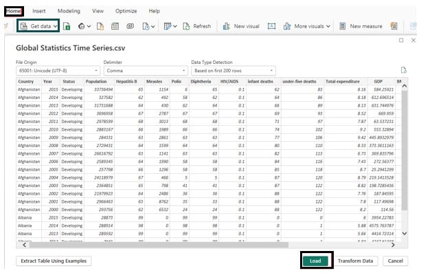
Step 1: Open the Power BI Desktop, import the Global Statistics Time Series dataset using Data Connection, and click on the Load button.
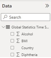
Once imported into Power BI, you can view the data fields in the Fields pane.
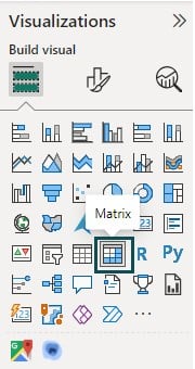
Step 2: Navigate to the Visualizations pane and choose Matrix visual type.
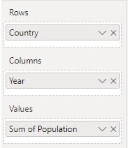
Step 3: Drag and drop the attributes from the Fields pane into the appropriate fields of the Matrix visualization.
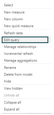
Step 4: Right-click on the table and select the Edit query option.
Create a new G10 Country column in Power Query Editor by navigating Add Column – Custom Column. The G10 Country column refers to the list of countries in the G10 forum.

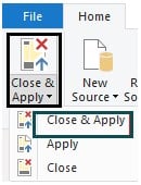
Click on Close & Apply to save the changes.
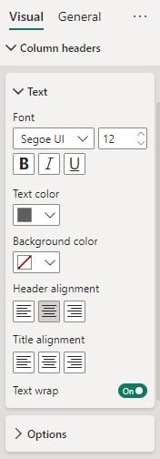
Step 5: Navigate to the Format your visual tab to customize the appearance of the Matrix visual. Here, we have applied the below customizations to the visual.

Additionally, we have also adjusted the Column headers and Row headers to increase the Font and alignment.
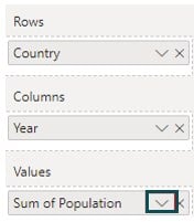
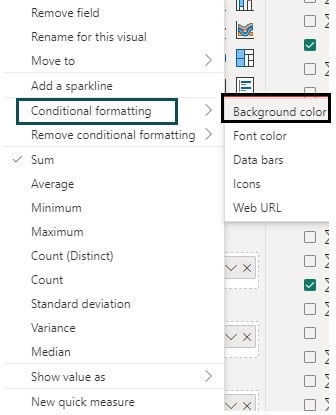
Step 6: Navigate to the Visualizations pane, click on the down arrow next to Sum of Population under Values section.
Step 7: Choose Conditional formatting – Background color.
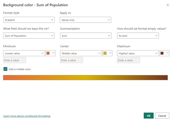
Step 8: Provide the details such as Format style, fields, color gradient, and other information in the Background color window.
Here, we have added the color gradient as per the details below with an option of middle color.
Step 9: Repeat steps 6 and 7 (instead of choosing the Background color, select Font color).
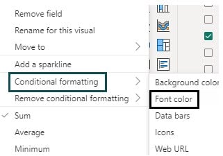
It will open a Font color window where you can provide the appropriate details such as format, color gradients, and other information as per requirements. Ensure the color gradient is specified the same as the ones specified in step 8.

Step 10: Navigate to the Format your visual tab under the Visualizations pane and specify the formatting options such as Title, Font, and other details.

Step 11: Navigate to the Filters pane and provide filter conditions for your visual. Here we have filtered data based on the G10 Country flag.
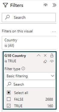
Post these changes, you will see the Table Heat Map in Power BI as per the color gradient specifications.

Example #2
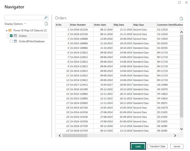
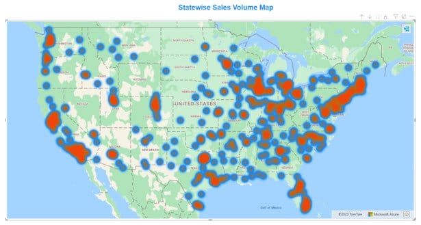
In this example, we will create a geographical heat map in Power BI using the Power BI Maps dataset. The Power BI Maps dataset contains sales details across US cities, revenue, and product details.
To create a geographical heat map in Power BI, follow the steps highlighted below:
Step 1: Open the Power BI Desktop, import the Power BI Maps dataset, and click on the Load button.
Step 2: Navigate to the Visualizations pane and choose Azure map visual type.

Step 3: Drag and drop the geographical attributes from the Fields pane into the appropriate fields of the map visualization.
Step 4: Navigate to the Format your visual tab and toggle on the Heat map.

Step 5: Expand the Heat map and specify the formatting options such as Size, Colors, Zoom, and Options section for your map.

You can also provide the Title, Effects, and other formatting options available under the General tab.

Once the formatting is done, you shall be able to view the Azure map with Heat Map in the report canvas.
Important Things to Note
Important things to note when using the Heat Maps in Power BI include:
- Ensure that your data is clean and properly prepared before creating a Heat Map.
- Choose appropriate color scales to represent your data accurately, and consider colorblind-friendly options for accessibility.
- Be mindful of the performance impact, especially when dealing with large datasets. Aggregating or summarizing data may be necessary for smoother performance.
- Think about how users will interact with your Heat Map and design it accordingly.

Frequently Asked Questions (FAQs)
Yes, you can customize the colors in a Power BI Heat Map following the instructions provided below:
• Select the Heat Map visual in your Power BI report.
• Navigate to the Format your visuals tab under the Visualizations pane. You will see the Heat map option under the Visual tab.
• Toggle on the Heat map slider and expand the Heat Map section and you will notice the Colors section.
• Expand the Colors section to view the color options available for the different gradient stops.
• You can further customize the color options by clicking on any of the colors i.e. gradient stop down arrow. Power BI will show the available color pop-up window.
• You can further choose different colors by clicking on the More colors option.
Yes, it is possible to drill down into the details in a Power BI Heat Map. To perform the drill down into details, follow the steps highlighted below:
• Select or hover the mouse over the Power BI Heat Map visual. You will notice a drill control option in the action bar.
• Turn on the drill-down option by selecting one of the single downward arrow, double downward arrow, or the hierarchy icons.
• With each of the options selected, Power BI will apply the drill down as per the selection and the heat map will be adjusted accordingly.
The limitations of Heat Maps in Power BI may have evolved, but some common limitations to consider include:
• Limited interactivity: Heat Maps, by default, may not offer the same level of interactivity as some other visuals, although you can enhance interactivity through additional configurations.
• Scalability: Performance may degrade when dealing with very large datasets or complex calculations.
• Lack of drill-down: Heat Maps, on their own, may not support direct drill-down into detailed data points.
• Customization constraints: While you can customize colors and some formatting options, the level of customization compared to other visuals may be limited.
You can export or share a Power BI Heat Map in several ways:
• You can publish your Power BI report to the Power BI Service, where you can share it with others.
• You can export your report to PDF or PowerPoint format, which includes the Heat Map.
• Power BI provides embedding capabilities, allowing you to embed your Heat Map and reports in a website or application, which others can access.
• In Power BI Service, you can generate a direct link to a report or dashboard and share it with others, granting them access to the Heat Map.
Recommended Articles
This has been a guide to Power BI Heat Map. Here, we discuss the top 2 methods to bulild Heat Map in Power BI along with step by step examples You can learn more from the following articles –

Leave a Reply