
What Are Quick Analysis Tools In Excel?
The Quick Analysis tools in Excel analyze the data quickly and easily using different Excel tools. However, this option is available only in Excel version 2013 and above.
We can enable the Quick Analysis tool the moment we select the required dataset or cell range in a worksheet.
Where To Find Quick Analysis Tools In Excel?
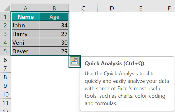
In a dataset, whenever we select a cell range, we get a feature at the bottom right corner, i.e., the Quick Analysis feature, as shown below.
Use this Quick Analysis Tools In Excel Template to follow along with the examples in this article.
Download Excel Template
Key Takeaways
- Quick Analysis Tools in Excel helps users analyze the data w.r.t some important calculations, highlighting, or markings, without using the formulas or the Excel ribbon.
- We have 5 tools in the Quick Analysis feature as follows:
- Formatting – highlights selected cell values.
- Charts – creates charts of the chosen cell range.
- Totals – returns totals of cell values like SUM, Average, etc.
- Tables – summary of a dataset in form of a data table.
- Sparklines – they are small charts which is placed within cells.
- We can enable/disable the Quick Analysis feature using the Excel options window.
How To Use Quick Analysis Tools In Excel?
We can use the Quick Analysis Tools in Excel in 2 ways, namely:
- Select the data cells, and click on the “Quick Analysis” icon in the bottom right corner.
- Select the data cells, and press the excel keyboard shortcut keys “CTRL + Q”.
The 5 available tools in the Quick Analysis feature are,
- Formatting – Allows us to highlight required data.
- Charts – Helps us to visualize data.
- Totals – Automatically calculates the sum for us.
- Tables – Helps us sort, filter and summarize data.
- Sparklines – They are small charts which is placed within cells.
Let us consider each of the 5 tools with their specific example in the coming sections.
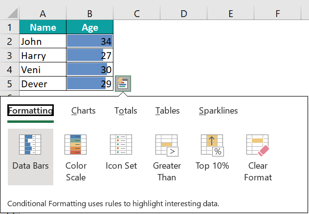
The succeeding image depicts the names and ages of the people, and we will use the Formatting option for the given data using the Quick Analysis Tools feature.
In the table, the data is,
- Column A shows the Name.
- Column B contains the Age.

The steps to format using the Quick Analysis Tools in excel are as follows:
- Select the given data table, and click the Quick Analysis button at the down-right corner, as shown below.

- Select the “Formatting” tool,
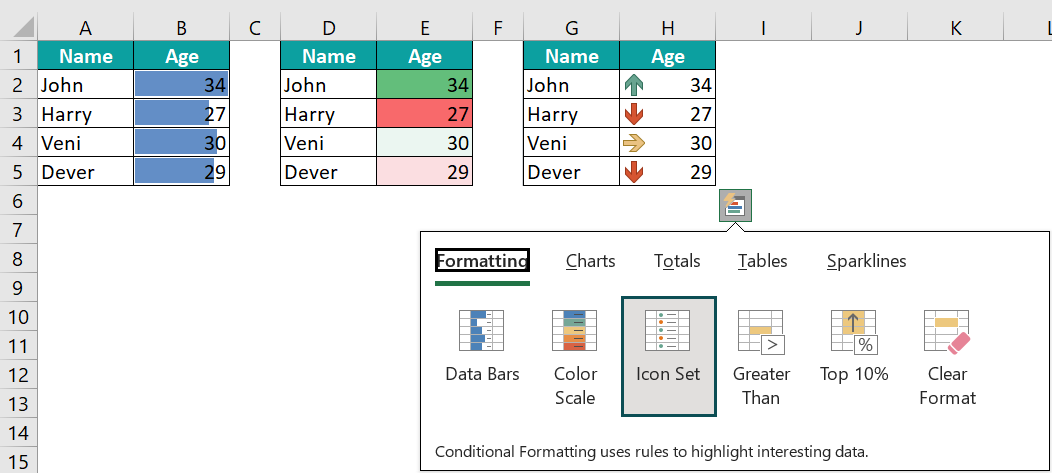
• Scenario 1 → Click the “Data Bars” option. The Data Bars are formed, as shown below.

• Scenario 2 → Click the “Color Scale” option. The Color Scale is formed, as shown below.
• Scenario 3 → Click the “Icon Set” option. The Icon Sets are formed, as shown below.
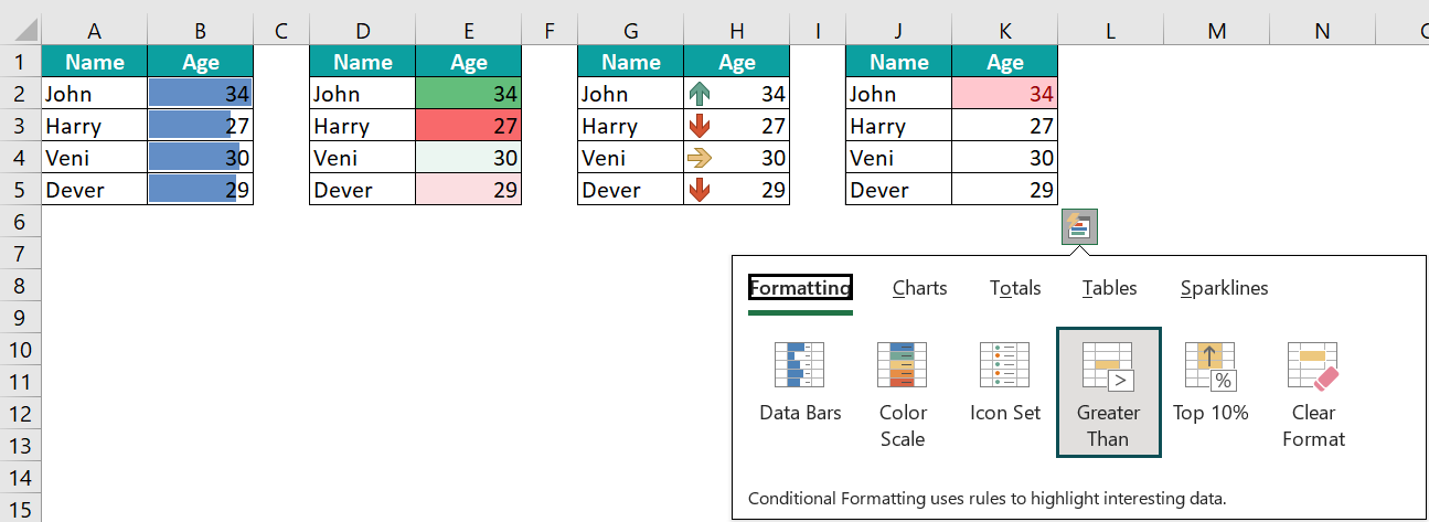
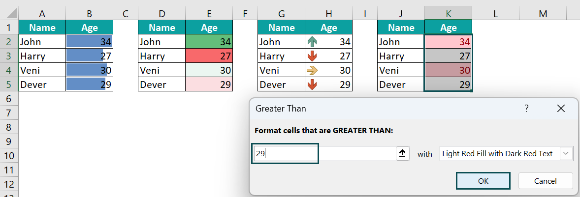
• Scenario 4 → Click the “Greater Than” option.
The “Greater Than” window appears. Set the numeric value for which it must display the greater than value, here 29, in the “Format cells that are GREATER THAN:” box, and click “OK”. The values greater than 29 are highlighted, i.e., 34 and 30, in cells K2 and K4, as shown below.
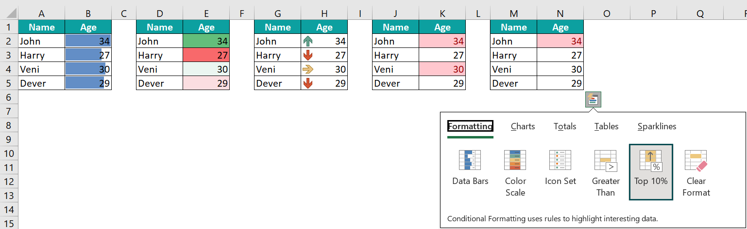
• Scenario 5 → Click the “Top 10%” option. The Top 10% values are seen, as shown below.
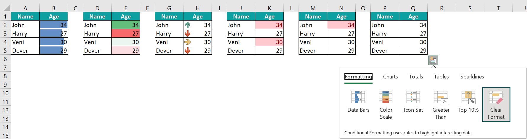
• Scenario 6 → Click the “Clear Format” option. It will clear the formatting on the selected cell range, as shown below, in cells P1:Q5.

Examples
We will consider the rest of the 5 tools available in the Quick Analysis Tools in Excel with some examples.
Example #1 – Charts
The succeeding image depicts the sales and purchase of items, and we will use the Charts option for the given data using the Quick Analysis Tools feature.
In the table, the data is,
- Column A shows the Item.
- Column B contains the Sales.
- Column C contains the Purchase.

The steps to insert charts using the Quick Analysis Tools are as follows:
- Step 1: Select the given data table, and click the Quick Analysis button at the down-right corner, as shown below.

- Step 2: Select the “Charts” tool
- Scenario 1 → Click the “Clustered Column” option. The Clustered Column chart is formed, as shown below.

- Scenario 2 → Click the “Stacked Column” option. The Stacked Column excel chart is formed, as shown below.

- Scenario 3 → Click the “Scatter Column” option. The Scatter Column chart is formed, as shown below.

- Scenario 4 → Click the “Clustered Bar” option. The Clustered Bar chart is formed, as shown below.

- Scenario 5 → Click the “Stacked Bar” option. The Stacked Bar excel chart is formed, as shown below.


Example #2 – Totals
The succeeding image depicts the marks of every subject of John, and we will use the Totals option for the given data using the Quick Analysis Tools feature.
In the table, the data is,
- Column A shows the Subject.
- Column B contains the Marks of John.

The steps to find totals using the Quick Analysis Tools are as follows:
- Step 1: Select the given data table, and click the Quick Analysis button at the down-right corner, as shown below.

- Step 2: Select the “Totals” tool,
- Scenario 1 → Click the “SUM” option. The sum of the selected data is calculated and displayed in cell B7, as shown below.

- Scenario 2 → Click the “AVERAGE” option. The average of the selected data is calculated and displayed in cell B7, as shown below.

- Scenario 3 → Click the “COUNT” option. The count of the selected data is calculated and displayed in cell B7, as shown below.

- Scenario 4 → Click the “% Total” option. The ‘% total’ of the selected data is calculated and displayed in cell B7, as shown below.

- Scenario 5 → Click the “Running Total” option. The ‘running total’ of the selected data is calculated and displayed in cell B7, as shown below.

Example #3 – Tables
The succeeding image depicts a person’s money withdrawals and deposits, and we will use the Tables option for the given data using the Quick Analysis Tools feature.
In the table, the data is,
- Column A shows the Date.
- Column B contains the Item.
- Column C contains the Amount.

The steps to create tables using the Quick Analysis Tools are as follows:
- Step 1: Select the given data table, and click the Quick Analysis button at the down-right corner, as shown below.

- Step 2: Select the “Tables” tool,
- Scenario 1 → Click the “Table” option. The table is formed, as shown below.

- Scenario 2 → Click the “Pivot Table” option. The Pivot Table is formed, as shown below.

Example #4 – Sparklines
The succeeding image depicts the price of the fruits, and we will use the Sparklines option for the given data using the Quick Analysis Tools feature.
In the table, the data is,
- Column A shows the Fruits.
- Column B contains the Price.

The steps to insert sparklines using the Quick Analysis Tools are as follows:
- Step 1: Select the given data table, and click the Quick Analysis button at the down-right corner, as shown below.

- Step 2: Select the “Sparklines” tools,
- Scenario 1 → Click the “Line” option.

We get the sparkline in column C, as shown below.

- Scenario 2 → Insert a column between Columns B and C, and then click the “Column” option. The Spark Columns are formed, as shown below.

- Scenario 3 → Insert a column between Columns B and C, and then click the “Win/Loss” option. The spark Win/Loss sparklines are formed, as shown below.

Important Things To Note
- Excel doesn’t activate the Quick Analysis button,
- When we select blank cells.
- If the entire column or a row is selected.
- If the Quick Analysis feature is not seen when we select the cell range, we can enable it from the Excel Options.
- The Quick Analysis tool is a dynamic feature that provides various data analysis options. Using it to analyze data instantly at a click of a button.
Frequently Asked Questions (FAQs)
The Excel Quick Analysis Tools are the analysis tools consisting of charts, tables, sparklines, and totals of a few arithmetic calculations without the usage of formulas. The required data can be graphically represented as well.
The Shortcut Key of the Quick Analysis Tools in Excel is,![]()
We can enable the Quick Analysis Tools in Excel as follows:
First, select the “File” tab → go to the “More…” option from the list → select the “Options” option from the drop-right, as shown below.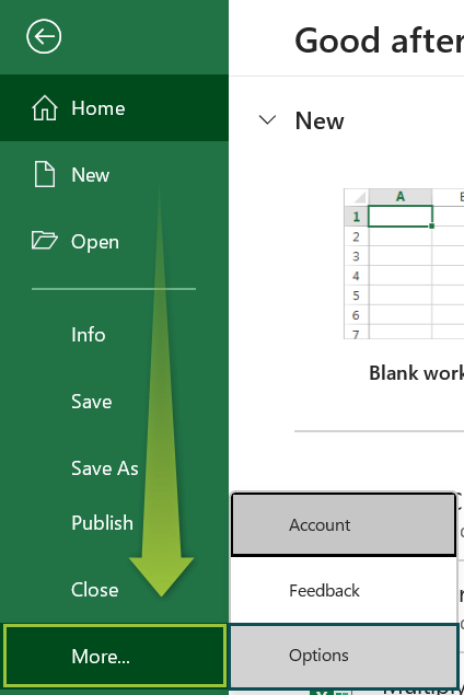
The “Excel Options” window pops up.
• On the left-side of the window, click the “General” option.
• On the right-side, check/tick the “Show Quick Analysis options on selections” checkbox in the “User Interface Options” section.
• Click “OK”, as shown below.
Use this Quick Analysis Tools In Excel Template to follow along with the examples in this article.
Download Excel Template