What Is Surface Chart In Excel?
The Surface Charts in Excel are the tools that enhance the ability to be a visual analytics tool. The essential components of a surface chart are dimension values or values set on the x-axis, the other is the measure in the context, which is shown by the y-axis, and the third axis is the z-axis which shows the different series in the given context values. The charts are used for temperature analysis. The chart works on numbers and requires at least two series.
For example, the below image shows the four Student’s Marks in five subjects; we will make the Surface Chart in Excel from the given data.
📥Download the ready-to-use Excel template to practice this tutorial yourself.
Surface-Chart-in-ExcelIn the table,
- Column A show the subjects
- Columns B, C, and D show the marks of John, Ron, and Harry, respectively.
The steps to demonstrate the Surface Chart in Excel are as follows:
Step 1: Select the table data to create a surface chart.
Step 2: Go to the Insert tab.
Step 3: Select the Insert Waterfall, Funnel, Stock, Surface, or Radar Chart excel option from the Charts group.
Step 4: Click the down arrow button of the 3-D Surface option.
Step 5: Select the formatting of an Excel Surface Chart we want from the drop-down list.
Step 6: The Surface Chart is formed in the following image.
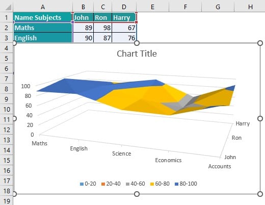
Table of contents
Key Takeaways
- Surface Charts in Excel help us enhance visual analytics.
- Using surface charts in Excel, we can show temperature analysis.
- Also, we can use different color combinations for visual effects.
- Surface Chart in excel must be applied only after studying the context properly so that the application doesn’t result in the wrong application of the chart.
- The Surface Chart in excel is easy to use but it is not commonly used.
Explanation and Uses
The Surface Charts plot the data as two or three-dimensional terrain so we can see the overall trend and any anomalies that may be present.
In forming a 3-D chart, a 3-D column, a 3-D line, or a 3-D surface chart, we can change the format of the 3-D chart, the chart’s rotation, and the chart’s scaling. The charts show the elements in 3-D without using a third depth axis, like an excel pie chart in 3-D, a bar chart in 3-D, or a stacked area in a 3-D chart; we can change the format of the 3-D chart elements. The 3-D rotation and scaling of the chart are not available for the individual chart elements, and we can only change the 3-D rotation and scale for the whole chart.
Types of Surface Charts in Excel
There are four types of Surface charts to create; we apply several options to customize and enhance the result. They are as follows;
- 3D Surface Chart – This chart looks like a curtain dropped on 3D column charts. This chart is best used when x and y are numerical ranges.
- 3D Wireframe Chart – This chart is the same as the 3D Surface Chart with no fill color. The chart looks like colored wires surround it for the 3D Surface Chart.
In the Wireframe chart, it is convenient to see the back of the boundaries, but in the 3D surface chart, the backside area is difficult to see from one perspective. - 2D Contour Chart – This chart is the same as seeing a 3D surface chart from the top; the topographical representation is very similar. The Contour chart’s depth is unimportant; the depth can be calculated by evaluating shade and light. The Contour chart is used for covering the areas by other ranges.
- Contour Wireframe Chart – This is the same as the contour chart but without the colored areas. The colored wires are used in forming a contour wireframe chart. This looks like watching a wireframe surface chart from above.
The use of the Surface Plot is to relate to two continuous variables. A Surface Plot displays the three-dimensional relationship in two dimensions, with the variables on the x- and y-axes and the response variables represented by a smooth surface.
How to Create Surface Chart in Excel?
#1 – Example
The image below shows the furniture company’s Sales, Purchases, and Profit of items, and we will make the Surface Chart in Excel from the given data.
In the table,
- Column A show the Item
- Column B contains the Sales
- Column C contains the Purchase
- Column D contains the Profit
The steps to demonstrate the Surface Chart in Excel are as follows:
Step 1: Select the table data to create a Surface Chart.
Step 2: Go to the Insert tab.
Step 3: Select the Insert Waterfall, Funnel, Stock, Surface, or Radar Chart option from the Charts group.
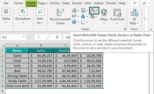
Step 4: Click the down arrow button of the 3-D Surface option.
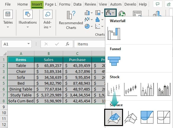
Step 5: Select the formatting of an Excel Surface Chart we want from the drop-down list.
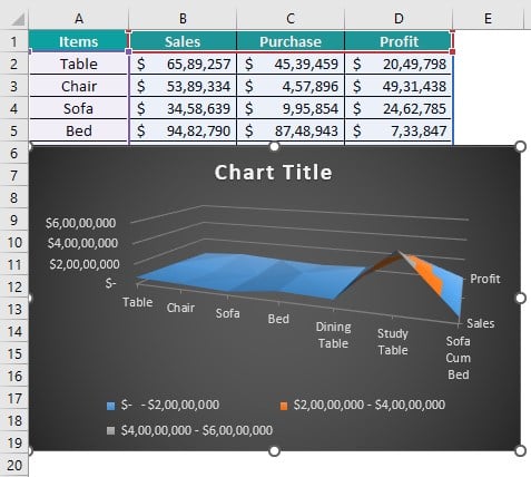
Step 6: The Surface Chart is formed in the following image.
#2 – Example
The image below shows the Height and Weight of people, and we will make the Surface Chart in Excel from the given data.
In the table
- Column A show the Name
- Column B contains the Height
- Column C contains the Weight
The steps to demonstrate the Surface Chart in Excel are as follows:
Step 1: Select the table data to create a Comparison Chart.
Step 2: Go to the Insert tab.
Step 3: Select the Insert Waterfall, Funnel, Stock, Surface, or Radar Chart option from the Charts group.
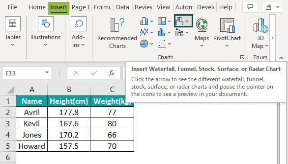
Step 4: Click the down arrow button of the Wireframe 3-D Surface option.
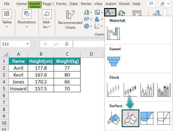
Step 5: Select the formatting of an Excel Surface Chart we want from the drop-down list.
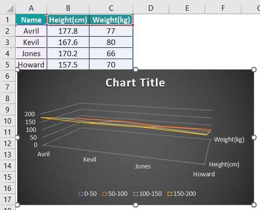
Step 6: The Surface Chart is formed in the following image.
#3 – Example
The image below shows the Quantity and Price of fruits, and we will make the Surface Chart in Excel from the given data.
In the table,
- Column A show the Fruits
- Column B contains the Quantity
- Column C contains the Price
The steps to demonstrate the Surface Chart in Excel are as follows:
Step 1: Select the table data to create a comparison chart.
Step 2: Go to the Insert tab.
Step 3: Select the Insert Column or Bar Chart option from the Charts group.
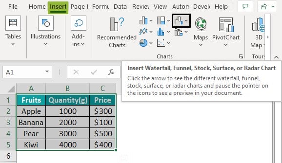
Step 4: Click the down arrow button of the Contour option.
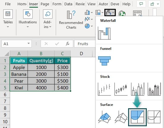
Step 5: Select the formatting of an Excel Surface Chart we want from the drop-down list.
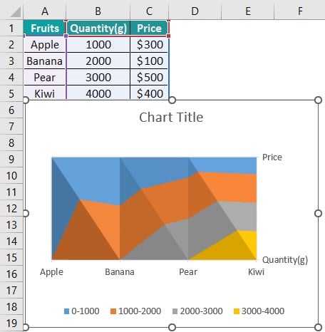
Step 6: The Surface Chart is formed in the following image.
#4 – Example
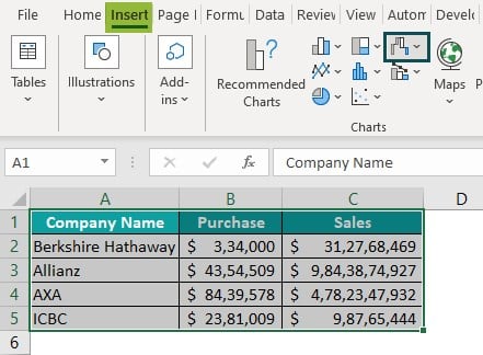
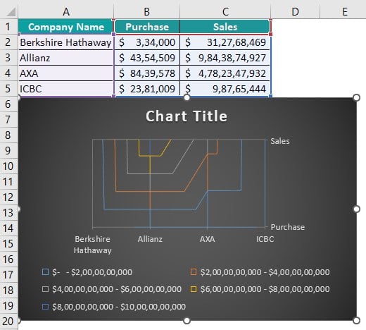
The image below shows the Company’s Purchases and Sales, and we will make the Surface Chart in Excel from the given data.
In the table,
- Column A show the Company Name
- Column B contains the Purchase
- Column C contains the Sales
The steps to demonstrate the Surface Chart in Excel are as follows:
Step 1: Select the table data to create a Comparison Chart in excel.
Step 2: Go to the Insert tab.
Step 3: Select the Insert Column or Bar Chart option from the Charts group.
Step 4: Click the down arrow button of the Wireframe Contour option.
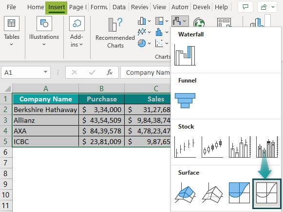
Step 5: Select the formatting of an Excel Surface Chart you want from the drop-down list.
Step 6: The Surface Chart is formed in the following image.
Important Things to Note
- To study situations involving complex three-dimensional charts, surface charts are used.
- There are various options in the Surface Chart, which should be selected after identifying the suitability of the chart based on the context.
- Each option in the chart shows some uniqueness, suits, and is applicable in a situation.

Frequently Asked Questions (FAQs)
Following are the steps to insert the Surface Chart in Excel;
Step 1: Go to the Insert tab.
Step 2: Select the Insert Waterfall, Funnel, Stock, Surface, or Radar Chart option from the Charts group.
Step 3: Select the Surface chart option from the drop-down list.
• Click the Chart Type icon on the Chart Design ribbon.
• The Surface option will still be selected.
• Select a new surface type from the main window.
• Click OK.
Follow the below steps to Add the Data;
• Click the Selected Data icon on the Chart Design ribbon.
• Select the Add button.
• Now, click the suitable column heading, row label, or name for the new range in the first box.
• Choose the second box in the sheet, then select the new range to add in.
• Click OK.
Follow the below steps to Remove the Data;
• Click the Selected Data icon from the Chart Design tab from the Excel ribbon.
• Select the Category that is to be removed.
• Click Remove.
• Then click OK.
Follow the below steps to Show the Data;
• Select the Filter icon present in the top-right corner of the chart.
• Select or deselect the items we want to hide or show.
Download Template
📥Download the ready-to-use Excel template to practice this tutorial yourself.
Surface-Chart-in-ExcelRecommended Articles
This has been a guide to Surface Chart in Excel. Here we learn how to create surface chart in Excel with examples & downloadable excel template. You can learn more from the following articles –

Leave a Reply