What Is Timeline Chart In Excel?
A Timeline Chart in Excel is a versatile graph that uses a linear scale to represent a sequence of events in chronological order. The events may be the timelines of a project’s overall progress, milestones achieved, or the deadlines met. Therefore, this chart is useful in different phases of project management, such as workflow planning and optimization. For example, the below table shows the major milestones in a project from Jan-Aug.
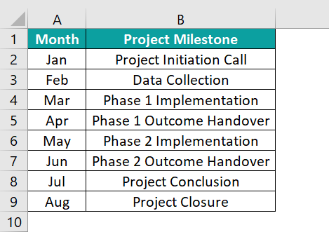
We will represent the given milestones graphically using Timeline Chart in Excel. To create a Timeline Chart in Excel, we need a helper column (in this case, we use the column Text Placement). We will learn this in detail in the coming sections.
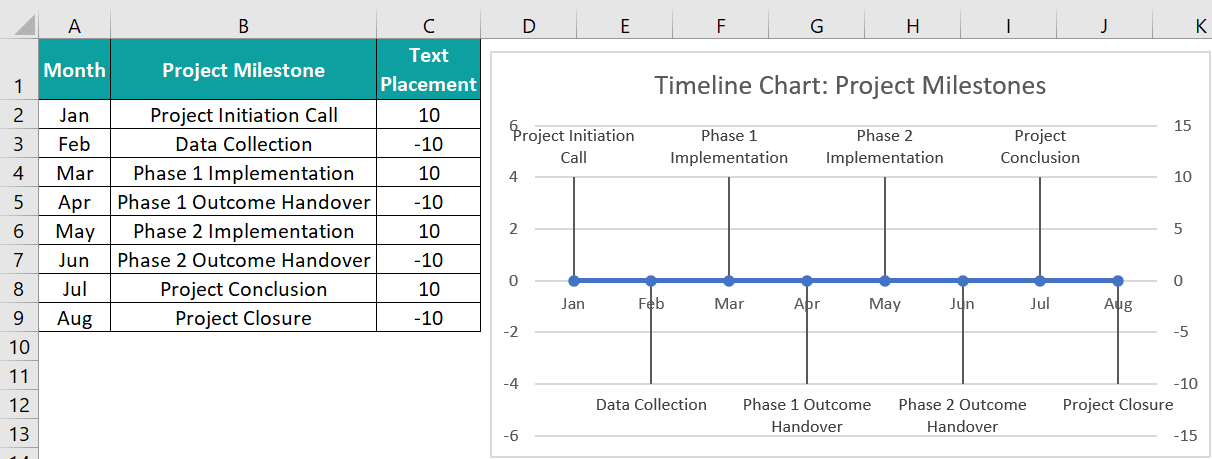
So, the above example shows a Timeline Chart in Excel depicting the timeline of the various milestones across the project.
Table of contents
Key Takeaways
- The Timeline Chart in Excel includes a linear scale to depict a series of milestones in chronological order graphically.
- Users can utilize the Timeline chart to monitor the progress level in each phase of a project and also, track the different project key milestones.
- A simple Timeline chart will include a time-based horizontal axis with alternating vertical lines representing various milestones.
- Though tedious, the steps to create a Timeline chart are straightforward. While the plot structure remains the same, the complexity depends on the aesthetic enhancements we need to make to suit our requirements.
How To Create Timeline Chart In Excel?
The steps to create a Timeline Chart in Excel are as follows:
- First, ensure the milestones or tasks list for which we wish to create the Timeline chart is accurate, complete, and chronological.
- Then, add a helper column to the source table and use the Line with Markers chart, with some modifications, to create a simple Timeline Chart in Excel.
Let us take a basic example to learn more about this chart.
Here, we will create a Timeline Chart in Excel for the project.
The below table shows a list of milestones and their estimated deadlines for a given project.
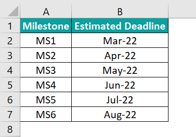
The steps to create a Timeline Chart in Excel are as follows:
- First, modify the source table by adding a helper column with values 5 and -5. This column will help graphically represent the milestones while maintaining the chronological order.

- Next, select the table, A1:C7 → go to the “Insert” tab → go to the “Charts” group → click the “Insert Line or Area Chart” option drop-down → in the “2-D Line” group select the “Line with Markers” chart type, as shown below.

Once we select the “Line with Markers” chart type, we will get the following chart.
- Next, right-click on the chart area → click the “Select Data” option from the menu.

The “Select Data Source” window appears, as shown below.
- Then, in the Select Data Source pop-up box, remove or uncheck the existing legends in the “Legend Entries (Series)”, and click “OK”.

- Next, click the Add button to open the Edit Series pop-up box.

- Then, enter the Series name as Date and Series values as the Milestone list, A2:A7, and click OK in the Edit Series pop-up box.

- In the Select Data Source window, go to the “Horizontal (Category) Axis Label” group → click the Edit option.

The “Axis Label” dialog box pops up, here, enter the Axis label range as the estimated deadline column range, and click OK to close the Axis Labels window.
- In the Select Data Source window, click the “Add” option in the “Legend Entries (Series)” group.

The Edit Series window pops up. In the Series name: field, type Helper, and in the Series values: field, select the column C cell range, C2:C7, and click OK, as shown below.
The Helper gets entered in the Legend Entry (Series) group.
Finally, click OK in the Select Data Source window. We will get the following graph.
- Next, click the line chart and press Ctrl + 1 to open the Format Data Series pane.

In the Fill & Line tab, select the Line option as No Line.
- While retaining the same selection, go to Design → Add Chart Element → Error Bars → “More Error Bars Options…”

The Add Error Bars window pops up. Enter the series for adding error bars in the pop-up box, as the Helper column range, and click OK.
- Set Direction as Minus, End Style as Cap, and Error Amount Percentage as 100% in the Format Error Bars pane.

- Right-click on the Horizontal Line chart, click the Format Data Series, and set it as a secondary axis using the option in the Format Data Series window.


- Next, delete the secondary axis.

Once we delete the secondary axis, the chart will look as shown below.
- Next, add data labels to the chart.

Next, right-click a data label and choose Format Data Labels.
Set the Label Options as Category Name.
- Right-click the chart area and click the Select Data option.

Choose Helper and click Edit in the Select Data Source window.
Set the axis label range as the estimated deadline cell range.
Click OK to close the Axis Labels dialog box.
- Click on a newly added label and choose Format Data Labels.

Make the Label Options as Value From Cells. And set the data label range as the milestone cell range, and click OK.

- Next, in the Marker tab, select the option None.

- Click the data labels to make them bold. And using the Chart Elements option, enable the Chart Title element.

Finally, double-click the chart title element in the chart area to update it according to the requirement.
Thus, the achieved Timeline Chart in Excel template shows the various milestones in the specific project in chronological order. While the first milestone deadline is Mar-22, the last milestone deadline is Aug-22, with each bar extending to a magnitude 5 and -5, as per the Helper column values.
Examples
We will understand the Timeline Chart in Excel with some advanced scenarios.
Example #1
The following table showcases the different phases in a project and their respective deadlines. Clearly, we can see that there are intermittent gaps between different phases.
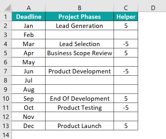
The steps to create a Timeline Chart in Excel using the 2-D Clustered Column chart are as follows:
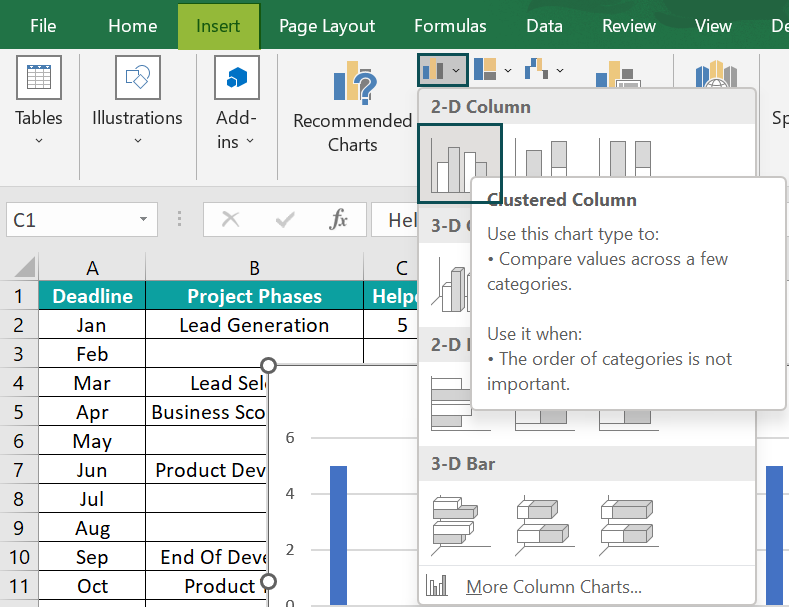
Step 1: To begin with, select the Deadline and Helper columns → go to the “Insert” tab → go to the “Charts” group → click the “Insert Column or Bar Chart” option drop-down → in the “2-D Column” group select the “Clustered Column” chart type, as shown below.
Step 2: Next, click the chart area and Chart Elements → Data Labels → More Options.
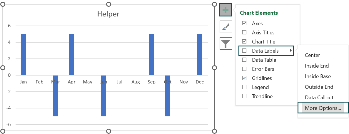
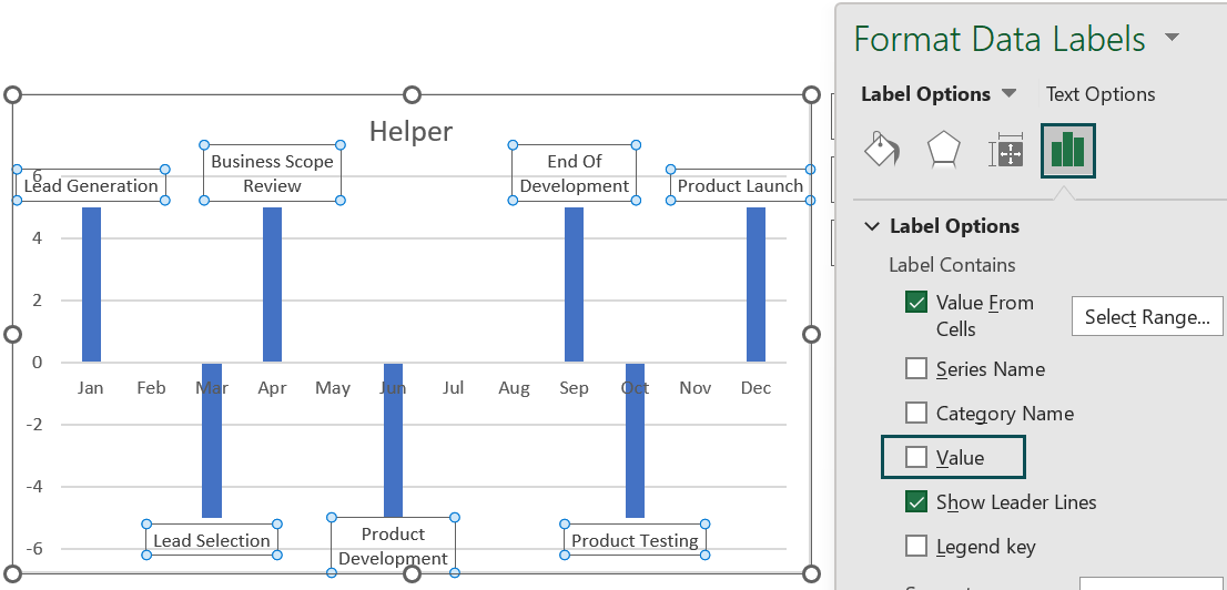
The Format Data Labels window opens on the right. Under the Label Options option, check/tick the checkbox of the Value From Cells option, and enter the Project Phases column range, B2:B13, in the Select Data Label Range field.

Next, uncheck the Value option under Label Options.
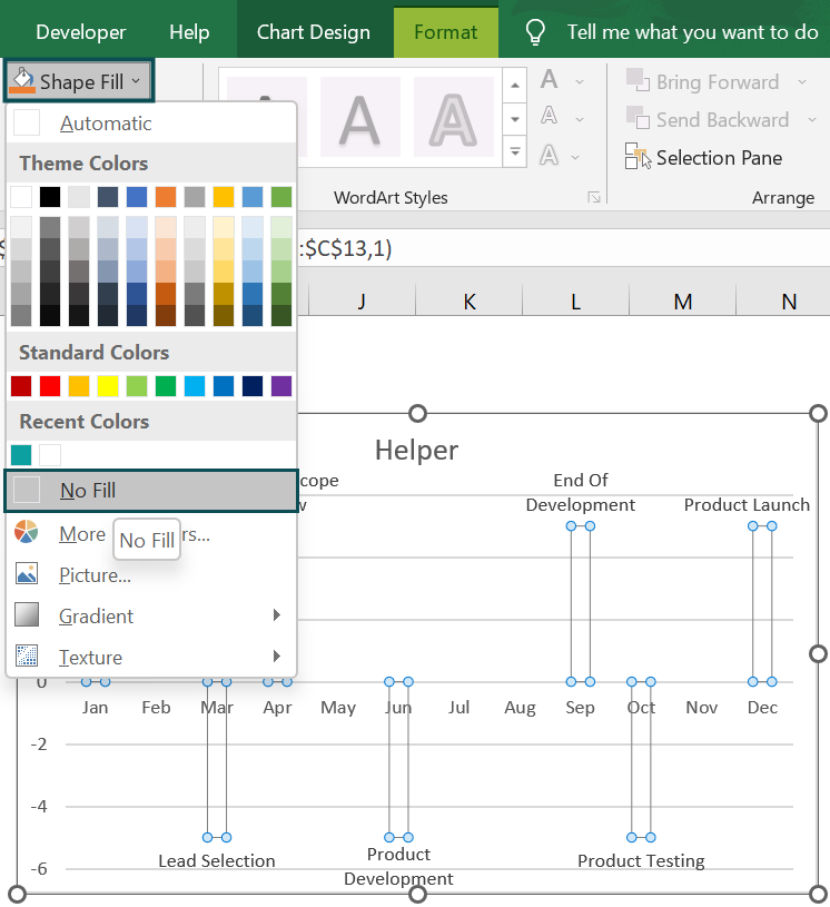
Step 3: Then, click one of the columns, the Format tab will appear on the ribbon, then select the Format tab → click the Shape Fill drop-down in the Shapes Style group → select the No Fill option, as shown below.
Step 4: Next, click the chart area and then Chart Elements → Error Bars → More Options.
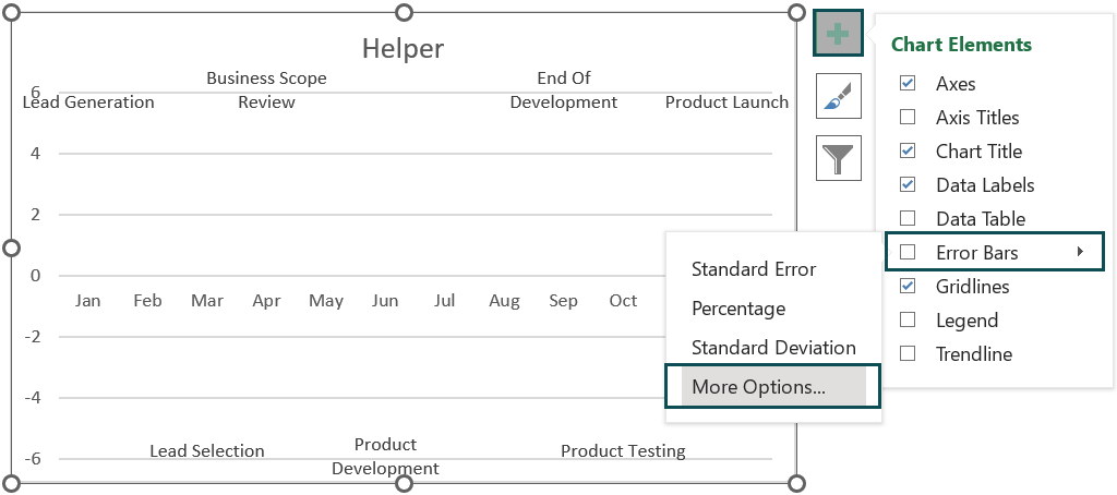
The Format Error Bars window opens, where we must fix the Direction as Minus, End Style as Cap, and Error Amount Percentage as 100%.
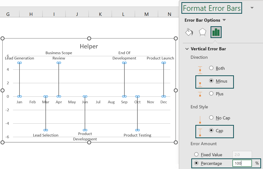
Step 5: Next, right-click the primary axis and delete it.

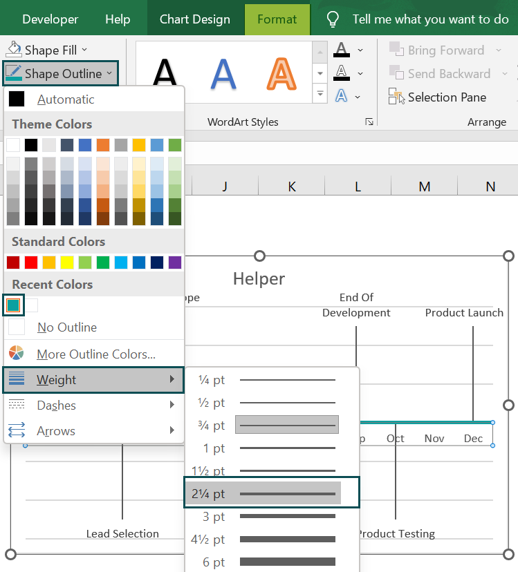
Step 6: Then, select the horizontal axis and Format → Shape Outline to set the required color and weight.
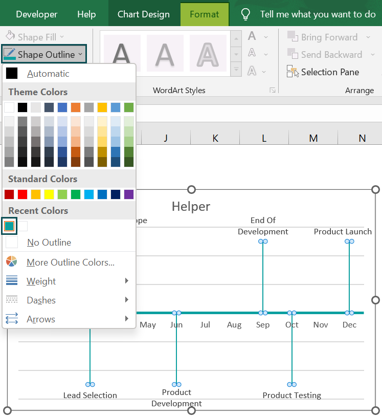
Step 7: Similarly, select the error bars and change the color in the same way as explained in the previous step.
Step 8: Now, double-click the chart title to update it according to the requirement.
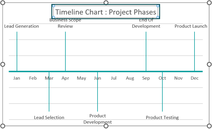
Here, we can make the title bold. And then, click the chart area, Chart Elements, and uncheck the Gridlines option.
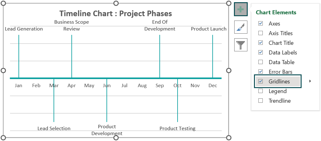

Thus, the final Timeline Chart in Excel is shown below.

The above Timeline chart shows the project phases against the respective deadlines, leaving the remaining months blank.
Example #2
The following source table provides the details of project phases, including the time, estimated hours for each phase, hours spent, and the progress in each phase.
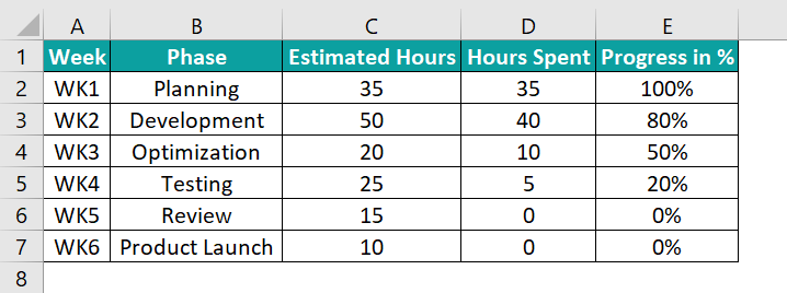
The steps to create the Timeline Chart in Excel are as follows:
Step 1: First, add the Helper column.

Step 2: Next, select the Week and Helper columns, i.e., columns A and F → go to the Insert tab → go to the Charts group → click the Insert Line or Area Chart option drop-down → in the 2-D Line group select the Line chart type, as shown below.
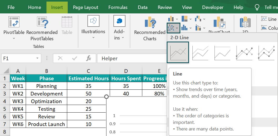
Step 3: Then, right-click the chart area → click the Select Data option to create two series, one for Estimated Hours and the other for Hours Spent.
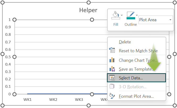
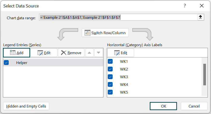
Follow Step 8 from the Basic Example to add the series.
In the Select Data Source window, click the Add option in the Legend Entries (Series) group.
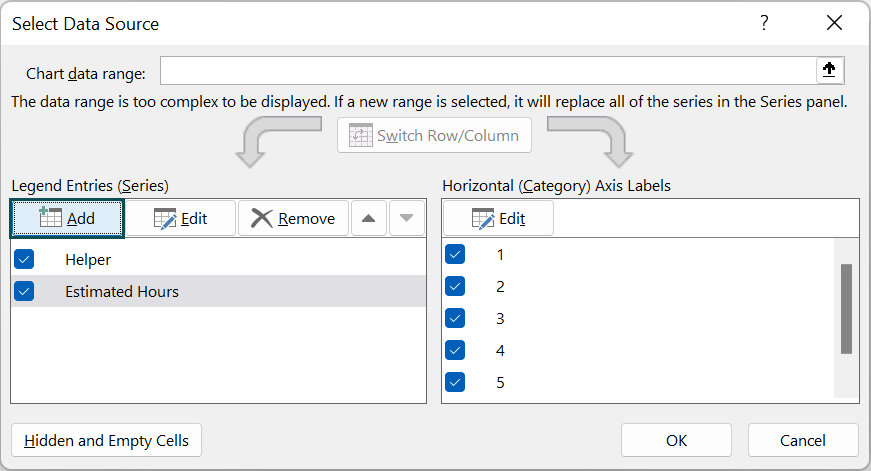
The Edit Series window pops up. Here, enter the values for the Estimated Hours series, as shown below, in the Series name: and the Series values: fields, and then, click OK to close the Edit Series dialog box.

Once again, click the Add option in the Legend Entries (Series) group.
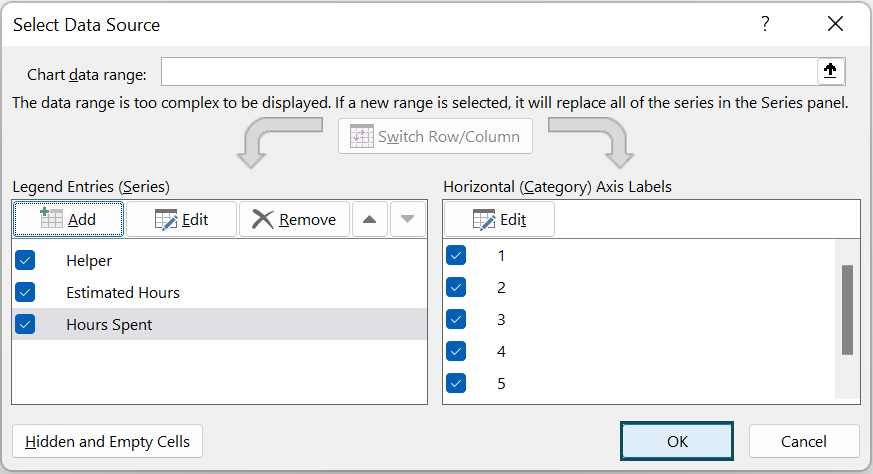
When the Edit Series window pops up, enter the values for the Hours Spent series, as shown below in the Series name: and the Series values: fields, and then, click OK to close the Edit Series dialog box.

Once both series are added, click OK to close the Select Data Source window.
Step 4: Next, right-click on the chart and select the Series Estimated Hours from the top option drop-down. Once the series points are highlighted, right-click on the data points, and then, click the Change Series Chart Type… option.
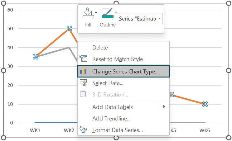
The Change Chart Type window appears.
Now, select the All Charts tab → click the Combo option on the left side → select the Custom Combination chart type on the right. (Learn more about Combo Excel Charts)
Next, below, tick the Secondary Axis checkboxes of the Estimated Hours and Hours Spent series → change the Hours Spent to Line chart type from the drop-down → click OK, as shown below.
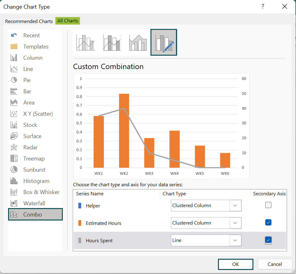
Once again, right-click on the chart and select the Series “Hours Spent” from the top option drop-down. Once the series points are highlighted, right-click on the data points, and click the Change Series Chart Type… option.

The Change Chart Type window appears. Select the All Charts tab → click the Combo option on the left side of the Change Chart Type window → select the Custom Combination chart type on the right-side → click OK, as shown below.
Next, below, check/tick the Secondary Axis checkboxes of the Estimated Hours and Hours Spent series.
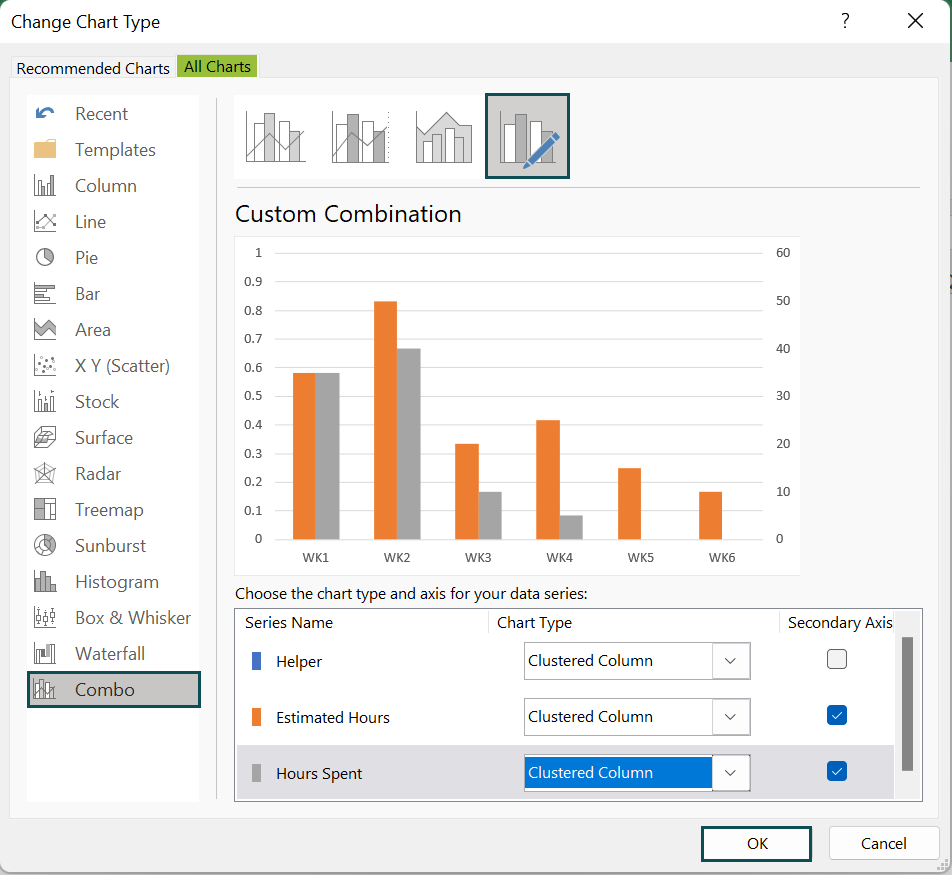
And click OK.

Step 5: Now, right-click the Estimated Hours data series and then, click the Add Data Labels option.

Step 6: Next, right-click on the added data labels and select the Format Data Labels option.
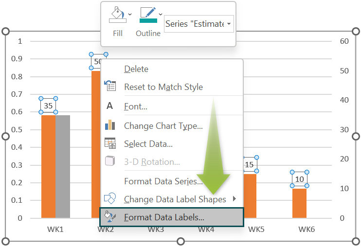
Check/tick the checkbox of the Value From Cells in the Label Options group, and enter the range as the phase column range.

And uncheck the option Value under Label Options.

Step 7: With the Estimated Hours data series selected, choose Design → Add Chart Element → Error Bars → More Error Bars Options.
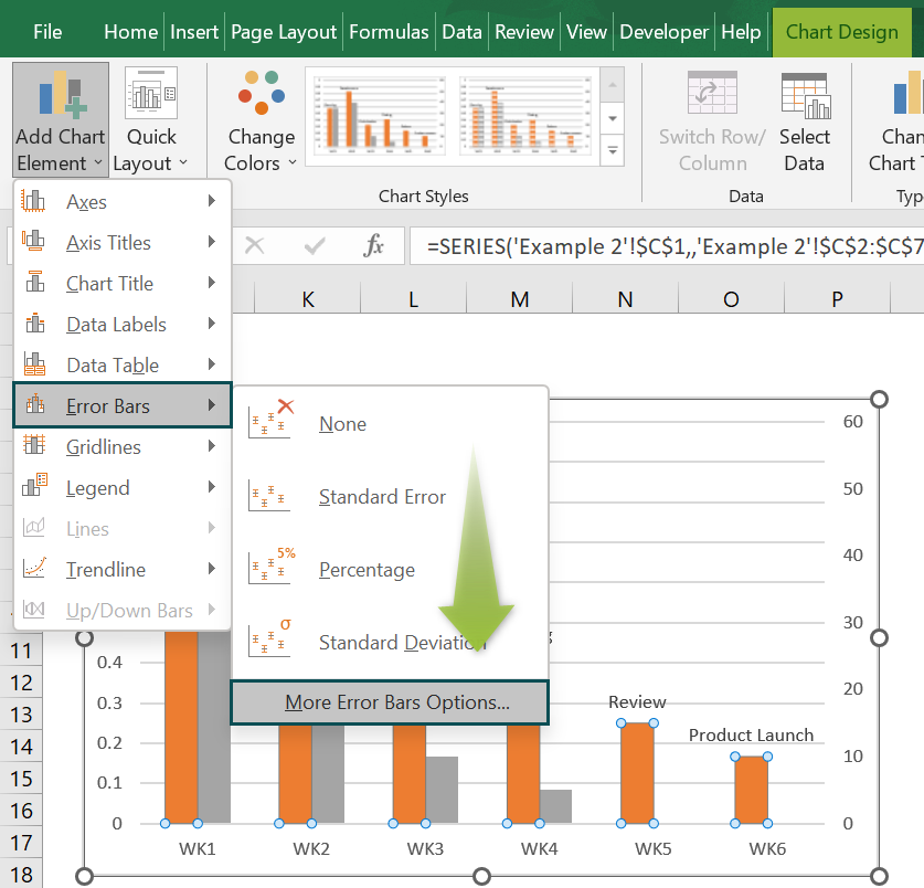
Set the Error Bars format as depicted below:

Next, go to the Fill & Line option, set Line as solid, and change the Color, Width, and Dash type as per requirement.

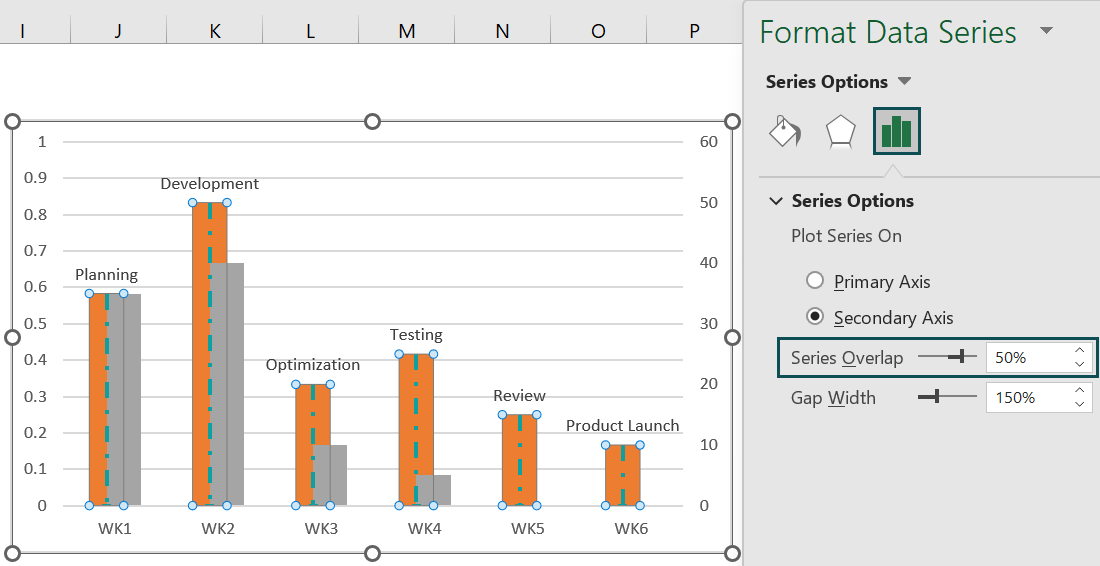
Step 8: Next, right-click the Estimated Hours data series and select Format Data Series.

Now, set the Series Overlap as 50% to increase the overlap between the columns.
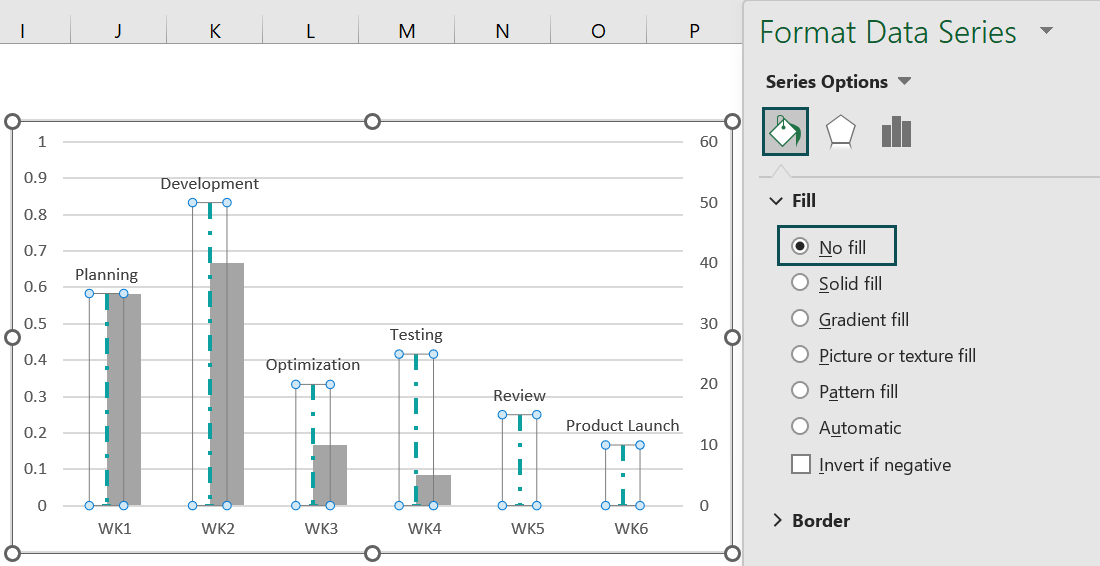
And set the Fill option as No Fill in the Fill & Line tab.
Step 9: Right-click the Hours Spent data series and then, select the Format Data Series option.
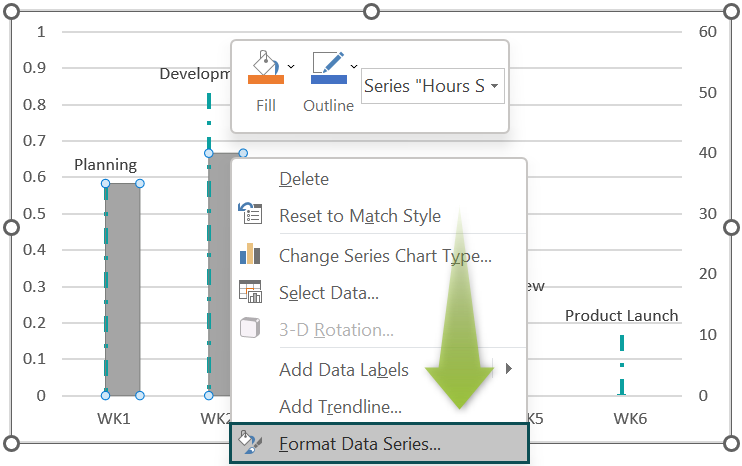
Similarly, set the required color using the Color option in the Fill & Line tab.

Step 10: Next, add the data labels for this data series.
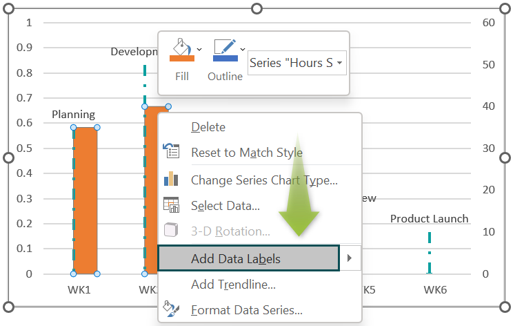
And similarly, format the data labels to show them as the Progress % at the bottom of the bars, in bold.
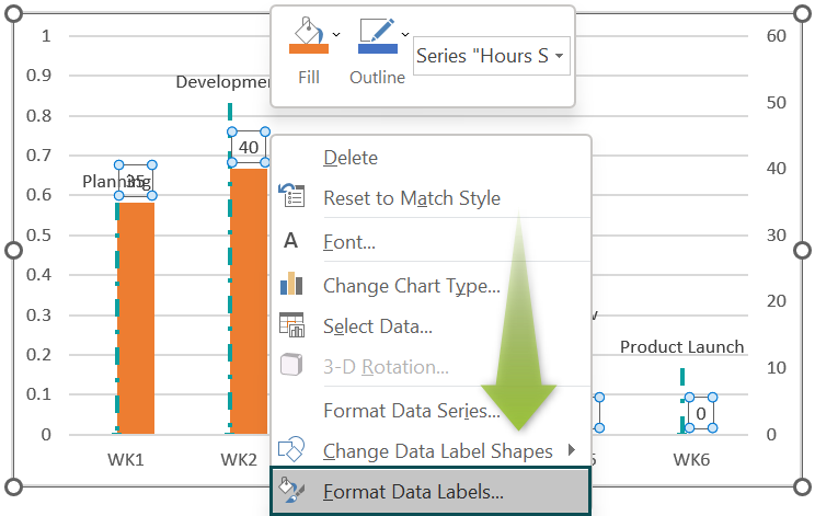
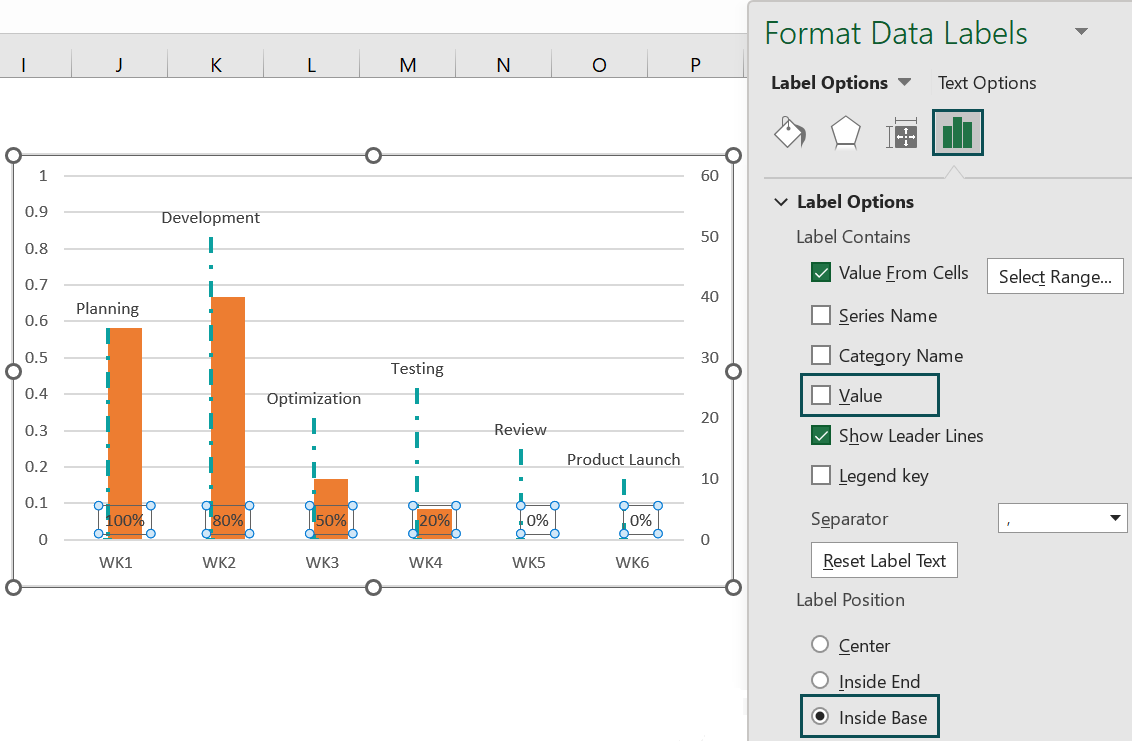
Then, set the label options as Value From Cells, with the data label range as the Progress column range.

Now, uncheck the Value field in the Label Options and also, set the Label Position as Inside Base.
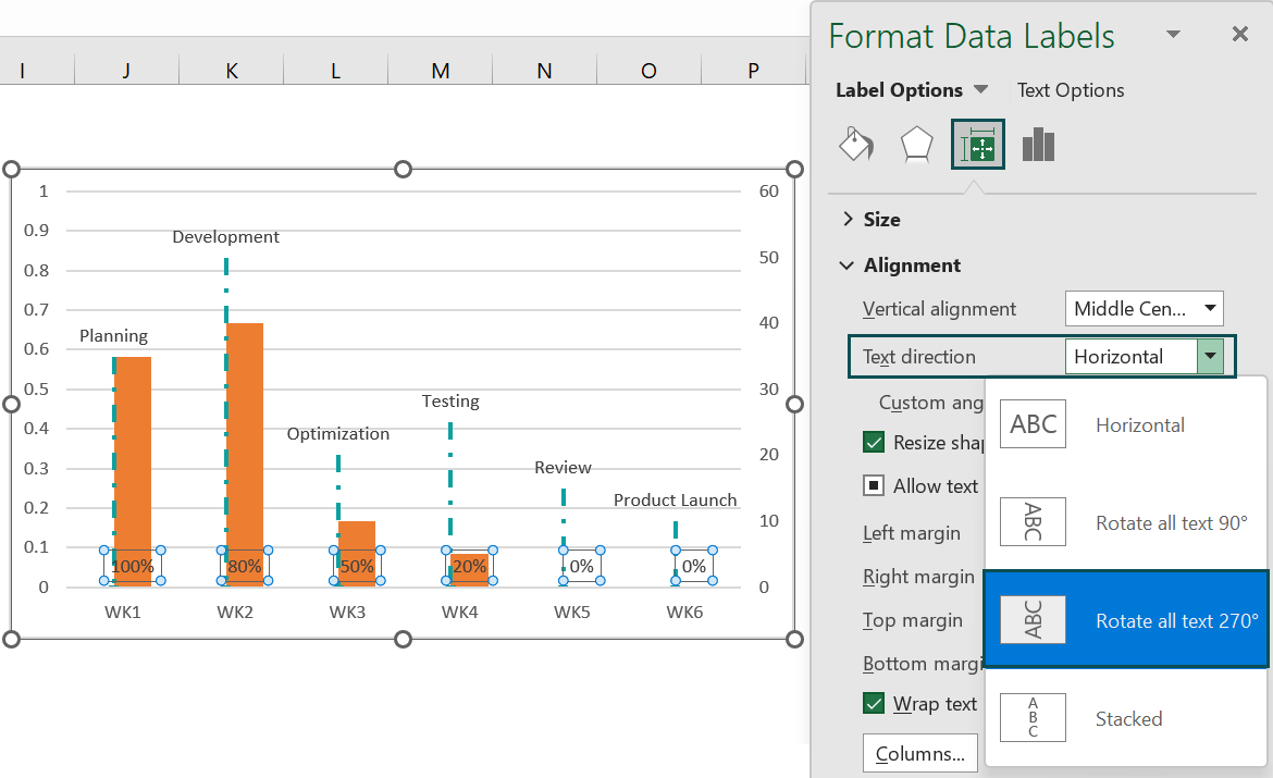
Next, in the Size & Properties tab, set the required Text Direction in the Alignment section.
And as the data labels are already selected, press Ctrl + B to make them bold.
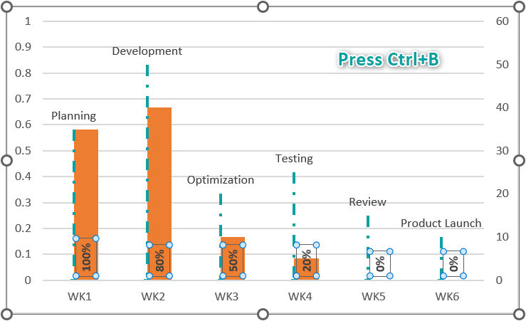
Step 11: Now, delete the primary vertical axis.
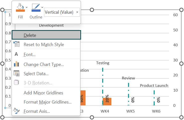
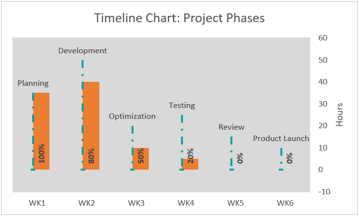
Step 12: Now, enable the Chart Title and Secondary Vertical Axis Title options using the Chart Elements drop-down.

Next, update the chart title and the secondary vertical axis title using the respective elements in the chart area.
Step 13: Then, right-click the secondary vertical axis and choose the Format Axis option.
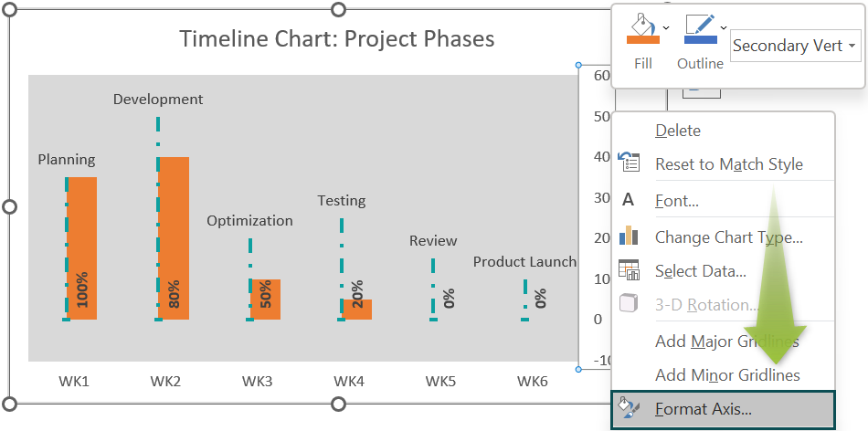
Set the Minimum Bound as 0.0.
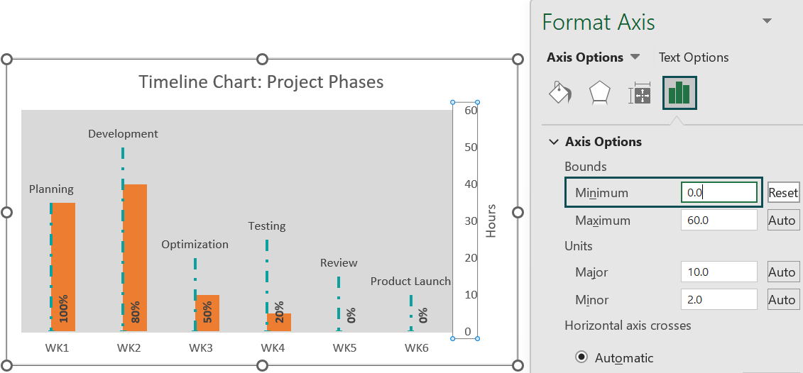
Thus, the final Timeline Chart in Excel is shown below.
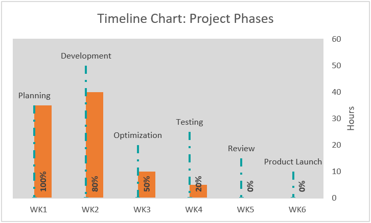
The dashed lines denote the project phases. They extend to the corresponding estimated hours, with the secondary vertical axis indicating the hours. And the orange bars show the progress in each stage.
Uses Of Timeline Chart In Excel
The uses of the Timeline Chart in Excel are:
- It helps graphically display the milestones in a project, the allocated time to achieve them, and the overall project progress.
- It is a useful tool for project management, which can help the stakeholders to steer the project most efficiently.
Important Things To Note
- Generally, we select the dataset and insert the required chart type to create any chart. However, it is different from the Timeline Chart in Excel, it takes time to build the chart, as it is not an inbuilt chart. But once we create the Timeline Chart in Excel template, we can modify data, which will modify the chart.
- It is best to create the required series manually in the Select Data Source window to avoid errors.
- Similarly, we can use a Line with markers chart or a 2-D Clustered column excel chart to create a Timeline chart.

Frequently Asked Questions (FAQs)
There is no Timeline Chart in Excel as an inbuilt feature. But we can create a Timeline chart by appending a helper column to the source table and using charts such as the Line or Clustered Column.
We can create a Timeline Chart in Excel for a project with four milestones from Jan-Apr using a Clustered Column chart.
For example, consider the following source table,
• 1: First, add the helper column to the source table.
• 2: Next, select the Estimate Time and Helper columns and click Insert → Column or Bar → 2-D Clustered Column chart.

• 3: Right-click on a bar and select Add Data Labels option.
Then, right-click one of the added data labels and select the Format Data Labels option.
Set the Label Options as Value From Cells and the required data label range as the Milestone column range.

• 4: Click a bar in the chart and choose Format → Shape Fill to change the bars’ color to No Fill.
• 5: Click Chart Elements → Error Bars → More Options to open the Format Error Bars window.
Set the below Format Error Bars settings.
• 6: Select the horizontal time axis and choose Format → Shape Outline to update color and weight.
Next, select one of the error bars and choose Format and Shape Outline to change the color.
• 7: Remove the primary vertical axis and the gridlines.

• 8: Update the chart title to achieve the below Timeline chart.
The Timeline chart is not working in Excel, perhaps due to the following reasons:
• The milestones listed in the source table are not in chronological order.
• We did not use a helper column with the required value.
• We did not create the required series properly using the Select Data option.
Download Template
This article must help understand the Timeline Chart in Excel, with its formula and examples. We can download the template here to use it instantly.
Recommended Articles
This has been a guide to Timeline Chart In Excel. Here we create the Timeline Chart along with step by step examples & downloadable excel template. You can learn more from the following articles –


Leave a Reply