
What Is Timeline In Excel?
Timeline in Excel is often referred as Milestone Chart in Excel. Projects include multiple phases and tracking the progress of each phase is equally important as the execution of each phase.
Tracking the status of the phases makes the job easy to execute and plan for the next phase of the project. Hence, a milestone chart or Timeline in Excel helps us to manage the project along with the project timelines.
Use this Timeline In Excel Template to follow along with the examples in this article.
Download Excel TemplateIn the timeline chart, each phase of the project shows up and down, and a typical timeline chart in Excel looks as shown in the following image.

A horizontal line has been drawn in the chart; on top and bottom of this horizontal line, each phase of the project is shown according to the execution time.
The benefits of using timeline in excel or milestone chart are as follows:
Identify major milestones of a project: Milestones are significant in any project and are often referred to as signs or health of the project. By identifying the milestones, we can answer a few questions such as,
- Are these the significant steps in the project?
- Are there any additional resources required in this step?
- If this task doesn’t get finished on time, can we complete the whole project on time or not?
- Do stakeholders required to take any strict actions in the coming phase of the project?
A timeline or milestone chart helps us to answer all the above questions and help the project managers to keep track of their project deliverables.
In Excel, we do not have a built-in chart for this timeline chart. However, we can create timeline in excel with formatting.
Key Takeaways
- Timeline in excel charts helps the project manager to look at the progress against the time and take necessary actions.
- A timeline chart requires a lot of formatting to be done to convert the regular chart into a milestone chart.
- A timeline slicer was first introduced in Excel 2013 version only for pivot tables.
- Using timeline in excel slicer, users can filter years, months, quarters, and days.
- To quickly create an event timeline, we can make use of smart art in Excel.
How To Create Timeline In Excel?
Using timeline in excel, we can create a chart or graphical representation of the tasks of the project. To create a milestone chart, we need to use the following steps.
Step #1 – Setting Up The Data
The first requirement of any graphical representation is to set up the data and the milestone chart is no different here.
First, make a list of tasks or phases in the project with the tentative start date as shown in the following image.

The first column is the expected month to complete the project phases. The second column is the phases or activities to be performed in the project.
Once we have listed down all the phases and tentative timelines for each phase, we need to create another helper column here i.e., create positive and negative numbers as shown in the following image.

Another formatting we need to do is apply the excel date format as MMM YYYY to the date column as shown in the following image.

Step #2 – Create a Line Chart
The actual process of building a timeline chart begins now. Select any of the cells in the data table, go to the Insert tab and insert the line chart as shown below.

We will get a line chart as highlighted in the below image.

Right click on the chart and click on the Select Data… option.

The Select Source Data window opens up. Choose Helper from the Legend Entries (Series) and remove it.

This will make the chart blank. Now, we need to manually reassign the values to the chart. Click on the Add button in the same window.

In the Edit Series window, choose cell B1 for Series name: and cell range B2:B9 for Series values:

Click on OK and we are back to the previous window.
Now click on the Edit option under Horizontal (Category) Axis Labels.

For this axis, the label chooses date values from the range A2:A9.

Click on OK.
Now we will be back to the data source window. In this window, we need to add another label i.e., helper column values.
Click on the Add button.

Choose cells from the range C2:C9 for the Series values: option.

Click on OK in the next two windows and now the chart looks like the following image.

To convert the preceding chart into a milestone chart, we must now apply formatting to it.
Step #3 – Apply Formatting to the Chart
Select the line chart and press the formatting shortcut key Ctrl + 1 to open the Format Data Series window on the right side.

Click on the Fill option and make change the line to no line.

Except markers, all the lines are disappeared. By selecting the markers go to the Design tab in the ribbon and click on the Add Chart Element option.

Hover on Error Bars and click on More Error Bars Options… option.

This will activate the Format Error Bars window on the right side.

Change the Vertical Error Bar to Minus.

Scroll down in the same format window and change the Percentage to 100% in the Error Amount category.

Once again, select the markers and open the Format Data Series window on the right side.

Click on Series Option and choose the Secondary Axis option.


As we can see, we have lines along with markers in the chart.
Select the markers, go to the Design tab under the Add Chart Element, hover on Data Labels and click on More Data Label Options.

It will open the Format Data Labels window. Select Label Options and expand Label Options.

Under Label Options, choose Category Name and unselect all other selected items.

Now, the chart starts to show up the dates as labels. We need to add phase names to the labels.
Right-click on the chart and choose Select Data… again.

Now, the Select Data Source window opens up. Choose Series 2 and click on the Edit option under Horizontal (Category) Axis Labels.

Select phase values from B2:B9 for Axis Labels.

Click on OK.
Now we will see Data Labels as phase names.

Remove gridlines from the chart.

Change font names to Times New Roman and font color to Black.
Add chart title as Project Milestone Chart.
And now the chart looks like the following image.

Replace the marker with triangle shapes as shown in the following image.

This will make the chart appear as shown below.


- There is an alternative way to create the same timeline chart. Follow the same steps as we have followed in the above example till we reach the following chart.

Now right-click on the chart and choose Change Chart Type… option.

This will open the change chart type window. Choose column chart for series 2 and line chart for phases.

Set the Gap Width of the data bars to 500%.

Change the bar fill color to no color and the border to black.

Add data labels to the bars as we did in the previous example.

Select the horizontal baseline in the middle of the chart and change the line color to black and solid line. Set the line width to 1.14 pt.

Remove the markers from the same baseline.

Select the date values on the x-axis and change the text to the bottom.

Add the chart title and other cosmetic changes to make it look neat. Now the chart looks like the following image.

Top Timeline Tools in Excel
The above one is all about the chart of projects or tasks. However, we have another timeline in Excel called Timeline for Pivot Tables.
For instance, we have created the following pivot table summary table.

The above pivot table shows city-wise monthly sales. For the above pivot table summary, we can insert a timeline and play around with the data.
When we select the pivot table, we will see a separate tab called Pivot Table Analyze.
Under this tab, choose Insert Timeline.

The Insert Timelines window opens up. Choose OrderDate in this window.

Click on OK and we will have a timeline slicer like the following image.

We have two years and under these two years, we have different months.
As we click on any of the months, it will filter for that particular month. For instance, in the following image we have selected Feb month for the year 2020 and the data will show only for 2020 Feb month.

Similarly, from the filter in the timeline, we can choose to show timelines like Month, Quarter, Year, Days.
For instance, we will choose QUARTERS for the slicer.


We have a timeline showing only quarters across two different years.
Once the timeline is inserted, we can play around with the timeline tools like Header, Selection Label, Scrollbar, and Time Level.

As of now, all the tools are checked, and we can see all the tools on the timeline.

In this way, we can play around with the timeline slicer in the pivot table.
Important Things to Note
- A timeline chart is often referred to as a Milestone chart in Excel.
- We do not have a built-in chart in Excel.
- To create a timeline chart, we need to create a helper column which is required to place the phases of the project one after the other.
- A timeline in the pivot table works as a slicer for date periods.
- All the tools of the timeline are enabled, by default.
- A timeline slicer in the pivot table works only for date columns.
Frequently Asked Questions (FAQs)
Once the pivot table is created, we can add timeline in excel for data related columns. Select any of the cells in the pivot table and under PivotTable Analyze tab, click on Insert Timeline.
After this choose the required date column from the data table to add timeline in excel.
Unfortunately, multiple project milestone chart is not yet available in Excel. Even to create a single milestone, one needs to go through multiple steps and formatting of the chart along with the helper column.
We can use smart art to quickly create an event timeline in excel. Go to the Insert tab and click on the drop-down list of Illustrations and choose Smart Art.
From the smart art, graphics choose the Basic Template under the process option.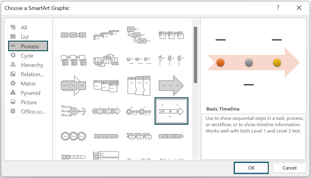
This will create a quick flow chart graphic. We can now enter our project tasks.

Use this Timeline In Excel Template to follow along with the examples in this article.
Download Excel TemplateRecommended Articles
Continue with these related resources when you want the next practical step in this topic.
- Charts In Excel
- Graphs And Charts In Excel
- Chart Wizard In Excel
- Line Chart in Excel
- Column Chart In Excel
Explore the full Excel Charts guide or browse Excel Resources.