


Introduction
Finance-related dashboards help you explore them interactively, such as filtering by region, clicking into product lines, or drilling from high‑level KPIs down to detailed rows. Traditionally, this requires a mix of pivot tables, pivot charts, slicers, and several layout steps that can take hours to set up. Excel Power View Copilot interactive reports instantly changes that by letting users describe the desired layout and behavior in plain language and having Copilot generate the underlying interactive report objects. When paired with Excel Power View Copilot report generation, the result is a self‑driven, slicer‑driven dashboard that updates as the data refreshes, without the analyst manually wiring every pivot table and chart.
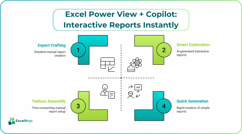
This article explains how to use AI interactive reports in Excel Power View Copilot to turn a simple dataset into a multi‑page, interactive report. It also tells you how to refine the layout, and how to avoid common layout and refresh issues. Copilot can create pivot tables, pivot charts, slicers, and KPI cards from a single prompt. For Excel users, that means less time on manual setup and more time on shaping the analysis and the story behind the visuals.
What “Power View–Style” Interactive Eeports Mean in Excel
In practice, Excel Power View Copilot interactive reports instantly refers to a Copilot‑generated layout that behaves like an interactive report:
- The user selects a region, time period, or product from a slicer, and every chart updates automatically.
- Clicking a slice in a pivot chart filters the underlying pivot table and other linked visuals.
- KPI‑style cells or small tables near the top show filtered totals that react to the current slicer state.
This experience is similar to classic Power View reports in Power BI, but inside Excel it is built from pivot tables, pivot charts, and slicers rather than a separate Power View canvas. Copilot acts as the layout engine, reading the table structure and then placing suitable objects on a new worksheet, linking them to the same PivotTable or data model, so they move together when the user filters.
How to Generate an Interactive Report with Copilot
Using Excel Power View Copilot interactive reports instantly follows a simple workflow that even mid‑level users can follow.
Step 1: Prepare the Base Data
Before asking Copilot, ensure the data is in a clean, table‑like layout:
- One row per transaction or record.
- Clear column headers that match the business logic (for example, Region, Product, Sales, Date).
- Formatted as an Excel Table (Ctrl + T) so Copilot can treat it as a structured dataset.
This step is the same as the preparation guidance provided in Microsoft’s Copilot‑visualization examples.
Step 2: Ask Copilot to Build the Layout
In Excel with Copilot for Microsoft 365, open the workbook and describe the desired report in plain language. A strong prompt for Excel Power View Copilot report generation might look like:
“Create a new worksheet and build a simple interactive dashboard using Table1 from the Sales Data sheet.
- Include a pivot table that shows total sales by region and by month.
- Add a pivot chart above the table that visualizes the same data as a clustered column chart.
- Insert a slicer for Region and a Timeline for Date so the user can filter both the table and the chart.
- Add a small KPI‑style card at the top that shows the total sales for the selected filters.”
Copilot then:
- Creates a new worksheet.
- Adds a PivotTable over the data.
- Adds a PivotChart that sits on the same cache.
- Inserts a Slicer and Timeline that filter both the table and the chart.
- Places a formula cell (often GETPIVOTDATA‑style) to show the current total sales.
This is the core of AI interactive reports in Excel Power View Copilot and shows how a single prompt can generate a fully interactive layout that responds to user clicks.
How to Refine the Copilot‑Generated Layout
The first version of the dashboard may have a rough layout or an overly complex chart. Refining it is straightforward.
- Drag the charts, slicer, and KPI cells into a clean grid so they do not overlap and are easy to read.
- Right‑click the pivot chart and choose Change Chart Type if a line or stacked column better tells the story.
- Adjust the slicer settings (e.g., number of columns, label width) so it fits neatly beside the charts.
- Add a short title and a small note explaining what the slicers do, so less‑technical users understand how to interact with the report.
This pattern is a practical example of instant interactive reports and demonstrates how the analyst can focus on the visual flow rather than the underlying pivot‑cache logic.
Practical Example: A Monthly Sales Dashboard
A common use case is a monthly sales performance dashboard where the business wants to slice by region and time and see the main trends and totals. Using Excel Power View Copilot interactive reports instantly, the workflow becomes:
- Clean the raw sales data into a single table with clear headers.
- Ask Copilot to create a new interactive dashboard sheet from that table, including a pivot table, a pivot chart, and slicers for region and period.
- Fine‑tune the layout and colors so the dashboard looks professional and is easy to navigate.
- Share the workbook with the team and explain how the slicers control the whole view.
This workflow is a concrete example of AI interactive reports in Excel Power View Copilot and shows how Copilot can compress what would otherwise be a multi‑step, manual dashboard setup into a guided, text‑based conversation.
Pitfalls and Best Practices
Excel Power View Copilot interactive reports instantly can speed up dashboard creation but also introduces subtle issues.
One common problem is sparse or messy layouts. Copilot may stack all visuals in one corner, forcing the user to re‑position them afterward. Best practice is to accept the initial layout as a starting point and then manually spread out the components so the dashboard is easy to scan.
Another risk is unintended pivot table groupings. Copilot sometimes drags multiple fields into the same area, creating confusing grouping levels. Users should review the pivot table field layout and remove unnecessary groupings so the slicers and timeline work cleanly.
A third pitfall is data‑type issues. If the date column is stored as text or if the numeric columns have mixed data types, the pivot table and slicer may not work as expected. Before running the prompt, it is sensible to verify that key columns are properly formatted as Date or Number so the interactive report behaves reliably.
Frequently Asked Questions (FAQs)
Excel Power View Copilot interactive reports instantly can replace much of the manual setup, especially for common layouts such as slicer‑driven sales dashboards, but they should not fully replace the analyst’s understanding of pivot logic and layout. The user still needs to review and fine‑tune the structure and visuals.
Excel Power View Copilot dashboards and Power BI reports both offer slicer‑driven, interactive experiences. But Excel is spreadsheet‑centric and better for small‑to‑mid‑volume datasets, while Power BI is built for larger, model‑based analytics. Many teams use Excel for quick, ad‑hoc views and Power BI for production‑level reporting.
AI interactive reports in Excel Power View Copilot can be safe for production if the underlying data is clean, the slicers and totals are tested, and the layout is polished. Users should also document the logic and share a stable version with the team rather than relying on repeated Copilot‑driven rebuilds.
Instant interactive reports Excel Power View AI can handle multiple tables if they are consolidated into a single, well‑formed source table or if they are joined into an Excel data model. For many use cases, flattening the data into a wide, transaction‑based table is the simplest way to ensure the Copilot‑generated report behaves as expected.
Recommended Articles
Continue with these related resources when you want the next practical step in this topic.
- How To Use AI With Excel
- How AI Is Transforming Data Analysis In Excel (2026 Complete Guide)
- Excel AI And Machine Learning: Beginner’s Guide For 2026
- The Most Useful AI Features in Excel: Unlock Smarter Spreadsheets in 2026
- Top Skills for AI-Enabled Excel in 2026 (Must-Master List)
Explore the full Excel AI Automation and Analysis guide or browse Excel Resources.