


Introduction
Finance teams import large blocks of transactional or performance data into Google Sheets and spend time building the right charts to visualize trends, variances, and drivers. The classic workflow involves manually selecting ranges, choosing chart types, tweaking series and formatting, and repeating the process for each new slice of the data. Google Sheets custom charts with Gemini changes this by letting users describe the desired chart in natural language. It allows the underlying Google Sheets logic, including the chart type, data range, and key formatting options. When combined with custom charts in Google Sheets with Gemini, the result is a faster, more repeatable way to turn raw tables into tailored visuals without navigating dozens of dialog boxes.
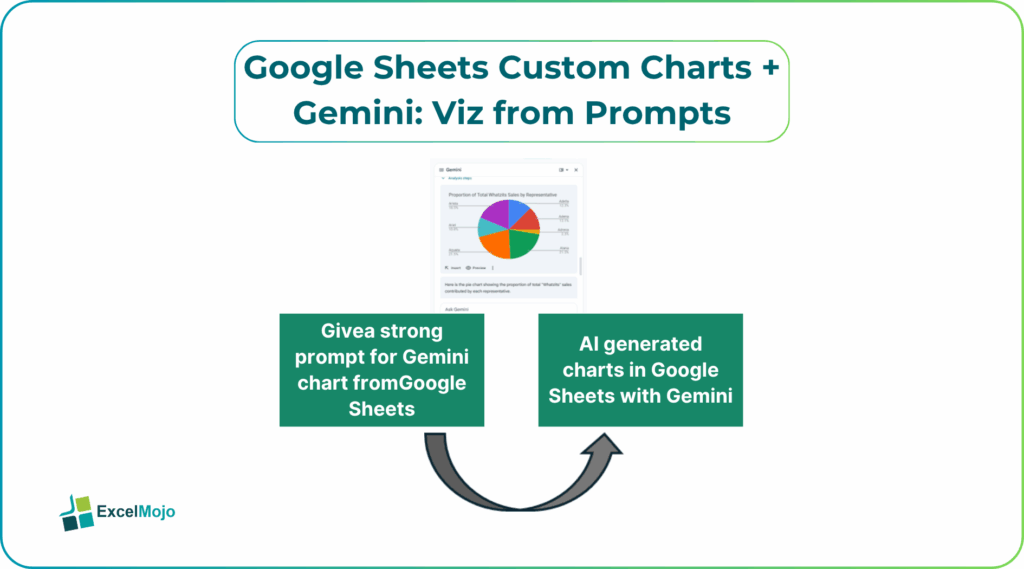
This article explains how to use Gemini‑driven prompts in Google Sheets to create charts with minimal effort. Users can describe the chart in plain language, and Gemini returns step‑by‑step instructions for building it. The article also covers how to refine those visuals and fix common formatting or layout issues.
Google’s documentation confirms that Gemini can generate and apply charts, sorting rules, and formula logic directly inside Sheets. This makes it easy to build visuals from text prompts without deep menu navigation. For spreadsheet‑focused analysts, that means more time interpreting the data and less time adjusting chart settings manually.
How to let Gemini Design the Chart Logic
Google Sheets custom charts Gemini viz prompts work best when the user clearly describes the visual and lets Gemini draft the underlying chart‑setup pattern.
Step 1: Define the Chart’s Purpose and Layout
Before running Gemini, state the goal in plain language, such as:
- “Create a clustered column chart that compares Actual Revenue and Budget by month, with a legend and gridlines.”
- “Build a line chart that shows cumulative sales by region over the last 12 months.”
These statements form the core of the prompt.
Step 2: Ask Gemini for a Chart‑Creation Instruction
A strong prompt for Gemini chart from prompts Google Sheets includes:
- The range of the data (for example, “A1:C24”).
- The chart type and any key formatting preferences.
- The desired labels and axis behavior.
Example:
“In Google Sheets, I have a table from A1:C24 where
- A1 = Month
- B1 = Actual Revenue
- C1 = Budget
Write step‑by‑step instructions for how to create a clustered column chart that shows Actual Revenue and Budget by Month, with a legend, gridlines, and the month labels on the horizontal axis.”
Gemini typically returns a sequence like:
- Select the range A1:C24.
- Go to Insert > Chart.
- In the Chart editor, choose the Clustered column chart.
- Set the horizontal axis to the Month column and the series to Actual Revenue and Budget.
- Enable Legend and Gridlines in the Customize tab.
This is the core of AI generated charts Google Sheets Gemini and shows how Gemini can generate clear, actionable directions for building a custom chart.
How to Implement the Chart in Sheets
Once Gemini provides the instructions, the analyst can execute them in a few simple steps:
- Select the appropriate data range.
- Insert the chart via the Insert -> Chart menu.
- Use the Chart editor to switch the chart type, series, and axis settings to match the AI‑suggested layout.
- Apply basic formatting, such as colors, labels, and gridlines, to align the chart with the team’s style guide.
This pattern is a practical example of create charts from prompts Google Sheets and demonstrates how a plain‑language prompt can translate into a ready‑to‑use visualization with minimal manual effort.
Customizing a Chart from a Natural‑Language Prompt
Custom charts in Google Sheets with Gemini become especially powerful when the user refines the AI‑generated chart with additional design choices.
For example, after Gemini generates a basic column chart, the analyst might:
- Change the chart title to match the business context.
- Adjust the color palette to match corporate branding.
- Add data labels or a trendline to make the chart more informative.
These refinements remain manual, but the starting point, the structure of the chart is now AI‑driven, which saves time and reduces the chance of selecting the wrong chart type for the data.
Practical Example: A Sales‑by‑Region Dashboard
A common use case is a dashboard that tracks sales by region and month. Using Google Sheets custom charts Gemini viz prompts, the pattern becomes:
- Place the raw data into a Google Sheet, with columns for Month, Region, and Sales.
- Ask Gemini for a prompt such as: “Create a stacked column chart that shows monthly sales by region with a legend and axis labels.”
- Let Gemini return a step‑by‑step instruction set, then follow it to create the chart in Sheets.
- Copy the chart into a dashboard sheet and link it to the underlying data so it updates automatically.
This workflow is a practical example of AI generated charts Google Sheets Gemini and demonstrates how Gemini in Google Sheets can turn a repetitive chart‑building task into a one‑time, guided process.
Pitfalls and Best Practices
Google Sheets custom charts Gemini viz prompts can speed up chart creation but also introduces subtle issues.
One common problem is over‑complex charts. Gemini may suggest charts that are visually cluttered or hard to interpret, especially if the prompt is vague. Best practice is to keep the chart focus on a single, clear message and to avoid overcrowding the visual with too many series or labels.
Another risk is misaligned ranges. AI‑generated instructions may refer to a fixed range that does not grow with the data. Analysts should anchor the chart to dynamic ranges or named ranges so that the chart updates as new rows are added.
A third pitfall is style inconsistencies. If each team member uses a different Gemini‑style prompt, the resulting charts may not match the organization’s visual standards. Teams should define a simple style guide like color palette, chart type preferences and encourage consistent prompts that align with that guide.
Frequently Asked Questions (FAQs)
Google Sheets custom charts Gemini viz prompts can handle much of the setup work, but they do not replace the need for human judgment. Analysts should still review the chart’s message, layout, and clarity before including it in a formal dashboard or report.
AI generated charts Google Sheets Gemini and manually‑built charts both use the same underlying chart engine, but the AI‑assisted process is faster and more consistent. The AI provides a clear, repeatable path to the chart, but the analyst still controls the final design and interpretation.
Gemini chart from prompts Google Sheets can be safe for production dashboards if the resulting charts are reviewed and tested against the data. Users should also ensure that the underlying ranges and formulas are robust and that the chart remains aligned with the business context.
Yes, create charts from prompts Google Sheets can handle dynamic data if the chart is anchored to a flexible range or named range. When the underlying data grows, the chart will update automatically, making it suitable for rolling reports and live dashboards.
Recommended Articles
Continue with these related resources when you want the next practical step in this topic.
- Graphs And Charts In Google Sheets
- Types of Charts in Google Sheets
- Google Sheets Pie Chart
- Bar Chart In Google Sheets
- Column Chart In Google Sheets
Explore the full Google Sheets Charts Dashboards and Pivot Tables guide or browse Google Sheets Resources.