


Introduction
Spreadsheet users who track KPIs, sales trends, or project milestones often want a quick visual cue next to each row to show whether performance is improving or falling. A simple solution is to place full‑size charts above the table. However, that takes up space and makes scrolling cumbersome. A more compact option is the SPARKLINE function, which puts a small inline chart directly into a single cell. By combining Google Sheets SPARKLINE Gemini mini‑charts with Gemini, analysts can generate the underlying SPARKLINE formulas from plain‑language prompts and apply them in bulk, avoiding the need to memorize the formula syntax. When paired with Google Sheets SPARKLINE with Gemini automation, the result is a wide range of compact trend indicators that update automatically as the underlying data changes.
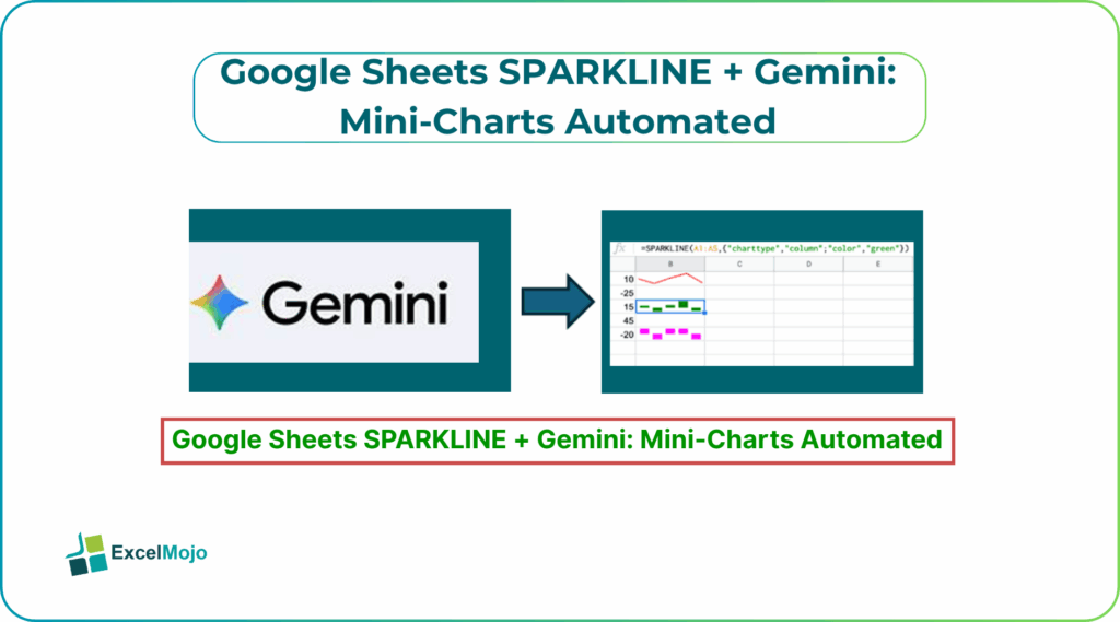
This article explains how to use Gemini powered SPARKLINE mini‑charts Google Sheets to create AI generated SPARKLINE charts in Google Sheets. You also learn how to phrase prompts that lead to robust, reusable formulas, and how to avoid common layout and refresh issues. It is a way to embed mini‑charts inside single cells, which underpins the pattern of automated mini‑charts Google Sheets SPARKLINE AI and the idea of using Gemini to generate the right parameters for line, bar, or win/loss charts. For users, that means less time on formula syntax and more time on interpreting the trends.
How SPARKLINE Works for Mini‑Charts -Google Sheets SPARKLINE Gemini Mini‑Charts
In Google Sheets, SPARKLINE creates a tiny chart that lives in a single cell. Instead of selecting a range and inserting a chart, the user writes a formula such as:
=SPARKLINE(B2:M2)
This puts a small line chart of the values in B2:M2 into the formula cell. The pattern is the same as described in Google’s own help on the SPARKLINE function, which lists several chart types, including line, bar, column, and win/loss, and explains that the function can be customized with optional parameters such as color, labels, and axis options.
Common patterns include:
- A line‑style Sparkline to show a trend over time in a single row.
- A bar‑style Sparkline that compares values across columns without vertical labels.
- A win/loss Sparkline that highlights whether a set of values is positive or negative.
These lightweight visuals are where automated mini‑charts Google Sheets SPARKLINE AI becomes most useful. The user can describe the chart they want, and Gemini can draft the full SPARKLINE expression with the right arguments.
How to use Gemini to Draft SPARKLINE Formulas – Google Sheets SPARKLINE Gemini Mini‑Charts
Google Sheets SPARKLINE Gemini mini‑charts works best when the user clearly describes the data layout and the desired chart behavior.
Step 1: Define the Structure and the Goal
Before asking Gemini, write a short description such as:
- “Create a Sparkline that shows the trend of monthly sales across columns B to M for each row, with a red line if the last value is below the first and green otherwise.”
- “Write a Sparkline that shows a bar chart of values in columns C to H for each row, with blue bars and no labels.”
These sentences give Gemini the logic it needs to build the formula.
Step 2: Ask Gemini for the SPARKLINE Function
A strong prompt for Gemini powered SPARKLINE mini‑charts Google Sheets is:
“In Google Sheets, I have a table where
- Columns B to M contain monthly values for each row.
- I want to put a Sparkline in column N for each row that shows the trend of those values in a line chart.
- Use a green line if the last value in the row is equal to or greater than the first, and a red line if it is lower.
Write the SPARKLINE formula that goes into cell N2 and that can be copied down the column.”
Gemini typically returns something like:
=SPARKLINE(
B2:M2,
{
“charttype”, “line”;
“color”, IF(M2 >= B2, “green”, “red”)
}
)
This is the core of AI generated SPARKLINE charts and shows how Gemini can generate a structured formula that combines the data range and conditional formatting.
How to Place and Test the Sparkline
Once the SPARKLINE expression is ready, placing it is straightforward.
- In Google Sheets, select the first cell where the mini‑chart should appear (for example, N2).
- Paste or type the SPARKLINE(…) formula and press Enter.
- Copy the formula down the column so each row gets its own Sparkline.
Because SPARKLINE runs inside a single cell, it scales well with the table; new rows added below the starting point will not automatically inherit the formula unless the user extends the range or uses an ArrayFormula pattern. For many use cases, a simple SPARKLINE in each cell works well enough.
Practical Example: Monthly Trend Tiles
A common use case is a performance sheet where each row is a product or region, and each column is a month, and the goal is to see at a glance which rows are trending up or down. Using Google Sheets SPARKLINE Gemini mini‑charts, the pattern becomes:
- Place the monthly data in columns B–M, with each row representing a product or region.
- Ask Gemini for a Sparkline formula that uses those columns and changes color based on whether the last month’s value is higher than the first.
- Place the generated SPARKLINE in the first row of the “Trend” column and copy it down.
- Adjust the column width and cell size slightly so the Sparklines are easy to read without overwhelming the table.
This workflow is a practical example of automated mini‑charts Google Sheets SPARKLINE AI and shows how Gemini can compress what would otherwise be a manual, formula‑typing exercise into a guided, text‑based conversation.
Pitfalls and Best Practices
Google Sheets SPARKLINE Gemini mini‑charts can speed up visualization but also introduces a few common issues.
One common problem is over‑large or cluttered Sparklines. If the range is too wide or the chart type is too detailed, the tiny graphic may become hard to read. Best practice is to keep the source range focused on the key period (for example, 6–12 months) and avoid stacking too many series in one Sparkline.
Another risk is formula fragility when ranges change. If the underlying data layout shifts (for example, by adding a new column in the middle of the range), the Sparkline formula may break or point to the wrong cells. Users should review the range in the SPARKLINE expression whenever the table structure changes.
A third pitfall is limited formatting options. While SPARKLINE supports basic colors and some chart‑type choices, it does not offer the same level of control as a full chart editor. For highly formatted visuals, analysts should still use standard charts alongside the compact Sparklines.
Frequently Asked Questions (FAQs)
Google Sheets SPARKLINE Gemini mini‑charts cannot fully replace full charts, but they complement them well. Sparklines are best used for row‑by‑row trend indicators, while full charts are better for detailed analysis and sharing.
Google Sheets SPARKLINE with Gemini automation and manually writing SPARKLINE formulas both use the same underlying function, but the AI‑assisted route saves time by drafting the exact syntax from a plain‑language description. The user still needs to test the formula on a few rows before applying it to the whole sheet.
Gemini powered SPARKLINE mini‑charts Google Sheets can be safe for large datasets if the underlying ranges are kept reasonably small and the formulas are tested on a subset of rows first. Very wide or deeply nested Sparkline patterns can slow down the sheet.
AI generated SPARKLINE charts in Google Sheets are typically designed for one row of values at a time, not for multiple independent series in a single Sparkline. For multi‑series comparisons, a standard chart is more appropriate, while Sparklines work well for showing the trend of a single row.
Recommended Articles
Continue with these related resources when you want the next practical step in this topic.
- Graphs And Charts In Google Sheets
- Types of Charts in Google Sheets
- Google Sheets Pie Chart
- Bar Chart In Google Sheets
- Column Chart In Google Sheets
Explore the full Google Sheets Charts Dashboards and Pivot Tables guide or browse Google Sheets Resources.