
Introduction
Finance teams often monitor K‑PIs such as revenue, costs, or transaction volumes over time, scanning for sudden spikes or drops that signal issues or opportunities. Doing this visually for dozens of metrics becomes tedious and error‑prone. Power BI AI insights anomaly detection addresses this by using built-in AI features to scan time‑based series and flag statistically unusual points without manual setup. With Power BI automatic anomaly detection enabled on a visual, Power BI overlays anomaly markers, letting users quickly see outliers and drill into the underlying rows that drive them.
Here we show you how to configure AI powered anomaly detection Power BI on key time‑series charts and how to interpret the results in a Power BI anomaly detection AI dashboard. Here, we see how Power BI AI insights time series can surface issues such as transaction‑volume spikes, revenue drops, or unusual month‑end patterns without complex modeling. In recent times, anomaly detection is available on line, column, and area charts that use a date or time field on the axis, and that the service handles the statistical logic behind the scenes . For analysts, that means a practical way to automate the first layer of exception‑based monitoring.
How Power BI AI Anomaly Detection Works
Power BI’s AI insights layer includes anomaly detection as one of several quick‑insight tools. When enabled on a visual, the engine:
- Treats the plotted series as a time‑based sequence and fits an underlying model to the expected behavior.
- Identifies points that diverge from that expectation by a statistically meaningful margin.
- Places visual markers (vertical bands or shaded regions) around the anomalous time periods.
Behind the scenes, the platform uses time‑series decomposition logic similar to seasonal‑trend‑based outlier detection; it does not simply flag every high or low value. This is why Power BI automatic anomaly detection tends to ignore one‑off but plausible extremes and instead targets sustained shifts or clustered deviations that may indicate root‑cause issues such as system errors, policy changes, or fraud‑like behavior.
For finance teams, that behavior suits common use cases such as:
- Detecting unusual cash‑out days in a transaction‑volume dashboard.
- Spotting sudden revenue drops across regions during a specific period.
- Highlighting abnormal month‑end or quarter‑end liquidity patterns.
How to Eenable and Interpret Anomalies in Power BI
Enabling Power BI AI insights anomaly detection follows a visual‑first pattern inside the Power BI service or Desktop.
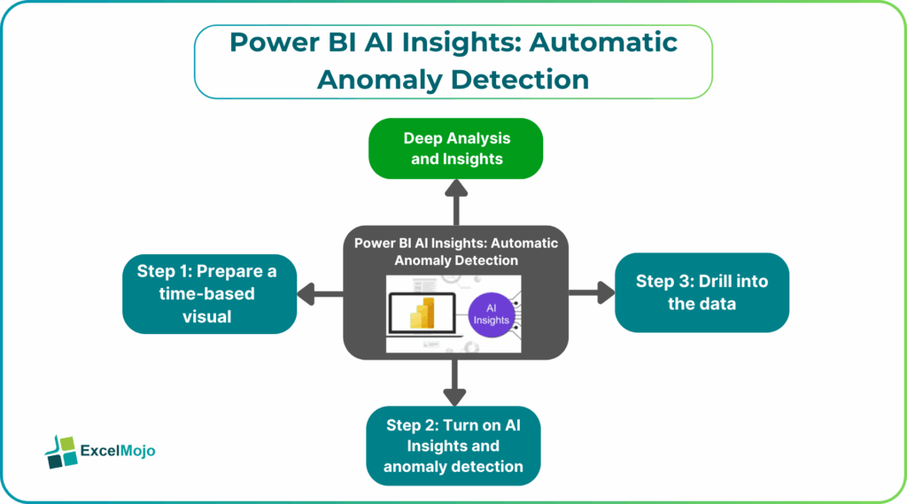
Step 1: Prepare a Time‑Based Visual
Create a line, column, or area chart that uses:
- A date/time field on the axis.
- One or more measures or aggregations on the value axis, such as sum of transactions, total revenue, or average balance.
For example, a chart named “Daily Transaction Volume” that plots SUM(TransactionAmount) by TransactionDate becomes a natural candidate for anomaly detection.
Step 2: Turn on AI Insights and Anomaly Detection
In Power BI Desktop or the Power BI service:
- Select the visual.
- Open the Analytics pane.
- Under AI Insights, toggle Anomalies or Anomaly Detection.
- Optionally adjust sensitivity or time‑range filters if the interface exposes those settings.
Power BI overlays vertical bands or high‑lighted regions where the detected anomaly occurs. Hovering over the marker typically shows:
- Time range of the anomaly.
- Magnitude (e.g., percent above expected).
- A brief description of the underlying context.
This step is the core of AI powered anomaly detection Power BI and shows how analysts can turn a simple trend chart into an automatic anomaly detection monitor with minimal code.
Step 3: Drill into the Data
Click on the anomaly band or use the context menu to drill through to the underlying data. Power BI can route users to a table or grid that lists the rows or transactions contributing to the spike or dip, which is especially useful for root‑cause analysis.
Practical Example: A Revenue‑Monitoring Dashboard
Suppose a finance team builds a Power BI anomaly detection AI dashboard that tracks monthly revenue by region. The design is:
- A line chart for “Revenue by Month” with Date on the axis and SUM(Sales) as the value.
- Region split via the legend or as a small multiple layout.
By enabling Power BI AI insights anomaly detection on each line, the dashboard can:
- Flag a month where North America revenue drops 30% below the expected trend.
- Highlight a spike in Asia‑Pacific revenue that coincides with a new campaign.
Analysts can then click the anomaly, review the detailed fact table, and determine whether the change stems from a data issue, an operational event, or a genuine business development. This workflow illustrates how Power BI AI insights time series can turn a static K‑PI dashboard into an active monitoring console.
Pitfalls and Best Practices
AI powered anomaly detection Power BI is powerful but not foolproof.
One common issue is misinterpreting sensitivity. Anomaly detection may mark too many or too few points depending on the data’s volatility. Analysts should test the visual on historical data, compare alerts to known events, and adjust the time range or filters until the pattern feels realistic.
Another risk is over‑reliance on the AI layer. Analysts should treat anomalies as a signal, not a final diagnosis. Each flagged point should lead to a manual check of the underlying data, assumptions, and business context before any action is taken.
A third pitfall is poor time‑series design. If the axis uses an inadequate grain (e.g., daily when data is sparse) or mixes different entities without a clear split, the anomaly‑detection engine may struggle. The Power BI AI insights anomaly detection pattern works best when the chart cleanly represents one logical series at an appropriate time scale.
Frequently Asked Questions (FAQs)
Power BI AI insights anomaly detection is designed for time‑based sequences plotted on line, column, or area charts. It does not apply in the same way to non‑time metrics such as a single‑value card, so analysts should use it primarily on Power BI AI insights time series visuals.
Power BI’s built‑in anomaly detection uses a pre‑defined statistical model and does not expose full parameter tuning, but analysts can influence the result by adjusting the time range, grain, and filters on the visual. For custom alert logic, they still need Power Automate, DAX thresholds, or Python scripts.
Anomaly detection automates the first‑order outlier‑finding logic, whereas manual thresholds require fixed rules such as “flag if revenue < 90% of average.” The AI‑based approach adapts to the series’ trend and seasonality, making it better suited for evolving data patterns.
No, Power BI automatic anomaly detection should not replace dedicated monitoring or APM tools. It is best used for business‑level K‑PIs inside Power BI dashboards, while log‑level, transaction‑level, or system‑level monitoring should live in specialized observability platforms.